
24/4/2023 - 24/7/2023
Leong Jiahui / 0353469
Bachelor of Design (Honours) in Creative Media
GCD62104 / DESIGN EXPLORATION
Instructions
WEEK 1
This week, we were given the brief to the project. We are required to create a fun experience that fulfills the purpose of an SDG. It's a fun topic and I am hoping to challenge myself with making a Live2D model, tackling the "Quality Education" SDG. The concept is that teachers take on a cartoony/ 2D character persona when delivering their lesson to appeal to children more. After seeing the examples given, I am also inspired to make a series satire "yes, and?" comics that can challenge the SDG concepts and ideas.
Ideas:
- live 2d model - vtuber (SDG news)
- yes, but comics
ref of senior:
https://zhaohanbo24.blogspot.com/search/label/Design%20Exploration
WEEK 2
There was a sudden topic change this week, as our school was suddenly invited to join the Taiwan International Student Design Competition (TISDC). The topic had now shifted to equality, with the catch of implementing Taiwan's symbolic entities. In their words: "Encourage international creative design exchange, develop creative design talents, express the international image of Taiwan attaching great importance to creative design, and establish the international design status of Taiwan.". Honestly, what does that even mean? Either way, I started researching what "international image of Taiwan" I wanted to go for. It helps that I've been to Taiwan just recently last December, so it still fresh in my mind somewhat.
Representatives from TISDC also visited the campus to give us a briefing on the competition, as well as showing us some past winners' works. They were all very inspiring and unique in their own way and gave me an idea of what to expect of the competition.
TISDC competition brief & rules
WEEK 3
I started brainstorming on potential ideas I could work on that do not require too much technical exploration, due to the extremely constricted time frame. But at the same time, I wanted to try something new and challenge myself outside my comfort zone. While searching for inspiration on Pinterest, I came across Korean artist 리노참치Rinotuna's works. They specialize in personifying items into characters. All of their work is very fun to decode, finding out how they interpreted the objects into parts of the model is a very creative inducing experience.
 |
| fig 3.1 rinotuna's works |
After experiencing the fun of viewing others' creative interpretations of objects in artworks, I decided, yes, that's quite a playful and engaging way to keep viewers stimulated. I also got quite pumped and wanted to make my own. Following the theme of Taiwan and Equality, I decided to give this concept my own spin and reimagine Taiwanese food and locations into fashion pieces and fit them into models with diverse body shapes and backgrounds. The concept is mainly to portray gender equality and body positivity through a playful interpretation of iconic Taiwan symbols.
As my initial plan for the project was to make a Live 2D model, I played around the idea of going ahead with the plan, but juggling the workload, I decided to start small with a simple subtle character animated poster instead.
WEEK 4 & 5
This week, I began working on the hands-on part of the project. I began by first collecting and researching all the iconic symbols of Taiwan. Separating the symbols into Landmarks and Cuisines, I considered their popularity and interpretation possibilities before selecting which I wanted to work with. I wanted them to be iconic and recognisable at a glance, something that is well known enough to represent Taiwan. After much consideration, I decided on:
- bubble tea
- taipei 101
- Guabao (pork belly bun)
 |
| fig 4.1 Taiwan symbol considerations |
Then, I started sketching my first characters, Bubble Tea & Taipei 101. I don't have a set look and feel for how I wanted them to look like, so I just worked my way through and hope for the best. I used the sketching as a brainstorming process as well, so I tried out different poses for each sketch, hoping to portray a different personality in each one. I also tried out different clothing styles and interpretations. I added greyscale values to all of them to give each of them better contrast and clarity.
 |
| fig 4.2.1 bubble tea sketches |
 |
| fig 4.2.2 Taipei 101 sketches |
 |
| fig 4.2.3 gua bao sketches |
WEEK 6 & 7
As I was expanding on bubble tea's design, I suddenly got the inspiration to incorporate disability rep into the project. Since body positivity and gender equality, while both important topics to discuss, there are already many conversations and campaigns bringing attention to them. Meanwhile, I realised that disability rep wasn't talked about nearly as much. This newfound idea kickstarted an entirely new thought process, now trying to incorporate disability representation into my characters, I try to relate their features and rationalise them so it does not feel forced or random when introduced together with the characters. Somewhere along the ideation, I actually lost the "fashion" part of the focus for this project, and focused on the character design as a whole, as both provide a visual impact to the viewer.
With the new ideas in mind, I started sketching out how i envision the characters to be, with the disabilities incorporated into their design. Even though I wanted the disabilities/disorder to be portrayed, I did not want it to overshadow the rest of the character's design. Here is how the first design finalisation of the character bubble tea, as well as the proposal slides for the presentation on week 7.
I also started rationalizing every design decision i made to streamline the workflow.
Bubble tea
disability representation:
blindness & vitaligo
characteristics:
- freckled skin
- pale pupils
- freckled skin
rationale:
- originated from Taiwan, acting as a Taiwanese cultural identity
- a blend of traditional Taiwanese tea culture with modern flavours and trends
- widespread popularity helps to increase awareness and appreciation of Taiwanese culture, cuisine, and lifestyle around the world.
Taipei 101
disability representation:
amputee
characteristic:
- amputated leg
rationale:
- symbol of Taiwanese ingenuity and modernity
- economic and cultural hub
- standout landmark that embodies the spirit of modern Taiwan
 |
| fig 6.1 bubble tea_blindness & vitaligo |
Proposal:
Design Exploration Proposal by Jiahui Leong
link:
Task 1 Feedback
- Establish a strong rationale for each Taiwanese motif chosen
- have silhouettes ready by next week
- Project brief: Explanation of what your project is about, how it is related to the selected SDG, how does the project will have an effect on the general public or target users/viewers.
- Your rationale of playful experiences in the design, and TISDC expansion
- Design evidences of project development: appropriate visual evidences based on your project - sketches, storyboards, wireframes, typeface selections, colour schemes etc.
- Technical evidences of project development: appropriate evidences that showcase initial tests, prototype, exploration of technical aspects for project execution
- Project timeline: Breakdown of tasks from Week 8 - Week 14
- give the characters a hero pose that showcases personality
- explore more
WEEK 8 & 9
These weeks were the ones where I felt burnt out a lot, with the CDP module cramping our schedule from 14weeks to 11 for Inofest, so this module did not have much progress. I played around with the idea of an amputee for Taipei 101's concept, and finalising his design. I decided to give him a cane to kind of give the disability a bit more emphasis, and I thought the cane balances out the design well (no pun intended).
 |
| fig 8.1 Taipei 101 finalised design |
 |
| fig 9.1.1 bobba color try out |
 |
| 9.1.2 Taipei 101 color try out |
WEEK 10-11
After picking out the colour combinations, I started painting the characters. To speed things up, I tried out the "no line art line art style" where I don't do any line art, tidied up my sketch and just started smacking colors on it. Not the smartest thing to do considering I have to animate the character by parts after this, but the no line art style made the painting look and feel a lot more juicier. I also started working on their splashart design, giving them a background that fits their theme.
 |
| fig 10.1 final renders of bobba and taipei 101 |
 |
| fig 10.2 splasharts of bobba & taipei 101 |
Moving on, I started working on the posters for the TISDC submission. Since the characters were already very detailed, I wanted the poster background to be a bit more simple and does not steal the show from the main focus. I also wanted to incorporate the wordings of their names in the poster.
 |
| fig 11.1 character poster try-outs |
Ultimately, these are the designs I went with. I chose ones that are simple, has a good contrast with the character and showcases the character well.
 |
| fig 11.2 bobba final poster |
 |
| fig 11.3 Taipei 101 final poster |
WEEK 12
I first cut out the pieces I wanted to animate in Procreate. It was a hassle lasso-ing the parts i wanted to animate, and even more of a hassle trying to figure out which part - which hole that needs to be filled and which don't.
 |
| fig 12.1.1 cutting the pieces |
fig 12.1.2 timelapse
As for the actual animation, I made it in after effects. The tools I mainly used was puppet pin and the basic transformation tools. I basically just threw it in and hoped for the best. The exporting of the video/gif was another ordeal, but I'll save your time and tell you how I eventually did it. This is also for future me's reference if i ever forget:
export as QuickTime MOV (alpha turned on) in Ae > convert MOV into Animated GIF in Media Encoder
Big shoutout to Jamie for helping me figure this out👍, and biggest shoutdown 👎to that Youtuber who wanted me to export the animation frame by frame and convert it into a gif on some shady website gif converter.
 |
| fig 12.2.1 After Effets Animation_bobba |
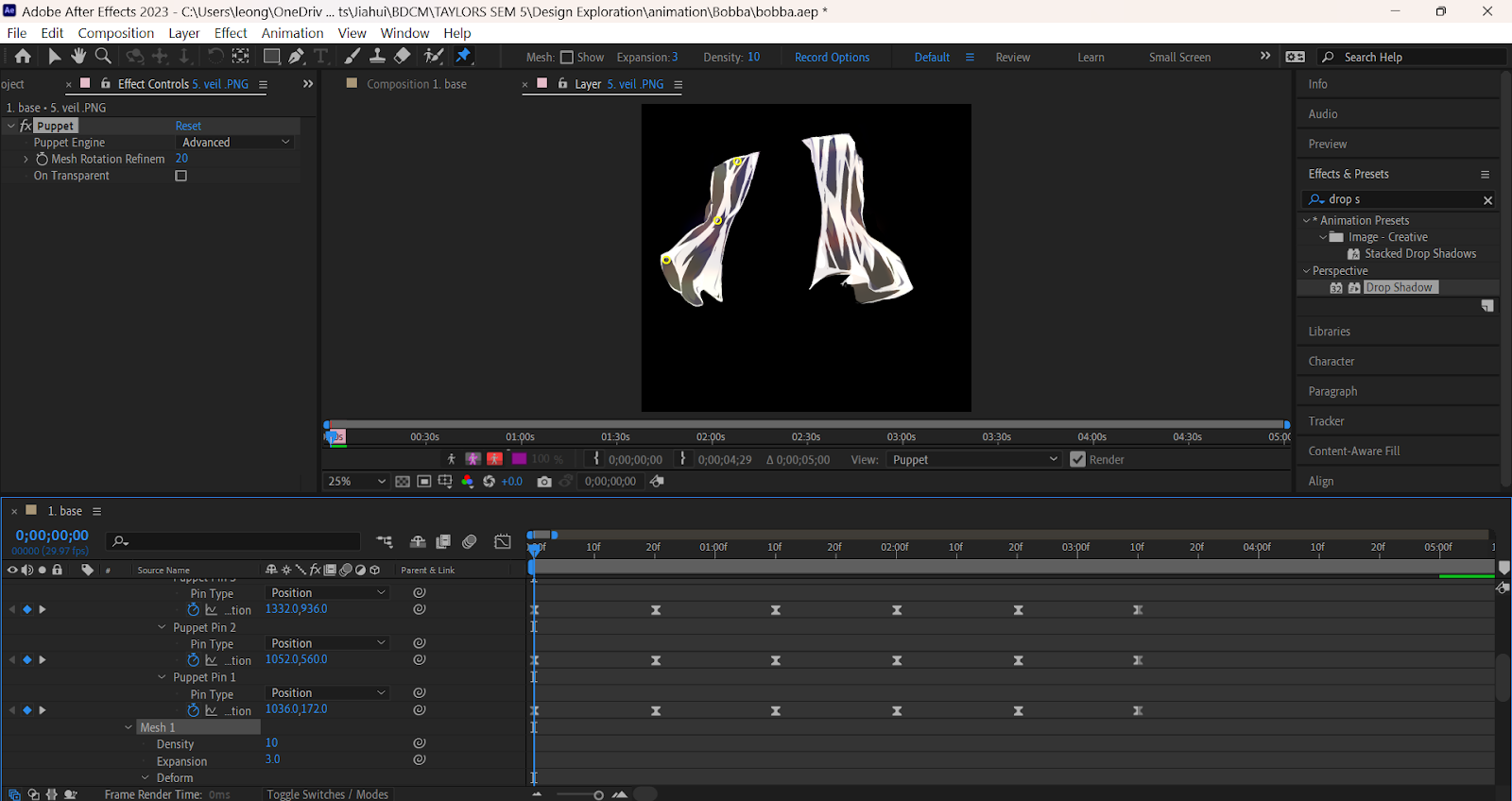 |
| fig 12.2.2 After Effets Animation_bobba2 |
fig 12.2.3 bobba_progress
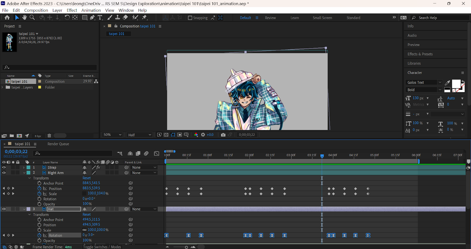
The animation progress was a lot smoother and more streamlined for Taipei 101. For starters, after I cut out the parts, I exported it as a Photoshop file instead of pngs! When there were unexpected holes in the animation, I just went back to the photoshop file to fill it in, it was like magic. I felt so powerful. With that said, I also attempted a bit more animated parts for Taipei 101, with more subtle movements in parts that are harder to animate, like his limbs.
 |
| fig 12.3.1 filling in gaps in photoshop |
 |
| fig 12.3.2 animation progress is poggers |
WEEK 13
Even with the animation done, I still felt that there were something missing from the project. The final outcome didn't feel like it has quite achieved the project objectives just yet, something needs to wrap it up with a big nice bow. With that in mind, I started thinking about something i could do to make this a full-on campaign that feels legit enough to launch. I also had to work with what I currently have because well,, presentation is literally next week hello,, then it clicked.What's engaging if not something viewers can interact with? I remember throwing around the idea of AR filters with my friend previously, so I decided, heck, I already have the animations, why not? I returned to my YouTube academy and started looking up tutorials on how to do this. Installed Meta Spark AR, booted it up, and the next thing you know I'm making an AR filter.
 |
| fig 13.1.1 AR filter progress 1 |
 |
| fig 13.1.2 AR filter progress 2 |
fig 13.2.1 AR filter testing 1
fig 13.2.2 AR filter testing 2
| fig 13.3.1 figma pages |
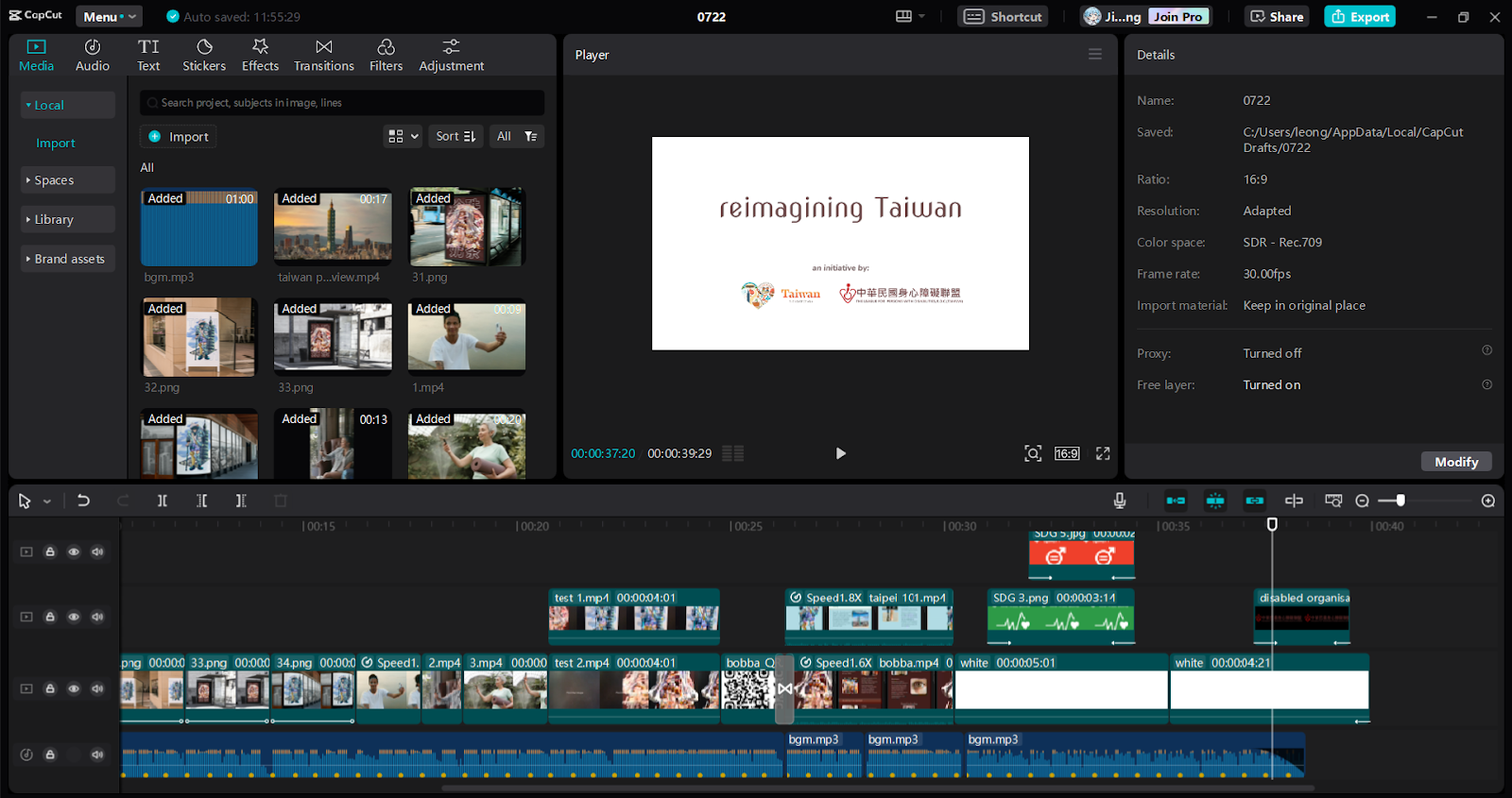
As a finishing touch to actually tie all the outcomes together, what better way to do so but making an showcase video? So that's what I did. I made a very brief storyboard, looked up assets, and got to work putting the video together. I also got some friends to film some scenes for me.
 |
| fig 13.4.1 brief video storyboard |
 |
| fig 13.4.1 video editing montage |
Final Outcome
Showcase Video
Final Presentation Slides
Design Exploration Final Presentation by Jiahui Leong
Reflection
This project started out ROUGH. I didn't really have a solid concept or idea to start with, and inspiration never quite hit the mark. Procrastination was insane this semester, and I felt like I was just blindly pushing through it with no aim in mind. This project didn't feel complete or whole until the very end, and it's just proof that a lot of times, you just gotta let ideas cook a bit. Forcing inspirations and ideas can only take you that far, so having the ability to recover, adapt and overcome while waiting for that idea to finally hit is just as important.
I'm glad I kept the momentum going throughout the semester, and gradually made progress, no matter how little, every week. I'm surprised to see how much the idea has evolved from day one and took shape into what it is today. It's actually a project that I'm quite happy with, and glad I never stopped trying, from giving my bare minimum to giving it my all.
I got to pick up a lot of new skills this project, such as simple character animations. It felt like the foundation for creating Vtuber Models, and I'm glad I got a feel of it here before I dive into Live2D. I also unexpected got to kick start my journey with Meta Spark here, which is something I have been putting off until "when I have more time". Apparently it was now.
Overall this was a very fun module to work with, just solely because of how limitless the possibilities can go. I appreciate the chance we were given to explore whatever we wanted with this module and do something for ourselves before the looming FYP, graduation and potential unemployment.
With this, I'm officially signing off from DE. Bye!
Comments
Post a Comment