 4.1.2022 - 9.1.2022
Leong Jiahui
0353469
Bachelor of Design (Honours) in Creative Media
Design Principles GCD60804AC182

Contents
EXERCISE
Instructions
Choose TWO principles from Gestalt theory / Contrast / Emphasis /Balance / Repetition / Movement / Harmony / Unity / Symbol / Word and
Image Create 1 design for each chosen principle.
Total: 2 works of design
PROGRESS: On the week you are working on an exercise, you are to
discuss your progress with your lecturer.
Requirements For materials, you may use any of your choice, but do consider their
suitability to best express your ideas.
Your work must be uploaded to
your blog beginning on Week 1.
Each post must contain:
1. a recap of the selected design principles
2. your design process:
- visual research
- idea exploration and description
- final outcome in PDF and short rationale
- feedback by lecturer
- reflection on the particular exercise
If you have any photographs as final submission or idea exploration,
make sure that they are clear, taken from various angles and properly
cropped.
Name your blog in your real name for quick and easy
identification.
Submission 1 Submit only your blog link (URL) on the given deadline. Each entry must be
in reverse chronological order. The most recent entry should be
place at the top of the section.
Exercise 1
Design Principle selected:
Harmony
Visual research
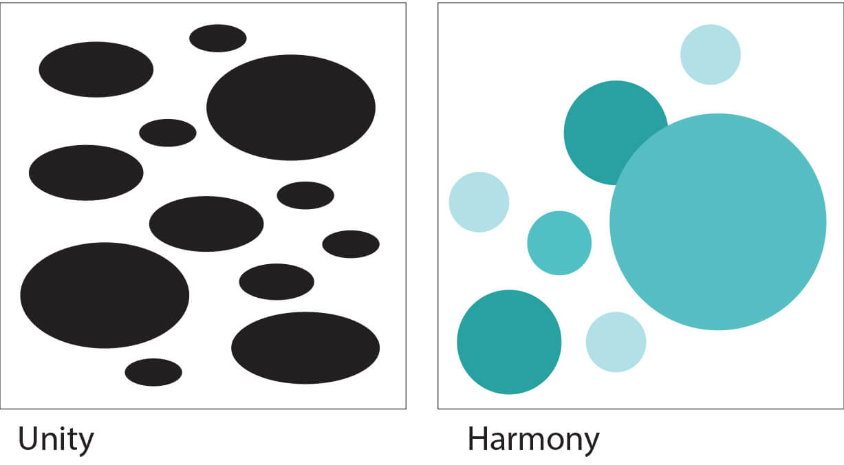
fig 1.1
Harmony is the principle of art that creates cohesiveness by stressing the similarities of separate but related parts.
Harmony enhances unity in a work of art. Specifically, harmony uses the elements of art (colour, line, shape, form, value, space, texture) as a vehicle to create a sense of togetherness amongst otherwise separate parts.
A set of colours that relate according to a specific scheme creates harmony.
Likewise, a uniform texture of brush strokes across the surface of a canvas creates harmony.
Another way to guarantee harmony is to choose compositional components that are similar in shape and contour. For example, a composition that utilizes only curvy shapes will have more harmony than a similar composition that includes both curvy and geometric shapes. The parts of the image below are in harmony because every contour is a curve.
Additional reading:
Idea exploration & description
I have decided to choose harmony as the main focus of my 1st exercise. Mainly because I've been struggling with differentiating harmony and unity since day 1, and these 2 principles had piqued my interest after all the research. While I still think they are similar and in a way, will always coexist and work to complement each other, I decided that harmony will be my focus for this project.
As I start to brainstorm on the piece, I realised that the idea of the piece was heavier on the side of repetition and contrast to the point where I have even considered switching my focus on the other principles instead. However, I have managed to tie everything back to harmony in the end.
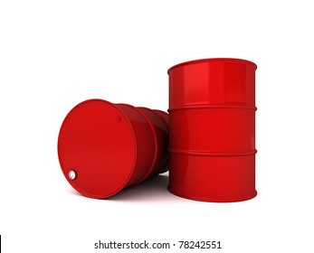
Everything started with a TikTok video I watched of a man hopping across a pool of water on the floating red oil barrels covering its surface. The red barrels instantly stood out from everything else in the video, and I got an idea to fill a blank page with bright red oil barrels. I could implement an element of repetition as well.

As I started looking up pictures of oil barrels, google started suggesting me pictures of red objects. That got me thinking. Wouldn't filling a page with the same object I could practically copy-pasted if I wanted to be pretty boring? So I decided to have a change of course. Instead, I decided to fill the page with the first few red objects that come to mind.
Progress

This was how it went! Was initially planning to do it digitally then decided otherwise. Honestly painting this had been one of the most therapeutic things I've done in a while. The red objects I've settled for are :
- coca-cola can
- youtube logo
- fire hydrant
- lipstick
- strawberry
- Mushroom from Mario
- Chilli
Reference pictures :
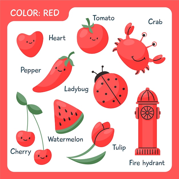
fig 1.3.2 Reference for fire hydrant
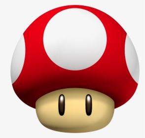
fig 1.3.3 Reference for Mario Mushroom

fig 1.3.4 Reference for coca-cola can

I really liked the clean white background and how the red pops from the page. The colour red that can be seen prominently on every object on the page had shown the element of harmony. However, I still felt like something was missing. I decided to cut them out and put them on a black background instead.
 fig 1.3.6

The red definitely pops out more on a black background and I'm glad I made the choice to cut them out. The thin white border I left made the piece look like a cute aesthetic sticker sheet. Then I decided to be more extra and added in little glitter pieces.
Final Outcome & Short rationale
Red
The glitter that didn't show up on camera well :
Tools:
- watercolour & watercolour paper
- glitter
- black card
Instead of choosing random objects and colouring them red, I decided on objects that are known for being red. I think this gives the piece more identity.
I liked how different red objects tied together and appeared to work in harmony in the piece.
As mentioned above, I have considered switching my focus from harmony to contrast halfway through working on the project. Primarily, I choose red because it was the colour that screams attention. While most lighter colours would fulfil the principle of contrast when placed on a darker background, I liked the vibrant red and how it managed to draw attention from the viewer immediately. I considered going for yellow that had a similar effect but decided that too much yellow on a dark page may come off a bit glaring.
However, while the red does show contrast, I still thought harmony represented the piece better as a whole. It now has a sticker sheet vibe going on and I'm a sticker hoarder. It fits.
Feedback by lecturer
Was unfortunately unable to get separate feedback from Mr Charles as I did make this piece a little late due to scrapping my original idea. However, I have taken notes from some of my peers' feedback who were working on the same design principle as I was.
Mr Charles had mentioned to never be afraid of experimenting with different shapes and textures as harmony could mean tying completely different objects together with their similar elements.
Reflection
I'm glad I scrapped my original idea and went for this one instead. Actually applying the principle of harmony in an artwork had helped me understand more about unity and harmony which I have had my confusion with for a very long time. Truthfully, I don't think I've fully grasped the difference between them still, but hey, one step at a time.
I do think the objects I chose to draw were simple and fit a the cutesy aesthetic I was going for, but I hope I'll be able to try out a similar piece with more detailed and complex objects instead in the near future.
EXERCISE 2
Design Principle selected:
Movement
Visual research

Movement: Movement is the path the viewer's eye takes through the work of art, often to focal areas.
Decided to work with movement for my second piece. After looking up countless examples online, I'm still fascinated by how a supposedly static artwork can create a flow.
Idea exploration & description
The idea started with planets and stars. I always liked doodling starry / galaxy theme art, so I looked more into it.

After some research on galaxy-themed artworks, I decided that I would like to go with a cute and doodly style similar to the image above. I continued to do further research into galaxy-themed doodles to find more inspiration.


Progress
I had decided to try doing my 2nd project digitally. It was a challenge as I was not at all familiar with digital art but ultimately the struggle was worth it.

My first draft. The general idea is having a beaker at the bottom exploding into stars and planets. Still deciding on whether to use dotted wavy lines or smoke.
 fig 2.2.2
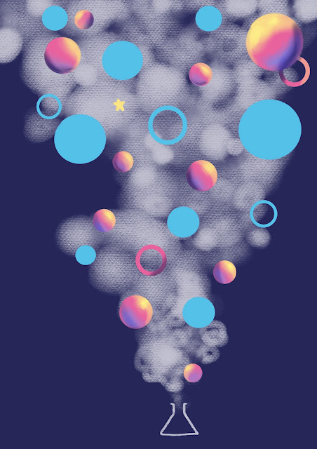
Tried playing with the smoke and planets. Didn't really like how it looked so I consulted Mr Charles. He suggested thinking more about the dynamics of the movement.
After some experimenting, I decided to completely omit the blue planets as they did not stand out the way the pink did and instead cluttered the piece. I also changed the direction of the smoke as well as switched the beaker to a smoking pipe.
Final Outcome & Short rationale
Smoking Dreams
Tools :
Procreate
Short Rationale
This was a completely spontaneous and random piece born from my long time interest in anything galaxy related. When it came to movement, I felt like nothing describes movement more than smoke, that's always drifting. Played with the perspectives to emphasize the flow. I also added sparkles to balance the composition. A textured brush was used for the smoke so it would have a slight contrast with the background and planets. Overall I was going for a magical vibe when painting this!
Feedback by lecturer
Mr Charles had suggested thinking deeper into what implies movement and suggested playing around with more flow / rhythm / pattern / beats. He had also suggested trying different perspective dynamic views.
Reflection
My first attempt at a full completed digital art went better than I thought! All the controls were completely new and I had to go on a Procreate youtube crash course before I could even start with anything but it was worth it in the end. I really appreciate Mr Charles' feedback on the piece as I have never once considered any of the points he rose (and they were really good ones, too!!) . I really liked the change in direction of the smoke compared to my original idea. Though in the end I still felt like the piece looked a bit unpolished. I still have a long way to go!
Lecture 11.1.2022


- In class impromptu drawing sessions based on music played.
- Further dive into the design principles in every artwork shared.
- Feedback session for exercise
In class activity :
A practice to draw something only consisting basic shapes based on the music played.
fig 3.1
Lecturer feedback :
Visible elements of rhythm, movement and balance.
fig 3.2
Lecturer Feedback : Good contrast, movement and rhythm.
Pretty awesome designs! and it does speak a lot about your design solution approaches and your personality!
ReplyDelete