31.1.2022 - 11.2.2022
Contents
SENSE OF PLACE
Instructions
Visual Research
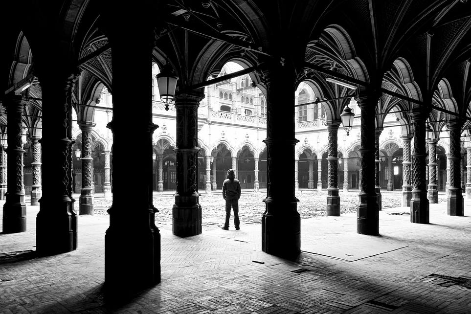
Sense of place refers to the emotive bonds and attachments people develop or experience in particular locations and environments, at scales ranging from the home to the nation. Sense of place is also used to describe the distinctiveness or unique character of particular localities and regions.
 |
| fig 1.1 |
Further reading :
- what is sense of place?
- What is SENSE OF PLACE? What does SENSE OF PLACE mean? SENSE OF PLACE meaning & explanation
Idea Exploration
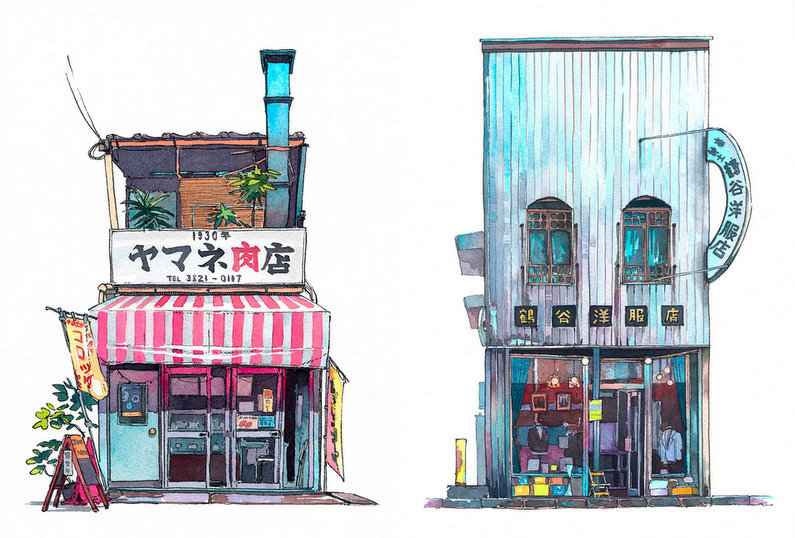
In the beginning, I was planning to draw Japanese shops I've visited during my trip there when I was 16. The artist Mateusz Urbanowicz has done plenty of beautiful works on some of the Tokyo storefronts and I love the ambience and aesthetic of the pieces. I was hoping to look up some unique shops I've visited and try to create one of my own Tokyo storefront piece. I'm a sucker for the details and the overall vibe of Japanese stores. But then I started my Visual research and found out what sense of place actually meant.
 |
| fig 1.2 Tokyo Storefronts by Mateusz Urbanowicz |
So you're saying that sense of place is NOT drawing a scenery and calling it a day?
Oh.
OH.
The groundbreaking discovery has completely thrown my initial idea into the dumpster. So turns out I can't just draw cute and pretty shops that I don't have a good reason to be attached to. Okay. Sad.
Still clinging to my love for Japanese storefront aesthetics, I went back to my travel photos and tried to recall any interesting events that happened.
Suddenly thankful for my clumsy personality, I found a perfect story to tell. And it helps that it just so happen to have taken place at one of the cutest stores I've been to in Harajuku, Japan.
Progress
 |
| fig 2.1 First draft |
Isn't the shop just the absolute cutest? I was a lil' hesitant about going forward with the idea since painting the details might actually kill me, but I was hoping that all the pink will help ease the pain in PAINting ( it didn't).
I was determined to slot in a phone screen somewhere in the picture since it plays a major part in what happened, but I didn't like how the piece looked no matter where & how I positioned the phone.
 |
| fig 2.2 Second draft |
I wanted to bring out the cute and happy atmosphere of the vibrant Harajuku that I loved and I was worried that drawing the specific scene may ruin it. While what had happened wasn't great, it didn't exactly ruin Harajuku for me. If anything, it made my experience there 10 times more memorable. So I decided to keep the piece light and colourful so I don't give the wrong idea to the audience.
I was contemplating whether to draw the aftermath of the incident or the moment before it happened. Decided to go with the latter to fully capture the happy atmosphere since, well, the incident hadn't actually happened yet. But I tried to drop hints that something was coming in the piece.
An update on the phone screen that I seem to care so much about, it's now held by the girl in the picture(aka me but prettier). She's taking a picture of her crepe with her phone.
Progress
I tweaked a couple of details and simplified some aspects of the shop along the way.
References :
 |
| fig 3.1.1 Santa Monica Crepes nighttime view |
 |
| fig 3.1.2 Santa Monica Crepes daytime view taken from Pinterest |
 |
| fig 3.1.3 reference for crepe details |
 |
| fig 3.1.4 more references of crepe details |
 |
| fig 3.1.5 more crepes. they all start to look the same after a while |
 |
| fig 3.2.1 progress shot when I was still optimistic about the idea and hadn't had the slightest clue about the back pain that's coming |
I enjoyed painting the strawberries a lot, so here's a close-up literally nobody asked for.
 |
| fig 3.2.3 wow that sure is a lot of pink |
Well, they haven't been more wrong.
It's me. I'm they.
 |
| fig 3.2.3 pAgnE |
Two days in (minus procrastination) and I am feeling disoriented. Call me insane but working on the detailing of the crepes? The highlight of my day. But they do start to look the same after a while. Or maybe I'm just sleep-deprived.
Either way, I'm done.
Drumroll, please!
Final Outcome
Seconds Before Disaster
Storytime!
So this happened on the final day of my trip. This was pre-covid, so Harajuku was crowded. After getting myself a crepe, I was standing in front of the store trying to take an insta-worthy picture of the crepe when a young boy came walking up to the shop with his mother. I wasn't paying much attention to them since I was busy taking pictures, and before I know it the boy tripped and fell. Onto me.
Naturally, I lost my balance and was trying to grab hold of something, but both of my hands were occupied.
Friends who heard the story would usually think that I dropped my crepe, ruined my outfit, or even dropped the crepe onto the boy, etc.
No, silly.
I dropped my phone.
When I heard the screen crack I could've sworn my heart broke too.
The phone couldn't be switched on at all and I lost my marbles. Bear in mind that this was already the last day of my trip, and there were already thousands of pictures on it, and I don't use any cloud services or an SD card that I could recover my photos from. And I'm in a foreign country, so I kinda also need my phone for communication and navigation buuut MY TRAVEL PHOTOS.
I don't think the boy noticed that I dropped my phone judging by how the crepe was still sitting perfectly in my hand and the streets were noisy and crowded, so they left after apologising briefly.
I was devastated and honestly, I don't remember much from that day or my flight home besides praying that my phone will magically switch on again. It didn't (duh).
I did eventually get my phone fixed when I got home and I LOST ALL MY PHOTOS-- Just kidding everything was fine, but that would probably make a better story. I think died a little inside.
Oh, did I also mention that I lost that said phone at a convention a few months later that same year? Wild.
Here's the picture I was taking right before it all happened. At least I still got a picture of the crepe. But at what cost?
 |
| fig 4 it looks better than it tastes |
Rationale
I think the story speaks enough for why I chose to draw the Santa Monica Crepes shop in Harajuku for my Project 2. I still remember the event vividly. It scarred me.
Even though I was trying to illustrate a story, I didn't want to distract the audience from the crepe shop itself. In fact, I emphasized the crepe signboard so it would be the first thing the audience sees. I exaggerated the colours and changed the background colour to provide more contrast and importance. I wanted the audience to see the shop, then only what was happening in it.
It was also my goal to make this piece appear as bright and happy as possible to portray the moment before everything went downhill and how naive and lost in the moment of happiness I was.
Placement wise, I placed the girl and the boy at opposite ends to signify the beginning and the end. Since my work is titled "Seconds Before Disaster", I wanted the people to look at this bright and colourful seemingly harmless artwork and wonder what could possibly have happened after this? The 'in' and 'out' signs further foreshadows the event that was gonna go down. (the only thing that went down was my phone, though)
All the pink in the piece tied the shop together and gives the shop an identity, in a way. You can tell that the shop ends at the traffic cone as the walls are of a different colour.
Lecturer Feedback
Mr Charles liked the selection of location and its vibrant colours (same, sir. same) but he suggested I create a scene and not just a static location. He suggested that I illustrate and try to bring out my memory of the place so that the audience could look at the piece understand how I felt.
Reflection
I am now in a love-hate relationship with the colour pink.
On a more serious note, this piece was a challenge for me as I have never done a drawing of a particular scene before. I'm talking full background with things happening.
The composition was tricky to grasp but I think I did okay. (minus the shopkeeper guy. NOBODY talks about him or whether he's sitting down or if his legs are just so short, okay?) Definitely something I want to work on more in the future.
I did surprisingly enjoy painting the strawberries and the crepes in general, though! I think food art is something I can explore, too.
Overall, it was fun to revisit the memory and in some way tell it through my artwork too! I learned a lot and I hope I'd be able to do more on this theme in the future.
Okay, time to stress about the final project now.


Comments
Post a Comment