
30/3/2022 - 27/4/2022
Leong Jiahui / 0353469
Bachelor of Design (Honours) in Creative Media
GCD 60104 / TYPOGRAPHY
Task 1: Exercises 1 & 2
LECTURE NOTES
Week 1 (30/3/2022)
Module briefing
Recorded Lecture - Typography Introduction
Typography:
- the style and appearance of printed matter.
- the act of creating letters.
Font: The individual font or weight within the typeface.
Typeface: The entire family of fonts/weights that share similar characteristics/styles.
Recorded Lecture - Development / Timeline
- Early letterform development: Phoenician to Roman.
 |
| Fig 1.1 Evolution from Phoenician Letter |
- Phoenicians wrote from right to left.
- The Greeks developed "boustrophedon", a style of writing that reads from left to right. This has changed the orientation of letter form.
| Fig 1.2 Evolution from Phoenician (1000 B.C.E.) to Greek (900 B.C.E.) to Roman (100 B.C.E.) |
2. Hand scrip from 3rd - 10th-century C.E.
Types of Roman letters that evolved include:
- Square Capitals
- Rustic Capitals
- Cursive
- Uncials
- Half-uncials ( marks the formal beginning of lowercase letters)
- Charlemagne
3. Blackletter to Gutenberg's Type
 |
| fig 1.4 1455: 42 line bible, Johann Gutenberg, Mainz |
With the dissolution of Charlemagne’s empire came regional variations upon Alcuin’s script. In northern Europe, a condense strongly vertical letterform know as Blackletter or textura gained popularity. In the south, a rounder more open hand gained popularity, called ‘rotunda’. The humanistic script in Italy is based on Alcuin’s miniscule
4. Text Type Classification
 |
| fig 1.5 text type classifications |
Week 2 ( 6/4/2022 )
Recorded Lecture - Basics / Text
1.Tracking: Kerning and Letterspacing
Kerning : the automatic adjustment of space between letters.
Letterspacing : to add space between the letters.
 |
| fig 2.1 difference between kerning and letterspacing |
 |
| fig 2.2 normal tracking, loose tracking and tight tracking |
While Uppercase letterforms are drawn to be able to stand on their own, lowercase letterforms require the counter form created between letters to maintain the line of reading.
 |
| fig 2.3 normal tracking & loose tracking for upper and lowercase letters |
 |
| fig 2.4 tight tracking |
2.Formatting Text
- Flush left: This format most closely mirrors the asymmetrical experience of handwriting. Each line starts at the same point but ends wherever the last word on the line ends. Spaces between words are consistent throughout the text, allowing the type to create an even gray value.
- Centered: This format imposes symmetry upon the text, assigning equal value and weight to both ends of any line. It transforms fields of text into shapes, thereby adding a pictorial quality to material that is non-pictorial by nature. Because centered type creates such a strong shape on the page, its important to amend line breaks so that the text does not appear too jagged.
- Flush right: This format places emphasis on the end of a line as opposed to its start. It can be useful in situations (like captions) where the relationship between text and image might be ambiguous without a strong orientation to the right.
- Justified: Like centering, this format imposes a symmetrical shape on the text. It is achieved by expanding or reducing spaces between words and, sometimes, between letters. The resulting openness of lines can occasionally produce ‘rivers’ of white space running vertically through the text. Careful attention to line breaks and hyphenation is required to amend this problem whenever possible.
 |
| fig 2.5 difference between the effectiveness of typeforms in conveying words |
3. Texture
 |
| fig 2.6 anatomy of a typeface |
4. Leading and Line Length
Type size: Text type should be large enough to be read easily at arms length—imagine yourself holding a book in your lap.
Leading: Text that is set too tightly encourages vertical eye movement; a reader can easily lose his or her place. A type that is set too loosely creates striped patterns that distract the reader from the material at hand.
Line Length: Appropriate leading for text is as much a function of the line length as it is a question of type size and leading. Shorter lines require less leading; longer lines more. A good rule of thumb is to keep line length between 55-65 characters. Extremely long or short lines lengths impair reading.
 |
| fig 2.7 examples with Adobe Jenson |
5. Type Specimen Book
- A type specimen book (or ebook for a screen) is to provide an accurate reference for type, type size, type leading, type line length etc.
- The text should create a field that can occupy a page or a screen.
- It is often useful to enlarge type to 400% on the screen to get a clear sense of the relationship between descenders on one line and ascenders on the line below.
fig 2.8 Sample Type Specimen Sheet

Week 3 ( 13/4/2022 )
Recorded Lecture - Text
1. Indicating Paragraphs
- ‘pilcrow’ (¶)
 |
| fig 3.1 example of pilcrow |
- line space (leading*) between the paragraphs
 |
| fig 3.2 example of line space |
- standard indentation (the indent is the same size of the line spacing or the same as the point size of your text.)
 |
| fig 3.3 example of standard indentation |
- extended paragraphs
 |
| fig 3.4 example of extended paragraph |
2. Widows and Orphans
Widow: a short line of type left alone at the end of a column of text
Orphan: a short line of type left alone at the start of new column.
 |
| fig 3.5 Widows and Orphans |
3. Highlighting Texts
 |
| fig 3.6 Highlighting Texts with typefaces |
 |
| fig 3.7 Highlighting Texts with colour |
 |
| fig 3.8 Highlighting Texts with background colour |
When highlighting text by placing a field of colour at the back of the text, maintaining the left reading axis (right example) of the text ensures readability is at its best.
 |
| fig 3.9 Highlighting texts with typographic elements |
4. Headline within Text
A headline emphasizes the level of importance by clearly signifying ti the reader the relative importance within the text and to their relationship to each other.
- A heads
 |
| fig 3.10 A heads |
- B heads
 |
| fig 3.11 B heads |
- C heads
 |
| fig 3.12 C heads |
Putting together a sequence of subheads = hierarchy.
 |
| fig 3.13 hierarchy |
5. Cross Alignment
Cross aligning headlines and captions with text type reinforces the architectural sense of the page—the structure—while articulating the complimentary vertical rhythms.
 |
| fig 3.14 Cross Alignment |
Week 4 ( 20/4/2022 )
Recorded Lecture - Text pt 2
1. Describing Letterforms
 |
| fig 4.1 Letterform cheat sheet |
2. The font
To work successfully with type, you should make sure that you are working with full font and you should know how to use it.
- Uppercase: Capital letters, including certain accented vowels, the c cedilla and n tilde, and the a/e and o/e ligatures.
- Lowercase: Lowercase letters include the same characters as uppercase
- Small Capitals: Uppercase letterforms draw to the x-height of the typeface
- Uppercase Numerals: numerals with the same height as uppercase letters
- Lowercase Numerals: numerals that are set to x-height with ascenders and descenders. They are best used whenever you would use upper and lowercase letterforms.
- Italic
- Punctuation, miscellaneous characters
- Ornaments: Used as flourishes in invitations or certificates
 |
| fig 4.2 Ornaments |
3. Describing Typefaces
 |
| fig 4.3 Describing Typefaces |
4. Comparing Typefaces
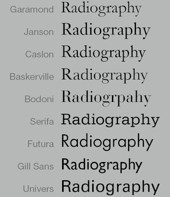 |
| fig 4.4 comparison between 10 most prominent typefaces |
Beyond the gross differences in x-height, the forms display a wealth of variety, in line weight, relative stroke widths and in feeling. For any typographer these feelings connote specific use and expression.
The Rs display a range of attitudes, some whimsical, some stately, some mechanical, others calligraphic some harmonious and some awkward.
 |
| fig 4.5 Comparing Typefaces |
Recorded Lecture - Understanding
1. Understanding Letterforms
The complexity of each individual letterform is neatly demonstrated by examining the lowercase ‘a’ of two seemingly similar sans-serif typefaces—Helvetica and Univers. A comparison of how the stems of the letterforms finish and how the bowls meet the stems quickly reveals the palpable difference in character between the two.
 |
| fig 5.1 comparison between letterforms |
2. Maintaining x-height
The x-height generally describes the size of the lowercase letterforms. However, you should keep in mind that curved strokes, such as in ‘s’, must rise above the median (or sink below the baseline) in order to appear to be the same size as the vertical and horizontal strokes they adjoin.
 |
| fig 5.2 maintaining x-height |
3. Form/ Counterform
One of the most rewarding way to understand the form and counter of a letter is to examine them in close detail.Its worth noting here that the sense of the ‘S’ holds at each stage of enlargement, while the ‘g’ tends to loose its identity, as individual elements are examined without the context of the entire letterform.
 |
| fig 5.3 Form/Counterform |
4. Contrast
 |
| fig 5.4 Contrast in Typography |
Recorded Lecture - Screen & Print
1. Typography in Different Medium
Print Type
- designed intended for a smooth and pleasant reading experience, and is readable even with a small font size.
- Good typeface examples: print-Caslon, Garamond, Baskerville
 |
| fig 6.1 Print Type |
Screen Type
- optimized and often modified to enhance readability and performance onscreen in a variety of digital environments.
- This can include a taller x-height (or reduced ascenders and descenders), wider letterforms, more open counters, heavier thin strokes and serifs, reduced stroke contrast, as well as modified curves and angles for some designs
- more open spacing to improve character recognition and overall readability
- Hyperactive Link/ hyperlink:a word, phrase, or image that you can click on to jump to a new document or a new section within the current document
- Font Sizes are typically set at about 10 points. If you were to read them at arm’s length, you’d want at least 12 points, which is about the same size as 16 pixels on most screens
- System Fonts for Screen/ Web Safe Fonts: pre-installed font selection
 |
| fig 6.2 comparison between font sizes of screen (left) and print (right) type |
 |
| fig 6.3 Pixel Differential between devices |
2. Static vs Motion
Static typography: has minimal characteristic in expressing words. Traditional characteristics such as bold and italic offer only a fraction of the expressive potential of dynamic properties.
 |
| fig 6.4 static medium |
Motion Typography: Temporal media offer typographers opportunities to “dramatize” type, for letterforms to become “fluid” and “kinetic”. Type is often overlaid onto music videos and advertisements, often set in motion following the rhythm of a soundtrack
 |
| fig 6.5 Motion Typography |
EXERCISE 1: Type Expression
Instructions
Our first task is to create typography from the following list of words :
- Cough (mandatory)
- Squeeze
- Pop
- Explode
- Grow
- Wink
The ones I selected are highlighted in yellow.
PROCESS
WEEK 2 (6/4/2022)
SKETCHES
 |
| fig 7.1 Sketches for Cough (3/4/2022) |
For #4, I'm trying to create vibrations. I also played with a different composition which I surprisingly liked more.
for #5, I played with bold letters, to emphasise the LOUDNESS of coughs. I thought about adding ! marks in the background. Will try it out during digitalisation.
#7 is a personal favourite. Fun fact, I actually got covid when working on this exercise, so I was literally coughing while sketching these up. The repeated coughs inspired this design, where the bolded words represent louder coughs while unbolded ones are normal. It's simple and I think conveys the message well.
Will try to merge some ideas and explore more alternatives during digitalisation.
 |
| fig 7.2 sketches for squeeze (3/4/2022) |
My sketches for Squeeze are generally not very innovative, but I think still conveys the message well.
#1 squeezes all letters together.
#2 squeezes the 2 Es together
#3 has the letters S and E larger on the side and squeezes the letters in between. Perhaps bolding both letters would make a greater effect.
#4 has the front letters squeezing into the letters Z
 |
| fig 7.3 sketches for pop (3/4/2022) |
Ideas #1, #2 and #4 generally work on the same concept - the 'O' popping off.
Idea #3 is inspired by musical notes. It needs to be polished up.
 |
| fig 7.4 sketches for grow (3/4/2022) |
Ideas #1 is a simple one with R and W larger than the other letters
Ideas #3 and #6 are generally the letters growing bigger from 'g'. Will play around will lowercase & uppercase letters when digitalising
Idea#2 was a little more ambitious but ended up not working very well. The idea was to have the letter R acting as a watering can and the O grows. Perhaps I could work on it more.
Idea #5 was basically a shadow of the word with the O growing out. Doesn't convey the message well, though.
 |
| fig 7.5 unused sketches for wink |
 |
| fig 7.6 unused sketches for explode |
DIGITALISATION
Before I begin, I watched Mr Vinod's Type Expression videos to better understand how the process works.


fig 7.7 & 7.8 Watching tutorials and testing out Illustrator
Cough
 |
| fig 7.9 Digitalisation sketches for 'cough' (12/4/2022) |
Pop
 |
| fig 7.10 Digitalisation sketches for 'pop' (12/4/2022) |
Grow
 |
| fig 7.11 Digitalisation sketch for 'grow' (12/4/2022) |
Squeeze
 |
| fig 7.12 Digitalisation sketch for 'squeeze' (12/4/2022) |
Final Type Expression
 |
| fig 7.13 Final Type Expression (13/4/2022) |
These are the final type expressions I went with. My favourites are probably cough and pop. Now onto the animations.
My first attempt at animating 'cough' looked messy. Feeling a bit discouraged that what I had in mind didn't quite translate in the work, I decided to try out another word to explore a bit more what I want to do.
Wow. I think I might be hopelessly bad at this. I chose 'pop' for my 2nd attempt as it is actually my favourite one out of the four that I did. I liked how the lines moved, but the animation didn't quite express the word at all. The animation for the letters seemed rigid too.
After a few more failed attempts at animating pop, I decided to go back and try my luck with 'cough'. Though not obvious, I did cut down on the number of frames for this one compared to the 1st attempt. Still messy, but I am starting to have an idea of how I wanted to do this.
I think we might have a winner. BUT I think it moved a bit too quickly.
After looking up 'coughing sound effects' on Youtube, I slowed it down by a couple of frames to match with the coughing rhythm (what) and am starting to like what I see (finally) But I have one last idea I wanna try out.
My final gif ended up having 20 frames, for what I hope is a pass-able result.
FINAL OUTCOME - EXERCISE 1
Week 3 (13/4/2022)
Animation
I chose the word 'cough' because I already have a rough idea of how I wanted to convey the words through animation. I wanted my animation to portray strong repeated coughs by showing the motion of letters coming forward.
1st attempt
 |
| fig 7.13 Cough gif 1st attempt (13/4/2022) |
2nd attempt
 |
| fig 7.14 Pop gif first attempt (17/4/2022) |
Back to square one, I decided to give cough another go.
3rd attempt
 |
| fig 7.15 Cough gif second attempt (17/4/2022) |
4th attempt
 |
| fig 7.16 Cough gif third attempt (18/4/2022) |
I think we might have a winner. BUT I think it moved a bit too quickly.
5th attempt
 |
| fig 7.17 cough gif fourth attempt (19/4/2022) |
6th & 7th attempt
 |
| fig 7.18 cough gif fifth attempt (19/4/2022) |
 |
| fig 7.19 Cough animation final outcome (23/4/2022) |
I tilted both fonts this time. It does look more dynamic, and I like how it looked overall. I feel like the animation still looked a lil choppy, so I'll polish it up for the final submission.
| fig 7.20 Cough gif animation progress (25/4/2022) |
FINAL OUTCOME - EXERCISE 1
1.Type Expression
 |
| fig 7.21 Final Type Expression (13/4/2022) |
2. Animation
 |
| fig 7.22 Cough final gif (25/4/2022) |
Exercise 2: Text Formatting
Instructions
 |
| fig 8.1 Exercise 2 Instructions |
PROCESS
WEEK 4 (20/4/2022)
For Exercise 2, we are to create one final layout addressing different areas of text formatting, such as kerning, leading, paragraph spacing, alignment, etc. This exercise will help us practice and develop our skills in spatial arrangement and information hierarchy. We are to use Adobe InDesign for this exercise.
To start off, I've watched Mr Vinod's video on text formatting to better understand the task at hand.
It was an interesting process to be able to see the differences between the type expressions as well as their fonts. Some may appear similar to one another at first glance but actually have different details upon inspecting them closely.
Upon exporting it and looking at them from afar, I realised that the letter 'i' at the end seemed generally more distant from the rest of the word for a few fonts. So I decided to give it another try.
 |
| fig 8.2 Tutorial video on text formatting |
 |
| fig 8.3 Kerning and Tracking process (20/4/2022) |
| fig 8.4 Kerning & Tracking 1st attempt(20/4/2022) |
| fig 8.5 Kerning & Tracking 2nd attempt (22/4/2022) |
I've shifted the 'i's a bit closer and adjusted a couple more letters accordingly. Overall I liked this version better.
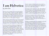
Next, we are to format the article "I am Helvetica" by John Doe. After watching the rest of the text formatting lecture videos, I made some notes referencing a senior's blog post (https://trxssah.blogspot.com/2021/03/blog-post.html) because my poor mind could not compute.
Notes:
- Leading: +2 points of point size / +2.5 or +3 depending on the typeface. Typefaces have different x-height thus may extend over the baseline grid.
- Body text: Negative and positive space has to be equal (middle gray value).
- Font size - 8-12pts
- Line length: 55 - 65 (body text), 35 (subtext).
- Headings: Double point size and leading of body text.
- Paragraph spacing same as leading.
- Keep text width the same for the same text of information.
- Try not to exceed +3/-3 for tracking to reduce ragging (line).
- Turn off hyphenation. If turning on hyphenation, ensure there are not too many else tracking adjustments must be made.
- Either use left align or left justify. Though left alignment is preferred.
- When using justify, more kerning and tracking need to be done to ensure there aren't many rivers (large awkward spaces between the words).
- Maintain cross alignment with grids
- Avoid widows and orphans.
VISUAL RESEARCH
Type formatting shouldn't be hard, I thought, but when I started I realise it was not as simple as I hoped. I resorted to looking up some sample article formatting examples online.
 |
| fig 8.6 Text formatting example 1 |
 |
| fig 8.7 Text formatting example 2 |
 |
| fig 8.8 Text formatting example 3 |
 |
| fig 8.9 Text formatting example 4 |
TEXT FORMATTING PROCESS
 |
| fig 8.6 Text formatting progress (22/4/2022) |

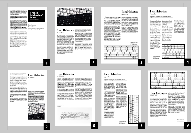 |
| fig 8.9 Text formatting progress (25/4/2022) |
Layout details:
Fonts:
- Adobe Caslon Pro (Semibold, Semibold Itallic, Bold Itallic, Bold)
- Bembo Std (Semibold, Itallic, Extra bold itallic)
Point size: 10 pt, 11pt, 12pt (body text & captions), 40pt, 20pt (heading), 20pt (subheading)
Leading: 11 pt (body text), 44 pt (heading)
Line length: 54-60 (layout #1, #2, #4, #5),49 (layout #3, #8), 31 (layout #6, #7)
Alignment: Left align
Paragraph spacing: 11pt
My personal favourites are #2, #3 and #5.
Update 26/4/22. The moment I realised I used forced line breaks instead of paragraph spacing when I was checking my work one last time before class tomorrow. I think I wilted a little. I'll have to redo my final ones.
 | ||
fig 8.10 Layout 1 (26/4/2022)
|

After the feedback session, I have apparently made mistakes on the leading as well as the drop cap. I've made further adjustments to my initial layout.
FINAL OUTCOME - Exercise 2
 |
| fig 8.12 Text Formatting Final Outcome (27/4/2022) |
Font:Bembo Std
Typeface: Bold, Bold Itallic, Extra Bold Itallic, Semibold, Itallic
Font size : 60 pt (heading), 17pt (sub-heading),10pt (body text & caption)
Leading: 62pt, 19pt, 12pt
Paragraph Spacing: 12pt
Average characters per line : 55 - 64
Alignment: Left
Margins : 12.7mm (top, left, right), 12.7mm (bottom)
Columns : 4
Gutter: 5mm
Mr Vinod had given some feedback on my sketches, telling me which is more feasible and conveys the message better than others. He also mentioned some steps on how to digitalise certain words on Adobe Illustrator.
WEEK 3 (13/4/2022)
Mr Vinod suggested trying to rotate letters to give a better effect of motion. He also advised being careful not to distort the letters, especially when it does not serve a good purpose.
WEEK 4 (20/4/2022)
For blogs, try not to use unnecessary paragraphs. Always add the dates of the pictures uploaded. Try to keep the progress photos smaller than the final to provide some visual hierarchy.
Week 5 (27/4/2022)
Pay attention to the e-portfolio formatting. Avoid placing the header in the middle. Align everything from the left instead. Make sure images are exported in 300dpi. Place the final outcome in one section and make sure both pdf and jpeg are available. Explore drop caps and change leading to at least 2pts bigger than the point size.
REFLECTION
Experience
Experience
Doing the lecture notes with blogger glitching every other time I try to import an image causes me physical pain.
Having to create our type expression and having to keep the graphical elements at a minimum stresses me out. Having been assigned the same words as the rest of the class, I was worried that my design will appear similar or less unique, which okay, it was, but facing that reality actually gave me inspiration and motivation instead of stress, so I don't know what past me was worried about.
Adobe Illustrator was intimidating but the lecture videos were very helpful in navigating the software and getting what I needed to do done. I had some hiccups here and there while digitalising where I accidentally pressed something wrong and everything was just GONE, and I had to panic search on google.
Animation took longer than expected, which was exhausting.
Text formatting...TEXT FORMATTING. Alignment can go burn in hell. It was uhm, an interesting experience that tested my patience way more than it was supposed to.
My overall experience sounded like a rant, but I'm actually very glad that I managed to learn so much in the course of 4 weeks.
Okay, I lied. I'm way more glad that I'm finally done with the task. Excited for the next one please be kind to my sleep schedule 🤞🏻🤞🏻🤞🏻
Observations
It was cool to study the different fonts in detail. They look so alike at first glance but actually have pretty distinctive features a. It's also fun to see how design principles are implemented into type.
Findings
It is important to look at your work from a distance. It can help us see mistakes we might otherwise have missed. I have also experienced how important feedback is to my work. The feedback I receive from an unsuspecting individuals always helps most as they have no idea what I'm doing and are just honest with what they see.
FURTHER READING
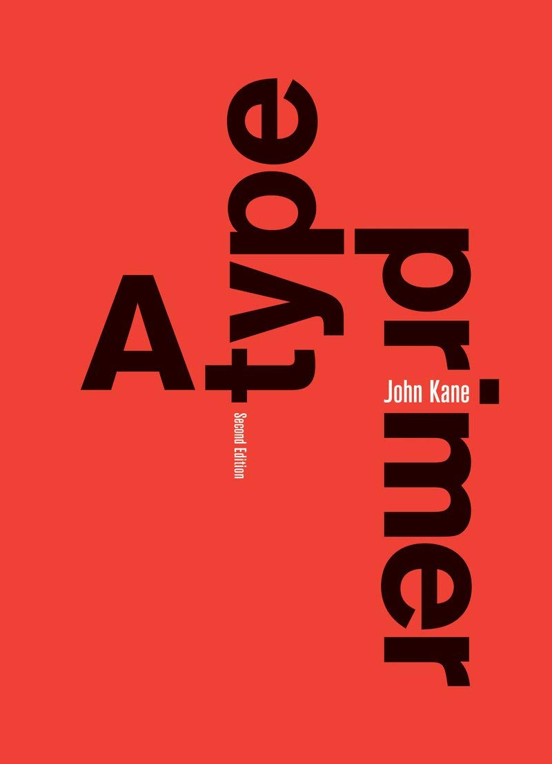 |
| fig 9.1 A Type Primer 2nd edition (2011) |
Based on the list of books recommended by Mr Vinod, I have decided to do some further reading on A Type Primer by John Kane.
5/4/2022
'Is this right?' when in fact there is no such thing in typography as 'right'. The question they should be asking themselves is, 'Does it work?'
The book started off by introducing the basics of typography like types of spacing as well as the technical terms of the specific parts of type forms. I got to learn the names of them, like stroke, apex/vortex, arm, ascender, barb, beak, bowl, crossbar, ear, cross stroke and more.
 |
| fig 9.2 Letter anatomy |
 |
| fig 9.3 uppercase and lowercase numerals |
Letters, words, sentences
1. Understanding letterforms


It is important to study the composition of letters and the space it takes up as well as how it is received by the viewer. From the grids, we can see that the letter A (fig x) that appears to be symmetrical turns out to be not that symmetrical after all.
2. Maintaining x height
 |
| fig 9.6 maintaining the x-height |
The x-height is generally used to describe the size of lowercase letters. Curved strokes must rise above the median (or sink below the baseline) to appear to be the same size as the vertical and horizontal strokes they adjoin.
3. Form/counter form
Comments
Post a Comment