
Leong Jiahui
0353469
Bachelor of Design (Honours) in Creative Media
COM61304102929-M / Illustration and Visual Narrative
Content
Week 1 (1/4/2022)
Ms Anis gave us a module briefing and Mr Hafiz ran us through some adobe illustrator basics as well as the bezier's game. They seem pretty chill. I like them already.
LECTURE REPORT
WEEK 2 (8/4/2022)
Instructions:
- For your study, find one animated cartoon/ anime character.
- Write a short report (min 300 words) about how the character elements work in relation to their personality and story in the media.
- You can re-use back points identified in the slides to help you write your report.
- Post your report into you blog as your weekly entry.
Character selected : MARIO
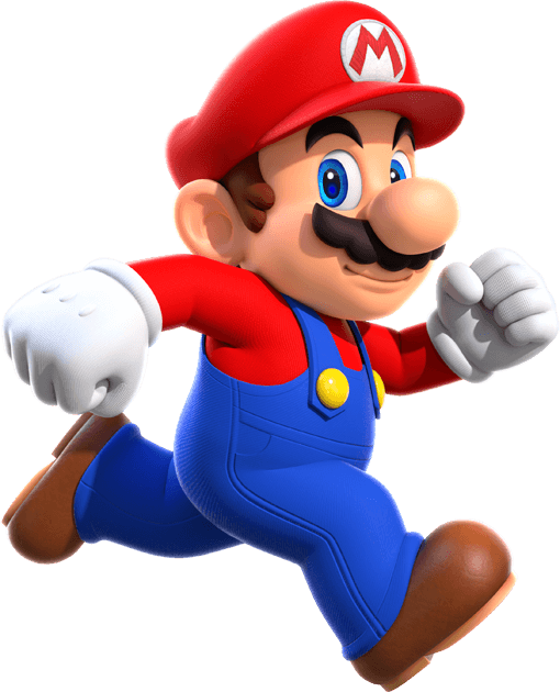 |
| Fig 1.1 Mario from video game series Super Mario |
Mario one of the many iconic characters by Nintendo and in fact was so iconic he was the mascot for the massive company.
In terms of design, he covers all 3 basic points of character design - iconic, simplicity and unique.
To start off, he is the main protagonist of the game, so his colour scheme consists of bright, primary contrasting colours - red and blue. While his main colour scheme is arguable red, the blue in his attire still stands out enough to represent the character. He is the only character in the series that has 2 main contrasting colours going on, compared to the rest of the main cast ( Luigi-green, Princess Peach-pink, Daisy-Yellow, Yoshi-green etc) His colour scheme also stands out from the background of the game, especially in the earlier games, where the game is mainly in 2d and the background mostly consists of duller or contrasting colours. Can't say the same about more recent instalments though. When I played 3D world sometimes the stages get so chaotic I couldn't even see my man Mario.
 |
| fig 1.2 Mario silhouette |
In terms of silhouette, he is also easily recognisable thanks to his extended nose and his unique movements, especially his dynamic jumping pose.
Mario's simple designs are also why he was so memorable. With his simple overalls, you could easily tell that he's a plumber, despite all the princess-saving and ass-kicking he's been doing on the side. And I think that's important and very impressive that just by looking at his outfit alone, we get reminded that he'll always be a tiny Italian plumber at its core.
In terms of uniqueness, I think the hat with his initial M plays an important role in making his character recognisable by many. One look at the hat and you know it's Mario's. It works wonders. His moustache is simple yet unique at the same time too. While one may argue that he doesn't look all that impressive with all the flashy new characters emerging over the past decade, but Mario was actually created in 1983 and sometimes, being a smol Italian man simply isn't much. But being the FIRST famous one though? The impact stays.
Going off tangent to talk about his voice actor for a bit. His voice is unique and instantly recognisable. While that wasn't a visual factor, it complements the character's identity well (being a small peppy Italian man, that is) and plays a very important role in giving a good character design their identity.
With all the factors combined, do you still find it surprising how a 5ft Italian plumber went from rescuing princesses to being a gaming sensation and now, having his own theme park?
WEEK 3 (15/4/2022)
Lecture Report 2 - Chiaroscuro
Instructions:
 |
| fig 1.3 Instructions for lecture report 2 |
Visual Study
The scene chosen is a scene from the movie Tangled by Disney. It is a dark scene despite the upbeat musical number where Rupunzel's mother Gothel is manipulating and guilt-triping her daughter to stay trapped in the tower.
 |
| fig 1.4 Lecture report 2 |
This scene fully encompasses the Chiarosuro effect where the background is in complete contrast from the two characters focused in the foreground. Being a complete pitch black background, it increases the dramatic tension between the two characters, and emphasises both Gothel's point of how deadly the outside world is and Rupunzel's conflicting feelings between listening to her mother or her heart.
It also manages to create sensational effect where it gives immediate focus to the two characters, especially to their contrasting facial expressions, which were the most illuminated by the light source.
The light source also helps create visual hierarchy. The light source shines from above, which we can determine based on the shadows of the characters and how the upper part of the characters (faces, hair and top surfaces of clothing) is brighter than the lower half of the characters. As the viewer, we will also naturally move our focus from top to bottom, following the direction of the light.
Finally, the chiaroscuro effect in the scene had also provided good amounts of negative space to build a tasteful composition.
Side stepping from the lighting, the character's outfits also helped distinguish the good and evil side, or perhaps the strong and the weak. Gothel's posed is poised and confident while rupunzel's is slouched and her facial expressions are in distress. Gothel's dress is in bloody red (red flags red flags) while rupunzel's is in innocent pastel pink. Their overall colour scheme factors in as well, where Rupuzel's is brighter than Gothel's. These details further distinguishes the two sides where both the characters in the spotlight stands.
Overall the scene was an impactful one where it highlights Rupunzel's emotional turmoil between listening to her mother or her heart, which played hand in her major decision to disobey her mother and escape from the tower later in the movie.
Overall the scene was an impactful one where it highlights Rupunzel's emotional turmoil between listening to her mother or her heart, which played hand in her major decision to disobey her mother and escape from the tower later in the movie.
WEEK 4 (22/4/2022)
Lecture Report 3 - Visual Types and Shots
 |
| fig 1.5 Lecture Report 3 |
The MV I'll be using is Taylor Swift's Blank Space.
1. Establishing
 |
| fig 1.6 establishing visual study |
2. Bird's Eyeview
 |
| fig 1.8 Bird's eyeview visual study |
3. Frame Within a Frame
 |
| fig 1.9 Frame within a frame visual study |
4. Medium Shot
 |
| fig 1.11 Medium shot visual study 1 |
 |
| fig 1.12 medium shot visual study 2 |
5. Close-up
 |
| fig 1.13 close-up visual study |
6. Worm's Eyeview
In this scene, we get a worm's eye view shot of Taylor running in her floral dress. This shot allows a better view of the full dress as well as the sky. The bright white and flowers of the dress signify a happy moment, and yet we can see dark clouds forming in the sky signifying that a storm is coming. This shot gives us a clear message that the happy moments are coming to an end.
 |
| fig 1.14 worm's eyeview visual study 1 |
 |
| fig 1.15 worm's eyeview visual study 2 |
Lecture Report 4 - Foreground, Middle-ground, Background
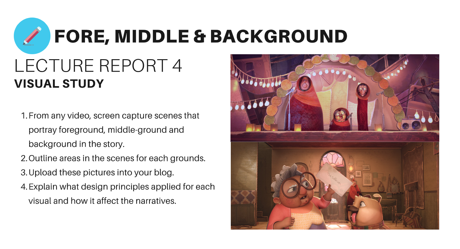
1. Foreground
In this shot, the woman and the dog are clearly in the foreground and are the focus of the scene. With the letter positioned between the woman and the dog, it creates a flow for the viewer.
2. Middle ground |
| fig 1.16 Foreground |
 |
| fig 1.17 middle ground |
 |
| fig 1.18 Background |
Project 1 - Vormator Challenge
Instructions
Progress
WEEK 2 (8/4/2022)Mr Hafiz ran us through the basics of Adobe Illustrator and taught us how to trace the Vormator shapes. The satisfaction of being to do it is on another level. Though it was only the beginning.
 |
| Fig 2.1 Tracing Vormator Shapes (8/4/2022) |
SKETCHING
 |
| fig 2.2 Character sketches (15/4/2022) |
Being the very biased cat person I am, I went with the first cat design. I liked the deer design too, but maybe next time, sorry deer.
DIGIALISATION
 |
| fig 2.3 Digitalisation in confusion (15/4/22) |
 |
| fig 2.4 What in the world (16/4/2022) |
WEEK 4 (22/4/2022)
 |
| fig 2.5 Vormator mock-up 1 (15/4/2022) |
 |
| fig 2.6 Vormator mock-up 1 final (20/4/2022) |
 |
| fig 2.7 sakura process ( 28/4/2022) |
 |
| fig 2.8 Vormator Challenge Final 1 (28/4/2022) |
So in line with her story, I've decided to give her a wand. Was debating whether I should give her an onusa or a suzu (both are Japanese temple wands used in traditional rituals) , when we all know I'll just go for the one that's easier to make.
 |
| fig 2.9 onusa wand reference (28/4/2022) |
 |
| fig 2.9 wand progress (28/4/2022) |
 |
| fig 2.10 wand progress (28/4/2022) |
 |
| fig 2.11 Vormator Challenge Final Outcome (28/4/2022) |
 |
| fig 2.12 Vormator Challenge outline (29/4/2022) |
WEEK 5 (29/4/2022)
Visual Research
Not quite sure where to begin, I looked up some card designs to get inspiration. I'm leaning towards a pastel cutesy cardcaptor sakura aesthetic style for the card, but we'll see how it turns out.
 |
| fig 2.12 visual research - Cardcaptor sakura |
 |
| fig 2.13 Visual research - @jianrou on IG |
 |
| fig 2.14 card progress (29/4/2022) |
 |
| fig 2.15 sparkle progress (29/4/2022) |
 |
| fig 2.16 Star colour comparison (29/4/2022) |
 |
| fig 2.17 Card variations (29/4/2022) |
5 stars on top because if this were a video game Mimi would be a 5 star character hands-down. Tried out a couple of variations with the positioning and the elements used in the cards.
Final Outcome
 |
| fig 3.1 Mimi Final Outcome (30/4/2022) |
 |
| fig 3.2 Mimi Card Final Outcome (30/4/2022) |
Character Backstory
Meet Hanami, more commonly known as Mimi, the guardian of cherry blossoms!
With the sakura representing a time of renewal and optimism as well as the beginning of spring, Mimi is always spotted smiling, spreading positivity and well wishes to the people to embrace the new season with joy.
Legend has it that if you look hard enough, you may be able to spot her hiding among the sakura trees when they are in full bloom. Smile back at her, and you will be blessed with prosperity and joy for the rest of the year.
**Disclaimer: The Hanami Festival is VERY real, but Mimi is VERY not.
Feedback
WEEK 3 (15/4/22)
Ms Anis liked the cat more too (I have acquired a fellow comrade). She gave me some tips on where to start with putting together the Vormator elements to create my character.
WEEK 4 (22/4/22)
Try to experiment with different shapes and not just stick with a few. Think of a colour palette that complements each other. Pinterest helps. It is okay to come up with a colour palette even before the character is done.
Reflection
5 weeks in and I am officially sick of these shapes, and I hope I never have to see them again.
Anyways.
What a ride! I have never imagined that these 9 shapes can possibly create...anything really, and to be thrown into this challenge as the first task of the course?? The digital art dummy in me is too stunned to speak.
The lectures, tutorials AND lecturers had been super helpful throughout the course of the task! I ended up having a lot of fun throughout the challenge and learned a lot abot Illustrator. Those panic googling sessions are worth it.
Since I'm practically a baby at digital art, I won't be too hard on myself but there is plenty of room for improvement. My colour choice is weak, especially on the trading card part. Everything ended up looking chalky and unpolished in the end. It would be good to explore more in colour study to improve my future works.
Character design-wise I actually found my work very simple-looking, but she's always smiling and that makes me smile back at her while working. Looking at & working on her makes me happy, and I think that is a win regardless.
Overall I'd say this was an interesting task to start off the course with, and I'm already excited to start the next one! IVN is my favourite course so far <3
I should also finally go watch that 45minute Illustrator tutorial video now.
Comments
Post a Comment