Week 6 - Week 74/5/2022 - 11/5/2022
Leong Jiahui / 0353469
Bachelor of Design (Honours) in Creative Media
GCD 60104 / TYPOGRAPHY
Task 2: Typographic Exploration & Communication
Content
Task 2: Typographic Exploration & Communication
Task 2: Typographic Exploration & Communication
Instructions
PROCESS
WEEK 6 (4/5/2022)
In this project, we are required to basically combine the skills we've learned in Task 1.
 |
| fig 1.1 Text length comparison (4/5/2022) |
First, I placed all 3 text options into the spreads to get a brief estimation of approximately how much space each will take up. The font & typeface I used was Bembo Std ( Semibold ) and the font size is 11pt. No proper tracking and kerning have been done yet, so the final result may differ.
Visual Research
 |
| fig 1.2 Code visual research |
When I came upon this picture, I thought it was very simple yet very fitting. It would probably be fun to venture and see what I can do with it. Something more elaborate, like <code/> or something.
SKETCHING
 |
| fig 1.3 Title sketches (5/5/2022) |
My first sketch (top left) is inspired by the binary code where I emphasized the downward strokes and made them look like 1s and 0s. The sketch below the line is a more refined version of the same idea.
Another random idea on the top right is making the Os into footsteps. I've tried using the Ls too but didn't like it as much.
 |
| fig 1.4 Layout sketches (5/5/2022) |
DIGITALISATION
 |
| fig 1.5 Title digitalisation progress (6/5/2022) |
After reading the text, I found out it hadn't got anything to do with actual coding, so my title mirroring the binary code wouldn't actually make sense, and neither would me making 'code' into <code/>, which is such a shame because I was pretty hyped with the idea.
Back to square one, I decided to try out some other ideas. I'm unsure whether the ideas contain too many graphical elements.
 |
| fig 1.6 Title digitalisation sketches progress (7/5/2022) |
 |
| fig 1.7 More title digitalisation sketches (8/5/2022) |
Figuring I should start doing the layouts instead cause I would probably never be contempt with any of the title designs I made, no matter how many I make. Hopefully, more ideas will flow in once I start with the layouts.
 |
| fig 1.8 Layout progress (8/5/2022) |
After getting some feedback from my sister, she pointed out that my title was not obvious enough and that she had seen "ODE" instead of anything else. Which was sad because I actually liked the design, but I guess it didn't deliver as much as I hoped it would. So I decided to try rearranging it.
 |
| fig 1.9 Title designing progress (8/5/2022) |
In these ones, the Code is more visible now, but "follow the" was not. I decided to make some layouts with it anyway to try out.
 |
| fig 1.10 Layout progress 2 (8/5/2022) |
The passage I've chosen was the longest one of the three. That meant less negative space to play around with, AND more tracking to be done. (what was I thinking?) This is what happens when you make stupid decisions - you'll have to sit through them till the end. However, (a bit off-topic) the passage did talk about the ethics artists should adhere to and was pretty interesting. After unconsciously reading the passage over and over again when doing the tracking, I know better than anyone not to design filtering UI for Walmart online gun shops (iykyk)
 |
| fig 1.11 Title progress mess (9/5/2022) |
Didn't know what had gotten into me when I decided to hell with creating artboards and started working outside of them. I mean, it gets the work done, but I should've been more organised. Now I can't find the title I wanted.
 |
| fig 1.12 Layout overview (10/5/2022) |
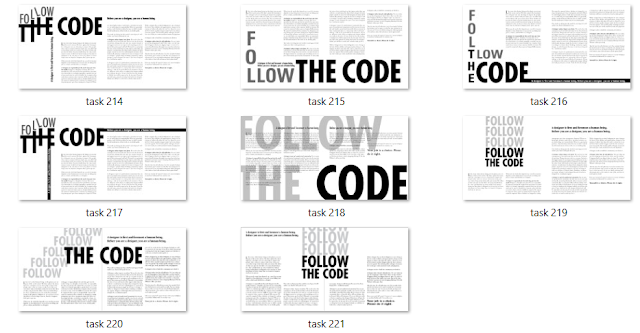
I've made a total of 12 different versions. Some share the same layout with the only title switched. Here are a few that I liked better.
Shortlisted layouts:
 |
| fig 1.13 layout 1 (10/5/2022) |
 |
| fig 1.14 layout 2 (10/5/2022) |
 |
| fig 1.15 layout 3 (10/5/2022) |
 |
| fig 1.16 layout 4 (10/5/2022) |
WEEK 7 (11/5/2022)
After the feedback session, apparently having the heading mimic elements of coding was completely fine. It still felt a little out of context, but perhaps I will go back to my first idea and try making a headline with that in mind.
It was also mentioned to avoid using condensed typefaces for body text, so basically, I need to re-do most parts. How exciting.
 |
| fig 1.17 layout 5 (11/5/2022) |
Newly edited layout entry 1. I changed the columns from 3 to 2. The line length was in the range of 55-65 now. I stretched the title further from the beginning to the end.
 |
| fig 1.18 New layout overview (13/5/2022) |
Bam. More of them. I am leaning more towards 19-21. They're simple but they work. I think.
Shortlisted layouts (round 2):
 |
| fig 1.19 layout 6 (13/5/2022) |
 |
| fig 1.20 layout 7 (13/5/2022) |
Layout 6 is a personal favourite. However, some of my friends do like layout 7 more, and I liked the aspect where the word 'follow' flows towards the beginning of the text, indicating where the reader was supposed to start reading.
To provide more contrast and depth, I decided to make other variations as well as change up the colour of "follow".
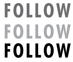 |
| fig 1.21 "Follow" colour variation (13/5/2022) |
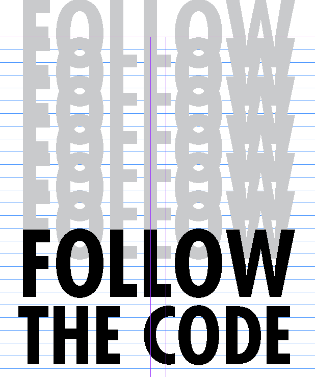 |
| fig 1.22 "Follow" alternate arrangement (13/5/2022) |
FINAL OUTCOME
 |
| fig 2.1 Final layout (13/5/2022) |
Font: Bembo Std (body text), Futera Std (Title), ITC Garamond Std (Sub-heading)
Typeface: Gill Sans MT regular & bold italic (body text), Futera Std bold condensed (Title), ITC Garamond Std bold narrow(Sub-heading)
Font size: 10pt (body text), 20pt (sub-heading)
Leading: 12pt
Paragraph Spacing: 12pt
Average characters per line: 50 - 60
Alignment: Left Align
Margins: 12.7mm (top, bottom, left, right)
Columns: 2 (per page)
Gutter (for columns): 5mm
FEEDBACK
Week 7 (11/5/2022)
General feedback: Take note of the point of alignment as well as the negative space. Make sure the heading represents the words. A different font type can be used for emphasis. Avoid using the condensed typefaces for body text.
Specific feedback: line length too short. When using 3 columns, the line length should be at least 35+-. More work needs to be done in formatting.
REFLECTION
Experience
0/10, terrible do not recommend.
Just kidding, that was my frustration talking (or is it?). This task had been an emotional rollercoaster. One moment I'm having a blast designing and the next I'm finding out that my designs don't work. I want to say that my type formatting has improved after all the training but honestly, I'm not that confident. I'll say it till I believe it. Overall my feelings are pretty mixed about the task, but I'm happy with my progression & exploration throughout this short amount of time and pretty satisfied with the final outcome, and that's all that matters. Baby steps, guys. Baby steps.
Observations
Effectively using negative space in a layout is important. I'm amazed to see how much it factors into a good layout
Findings
Don't ever pick the longest passage again.
Simple layouts work just as effectively as fancy elaborate ones, sometimes less is more.
FURTHER READING
 |
| fig 3.1 A Type Primer by John Kane (2nd edition) |
Making sentences, finding sense
Choosing an appropriate typeface depends on a number of factors:
- Content
- Tone
- Time period
- Intended audience
 |
| fig 3.2 Typefaces |
Short texts can be made more expressive by breaking them up for sense. Irregularity in the ragging provides cues for how to read the text and a lively interaction of form and counterform.
 |
| fig 3.3 Short texts |
Core messages tend to be highlighted or bolded, separated from their natural grammatical setting.
Combining scale and structures is also quite common. Both the organisation of the text and the use of scale support the meaning.
 |
| fig 3.4 Bold and scale |
 4/5/2022 - 11/5/2022


Comments
Post a Comment