Week 8 - Week 10
Leong Jiahui / 0353469
Bachelor of Design (Honours) in Creative Media
GCD 60104 / TYPOGRAPHY
Task 3A: Type Design & Communication
Instructions
PROCESS
WEEK 8 (18/5/2022)
We're on the first part of the final task people where did all the time go?
In this task 3A, we're tasked to design a limited number of western
alphabets. ( a e t k g r i y m p n ! # , . ) We are to first select an existing font design, study, analyse and deconstruct its anatomical parts before proceeding with our own designs.
Things to look out for during typeface designing:
- Canvas (1000x1000pt)
- x-height (500x500pt)
- Overshoot of rounded parts in the x-height
- Start designing with letters o a t h
- make sure to keep a master copy of the letters designed
- delete the extra unneeded anchor points
 |
| fig 1.1.1 overshoot |
 |
| fig 1.1.2 Typeface Construction tutorial video |
RESEARCHBuckle up people, we're going font hunting, cause that's apparently a thing now.
Resources: Google fonts & Font Share
My go to font whenever we're not forced to use a specific one (looking at you, arial and times new roman) will always be Montserrat.
 |
| fig 1.3.1 Montserrat |
 |
| fig 1.3.2 Montserrat |
Another aspect I like are definately Serif fonts, which is ironic because Montserrat is a Sans Serif typeface.
Combining the two will most likely create something similar to Serifa.
...Which I'm not the biggest fan of.
 |
| fig 1.3.3 Serifa Light |
Hence I thought, screw it, let's just try sketching some and then decide what to do next.
SKETCHES |
| fig 2.1.1 Sketches (19/5/2022) |
The first batch of sketches. How is any of them similar to Montserrat...They're not. My favourite is definitely sparkle#1.
After the feedback, Mr Vinod actually found the 4th font: stuffed the most promising, which was wild because that was I thought it looked super basic and didn't like it as much as the others. Hence, I'm going to do a couple more sketches based on "stuffed".
 |
| fig 2.1.2 Sketches 2 (23/5/2022) |
Basing the design on 'stuffed', I designed 2 variations of the font. I'll wait for further feedback, but for now, I am leaning towards option #2. Might end up combining the two.
WEEK 9 (25/5/2022)
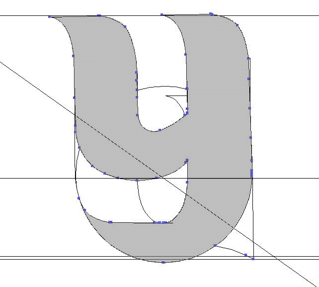
DECONSTRUCTION
 |
| fig 2.2.1 Deconstruction (25/5/2022) |
Findings:
- Downward stroke widths have the same thickness.
- The ascender length varies for different letters
- The ascend length and descend length are different
- overshoots are present
- for letter 't', the 2 sides are unbalanced
DIGITALISATION
 |
| fig 2.3.1 guide placement (25/5/2022) |
Following the tutorial from the demo video, I set up the guides with "Tyd" in Myriad Pro Regular with the x-width at 500x500pixels. I am now suddenly feeling intimidated for no reason but let's start.
 |
| fig 2.4.1 digitalisation of 'a' (25/5/2022) |
 |
| fig 2.4.2 digitalisation of 'e' (25/5/2022) |
I can't help but feel like I'm missing something vital here. What is this monstrosity? How do I do this 💀💀
 |
| fig 2.4.3 digitalisation in pain (26/5/2022) |
 |
| fig 2.4.4 Digitalisation progress (29/5/2022) |
I used the pen tool for minimal adjustments while trying to keep everything consistent. Keyword being "trying". Not entirely working, I'm afraid.  |
| fig 2.4.5 digitalisation progress (29/5/2022) |
This is possibly the ugliest 't' I've ever seen in my life. I fear for 'k' now, I really do.
 |
| fig 2.4.6 digitalisation progress (30/5/2022) |
I feel like I'm hyperventilating with every character I make. 4 more to go hang in there soldier.
 |
| fig 2.5.1 Digitalized font with guides(30/5/2022) |
 |
| fig 2.5.2 Updated digitalized font without guides (31/5/2022) |
I'll be honest. Some of them looked better than others, and the # looked a bit out of place but I still couldn't figure out how to make it look better without it turning out too condensed & heavy. Either way, I'll download FontLab and get it running first and figure out how to proceed from there.
 |
| fig 2.6.1 Imported letters into FontLab (31/5/2022) |
I may not be the happiest with my designs, but seeing them in FontLab gives off a different kind of satisfaction.
 |
| fig 2.6.2 FontLab progress (31/5/2022) |
 |
| fig 2.6.3 We have a problem (31/5/2022) |
Okay, we have a problem. Lots of problems actually. What went wrong. Update, it was the 'a'. Got too excited with the 1st letter and was doing whatever I wanted.
WEEK 10 (1/6/2022)
After the weekly feedback, Mr Vinod suggests that I omit the sparkle elements of the typeface as the thickness of the typeface is already heavy on its own. He also commented on the strokes of '#' and suggests that I make the horizontal lines thicker.
That sounds like a lot of work to be done. Are we ready or are we ready?
 |
| fig 2.7.1 Digitalized typeface updated ver (1/6/2022) |
Okay. I guess circles are cuter than sparkles. Who would've thought? Not me. Now let's move over to FontLab again.
 |
| fig 2.7.2 Fontlab progress (1/6/2022) |
 |
| fig 2.7.3 Fontlab trial (1/6/2022) |
Played around with the letters to make sure they all work. Now moving on to the kerning.
 |
| fig 2.7.4 Fontlab progress (1/6/2022) |
t & y s going to cause me some problems...
 |
| fig 2.7.5 kerning progress (3/6/2022) |
This is starting to turn into a challenge to see how many words I can come up with 15 letters. The more I continue the kerning the more I feel like I'm really just eyeballing the process, so I hope it turned out okay. I kinda have a bad rep when it comes to type setting.
--tangent of me on the verge of losing it--
After finally done with the kerning, I installed the font only for it to NOT SHOW UP in illustrator. I feel like crying I really do. Troubleshooting in progress zzz
 |
| fig 2.8 where is my font (3/6/2022) |
 |
| fig 2.8.2 if installed why missing |
I did not anticipate running into a problem like this. When I tested it out a few days ago with my incomplete font it worked completely fine. It's driving me a bit mad, and I want to scream.
 |
| fig 2.8.3 tears of joy |
FINALLYYY. Don't ask me how I've done it because I simply do not know. I restarted my laptop for the nth time and it just suddenly decided to work. It was like magic. Here's the list of things I've tried and one of them must've worked. Can't be sure which, though.
Poster Design
Credits: 8pt, Univers regular
Text: make type great again! (The entire typeface needs to have the same pt size.)
 |
| fig 3.1 Poster layouts (4/6/2022) |
With limitations with the font size, I stuck with simpler layouts. Since my font is rather thick, crowding them together didn't seem like a good idea. Currently, I am leaning towards Layouts 3, 4 & 6.
Shortlisted layouts:
 |
| fig 3.1.2 shortlisted layouts (4/6/2022) |
I'm torn between 1 & 3. I think they look simple and sleek and I that's really what matters in this poster.
FINAL OUTCOME
 |
| fig 4.1 Stuffed Final Outcome (5/6/2022) |
 |
| fig 4.2.1 Poster Final Outcome white ver (5/6/2022) |
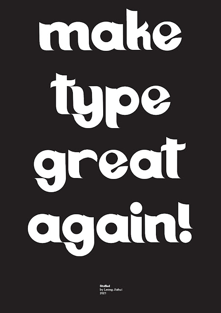 |
fig 4.2.2 Poster Final Outcome black ver (5/6/2022)
|
FEEDBACK
WEEK 8 (18/5/2022)
Specific feedback: Mr Vinod thought my 4th font: stuffed looked promising.
WEEK 9 (25/5/2022)
General feedback: Fonts with too many decorative elements can hinder communication.
Specific feedback: The # is too heavy. Take note of the consistency of strokes. Refer to existing typefaces for better understanding.
WEEK 10 (1/6/2022)
General feedback: Take note of the consistency of strokes. Start with designing the letter O and build other letters from there.
Specific feedback: Increase the thickness of the #. Take away the sparkle aspect of the font as the font is already quite heavy on its own. Overall fairly consistent, but some changes need to be done.
REFLECTION
Me @ my work the entire time:
You know that feeling when you bake a cake and it looks like crap and tastes pretty damn average but you're still happy that you made it anyway? And even though it is barely presentable you still took tons of pictures of it like a proud mom to share your epic failure with the world? That was exactly how I felt about the task.
It's a bit funny how I didn't like the fonts I designed in the beginning but grew more fond of them the more I worked on them when it usually works the other way around.
In the last task, I have had a newfound respect for typesetters. In this task, I've gained a newfound respect for font designers.
I have no doubt learned a lot about the basis of type designing, and it's honestly very mind-blowing to see how one letter can be built from another. It's also very cool to see how design principles are applied in the letters that directly affect the composition, balance and overall readability of the typeface.
Despite being a tedious process, I've actually enjoyed this task a lot more compared to the previous tasks. Well, not exactly to the extent where I want to design more cause it was still a pain, just less. I guess it's safe to say I wouldn't want to do this again in a while.
To the next>>>
FURTHER READING
 |
fig 5.1 A Type Primer by John Kane (2nd edition)
|
|
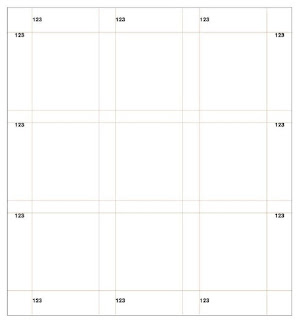
Grid Systems
A grid is a pattern of horizontal and vertical lines that intersect at regular intervals. In typographic design, a grid system is a method for organizing and clarifying text on a page
A grid is all about providing framework where the typographic elements and visuals work to reinforce meaning.
For the system to be effective it has to be both organic and responsive. The following are a few elements one has to take note while devising a grid system:
- the amount of text/images
- the kinds of text/images
- the levels of meaning and importance within the text/images
- the relationship between text & images
- the relationship between text/images with the reader
 |
fig 5.2 grid system
|
Components of the grid:
- Text page
- margins
- folios
- headers
- fields
- gutters
 |
| fig 5.3 running head/running foot/ running shoulder |
 |
| fig 5.4 folio |
Running head/
running foot/ running shoulder tend to be used to place the title or the author's name.Folios are typically used for page numbers
 18/5/2022 - 1/5/2022


Comments
Post a Comment