
31/8 /2022 - 29/9/2022
Leong Jiahui / 0353469
Bachelor of Design (Honours) in Creative Media
GCD 61004 / ADVANCED TYPOGRAPHY
Exercise 1:Typographic Systems / Exercise 2: Type & Play Part 1 &
2
LECTURE NOTES
WEEK 1 (31.8.2022)
Typographic Systems
- Axial: all elements are organised to the left or the right of a single axis

|
| fig 1.1.1 axial system example |
- Radial: all elements are extended from a point of focus

|
| fig 1.1.2 radial system example |
- Dilatational: all elements expand from a central point in a circular fashion

|
| fig 1.1.3 dilatational system example |
- Random: elements appear to have no specific pattern or relationship

|
| fig 1.1.4 random system example |
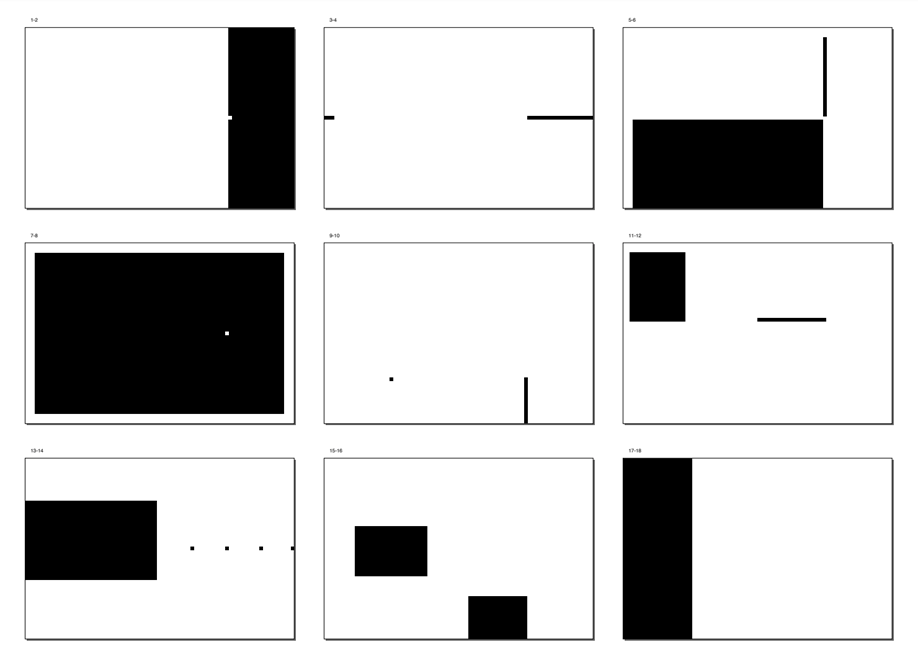
- Grid: a system of vertical and horizontal divisions

|
| fig 1.1.5 grid system example |
- Modular: a series of non-objective elements that are constructed in as a standardized unit

|
| fig 1.1.6 modular system example |
- Transitional: an informal system of layered banding
|
| fig 1.1.7 transitional system example |
- Bilateral: all text is arranged symmetrically on a single axis
|
| fig 1.1.8 bilateral system example |
Typographic Composition
Layouts, basically.
- Emphasis
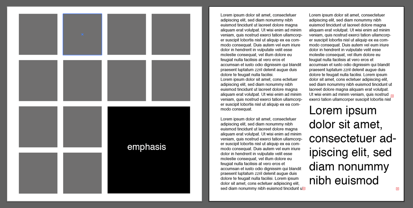
|
| fig 1.2.1 emphasis |
- The Rule of Thirds: a photographic guide to composition. It suggests that a frame (space) can be divided into 3 columns and 3 rows. The intersecting lines are used as a guide to place the points of interest, within the given space. Intersecting points are the focus points of the layout

|
| fig 1.2.2 Rule of Thirds |
Modernization of the old typographic systems (particularly the grid system)
brings about new models like the Environmental Grid system & the Form
and Movement system.
- Environmental Grid system: a system based on the exploration of an existing structure or numerous structures combined (super-structure) which includes non-objective elements to create a unique and exciting mixture of texture and visual stimuli.

|
|
fig 1.2.3 Environmental Grid System (Left to right: Paula Scher, Jonathan Barnbrook and David
Carson) |
- Form and Movement: A system is based on the exploration of the existing Grid Systems.The placement of a form (irrespective of what it is) on a page, over many pages creates movement
|
|
fig 1.2.4 Form and Movement (static ver) |
- Evolution of handwriting to letterforms
- The first print was developed in Korea
- It’s all history basically, refer to slides for more info
- Main point: looking behind gives you context. Looking forward gives you opportunities. Strive and do your best in advanced typography.
Programmers and Type Design: Big companies like Google has started to develop more vernacular typefaces.

|
| Fig 1.3.1 Multi-script |
Designing Type
Type design carries a social responsibility so one must continue to improve
its legibility. It is a form of artistic expression.
Depending on the typeface category (display type/text typ) the readability
and legibility of the typeface become an important consideration. However,
it is not as crucial if the typeface is a display type, where the
expression of the form takes a little more precedence.
The general process of Type Design:
- Research: determine the type's purpose & examine existing fonts for reference & context
- Sketching: done traditionally/digitally. Both methods have their pros and cons.
- Digitization: emphasis on the form and readability of the typeface. Uses software like adobe illustrator as well and professional type softwares like FontLab & Glyphs App.
- Testing: the process of refining and correcting aspects of the typeface. Prototyping is also part of the testing process and leads to important feedback.
- Deploy: further refining of prototypes created so that the teething issue remains minor.
Typeface construction:
- Roman capital
- using grids (with circular forms) can facilitate the construction of a letterforms and is a possible method to build/create/design your letterform
- An important visual correction is the extrusion of curved (and protruding) forms past the baseline and cap line. This also applies to vertical alignment between curved and straight forms as well as the distance between letters.
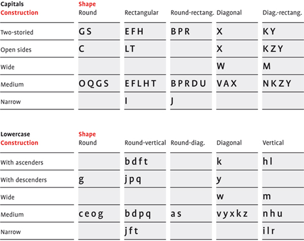
|
| fig 1.4.1 construction & considerations |

|
| fig 1.4.2 constructions and considerations |
Perception & Organisation
Perception in typography deals with the visual navigation and
interpretation of the reader via
contrast, form and organisation of the content.
- Contrast

|
| fig 1.5.1 contrast |
- size: size provides a point to which the reader’s attention is drawn, usually by making the title noticeably bigger than the body text.
- weight: how bold type can stand out in the middle of a lighter type of the same style.
- form: the distinction between a capital letter and its lowercase equivalent, or a roman letter and its italic variant, condensed and expanded versions
- structure: the different letterforms of different kinds of typefaces
- texture: Formed by putting together the contrasts of size, weight, form, and structure, and applying them to a block of text on a page.
- direction: the opposition between vertical and horizontal, and the angles in between. Mixing wide blocks of long lines with tall columns of the short lines can also create a contrast.
- colour: a second colour is often less emphatic in values than plain black on white. This allows them to be emphasized.
- Form: represents a concept in a visual form. When a typeface is perceived as a form, it no longer reads as a letter because it has been manipulated by distortion, texture, and enlargement, and has been extruded into a space.

|
| fig 1.5.2 form |

|
| fig 1.5.3 manipulation of typeface |
Organisation / Gestalt
Perceptual Organisation / Groupings:
- Law of Similarity: elements that are similar to each other tend to be perceived as a unified group
- Law of Proximity: elements that are close together tend to be perceived as a unified group
- Law of Closure: the mind’s tendency to see complete figures or forms even if a picture is incomplete, partially hidden by other objects. Our minds have to complete the rest of the picture.
- Law of Continuation: The alignment of the objects or forms plays a major role in this principle taking effect as humans tend to perceive each of two or more objects as different, singular, and uninterrupted objects even when they intersect.
- Law of Symmetry
- Law of Simplicity (Praganz)

|
| fig 1.5.4 gestalt principles |
Task 1: Typographic Systems & Type & Play
Instructions
EXERCISE 1:Typographic Systems
Progress
WEEK 1 (31.8.2022)
I made these 2 days before class because I missed the announcement last
week and it shows.
I didn't know why I just told you that.
Anyways,

|
| fig 2.1.1 exercise 1 drafts (Top to bottom row, left to right: axial, radial, dilatational, random, grids, modular, transitional, bilateral)(6.9.2022) |
WEEK 2 (6.9.2022)
After getting some feedback and peeking through my peer's works, I decided to start over. Getting into the punk spirit, I'll try to work towards being loud and bold in my next designs.
After getting some feedback and peeking through my peer's works, I decided to start over. Getting into the punk spirit, I'll try to work towards being loud and bold in my next designs.
Axial:
What punk and what bold? I am embarrassing myself.

|
| fig 2.2.1 axial attempt 2 (8.9.2022) |
Grid:

|
| fig 2.2.2 grid attempt 2 (9.9.2022) |
Modular:

|
| fig 2.2.3 modular attempt 2 (10.9.2022) |
Random:
|
| fig 2.2.4 random attempt 2 (11.9.2022) |

|
| fig 2.2.5 bilateral attempt 2 (11.9.2022) |

|
| fig 2.2.6 radial attempt 2 (11.9.2022) |

|
| fig 2.2.7 transitional attempt 2 (11.9.2022) |

|
| fig 2.2.8 radial attempt 2 (12.9.2022) |
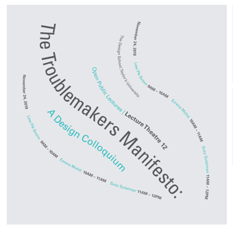
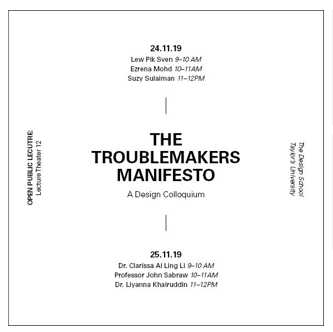
Final Outcome: Exercise 1

|
| fig 2.3.1 Final axial system JPEG (12.9.2022) |
|
| fig 2.3.2 Final dilatational system (12.9.2022) |

|
|
fig 2.3.3 Final radial system (12.9.2022) |

|
| fig 2.3.4 Final random system (12.9.2022) |

|
| fig 2.3.5 Final bilateral system (12.9.2022) |

|
|
fig 2.3.6 Final grid system (12.9.2022) |
|
|
| fig 2.3.7 Final transitional system (12.9.2022) |
|
| fig 2.3.8 Final modular system (12.9.2022) |
Final outcome PDF:
Final outcome PDF with guides & grids:
EXERCISE 2:Type & Play pt 1
WEEK 2 (6.9.2022)
In this task, we're required to make a selection of images
between man-made objects (chairs, glass, etc.) or structures (buildings),
and nature and extract letterforms from them.
I debated over choosing soap bubbles or rice grains, which ultimately I
chose the latter.

|
| fig 3.1.1 image selection (12.9.2022) |

|
| fig 3.1.2 rice font extraction (12.9.2022) |
Yeah... It is a bit of a stretch but I think that's sort of
the whole point...?

|
| fig 3.1.3 rice font progress (13.9.2022) |
This is looking kinda...cute? I think the pointy ends of the rice can
be refined further. Right now it only looked like rice because
I know it's rice.
WEEK 3 (14.9.2022)
After the feedback on week 3, I tried refining it further. It was
mentioned that the curve for P needs to actually be a curve instead of
stacking rice grains on each other to make a pointy circle. V looked
the most decent amongst the 5 letters. I think I can try widening the
little gaps in the letters to make them more noticeable. It looks
pretty consistent already, I think I hope.

|
| fig 3.1.4 more refining (15.9.2022) |
WEEK 4 (21.9.2022)
Who's gonna stop me from naming this font rice rice baby?
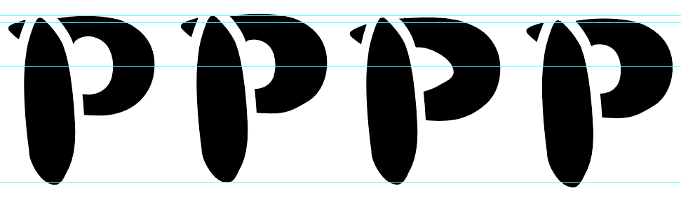
|
| fig 3.1.5 Struggling with P (21.9.2022) |

|
| fig 3.1.6 the refinement progress from start to finish (21.9.2022) |

|
| fig 3.1.7 font showcase (22.9.2022) |
Final Outcome: Exercise 2 pt 1

|
| fig 3.2.2 Final Outcome compilation (22.9.2022) |

|
|
fig 3.2.1 Final font showcase (22.9.2022) |
EXERCISE 2:Type & Play part 2
In this exercise, we're required to look up stock images or take our own
picture and combine it with a letter/word/sentence. The
objective is to enhance/support the interplay between the
letter/word/sentence and the selected visual. The text must be
woven into a symbiotic relationship with the image.
Given that we're killing two birds with one stone by entering the HONOR
talents award with our final piece, we have to follow the theme set:
Cultural Prosperity · Celebration & Renewal of life · Return.
WEEK 3 (14.9.2022)

|
| fig 4.1.1 photo 1 (17.9.2022) |

|
| fig 4.1.2 photo 2 (17.9.2022) |
Phrase ideas:
- Fleeting colours in flight
- Tale as old as time
- Lunar realm
- May our prayers be heard
- All that glitters
- Beneath the light
Yes they're pretentious but I'm in no place to be picky rn.

|
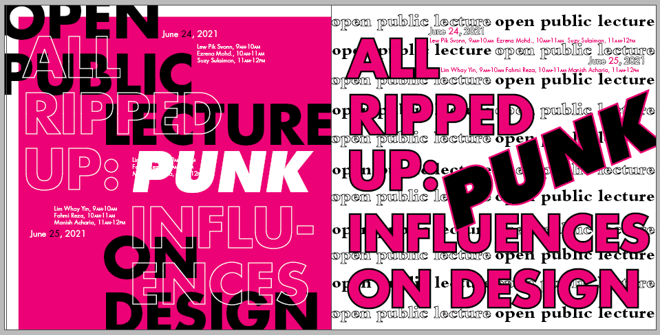
| fig 4.2.1 Exercise 2 pt 2 Attempt 1 (20/9/2022) |
WEEK 4 (21.9.2022)
After the briefing for the task, we were told that we
are forced encouraged to use images we took
ourselves to avoid getting sued.
Submission details:
- size 6,000 x 3,000 px (scale it down for e-portfolio submission)
- JPG format
- size ≤ 20M
- fonts from the 10 typefaces, or good typefaces from google fonts & fontshare

|
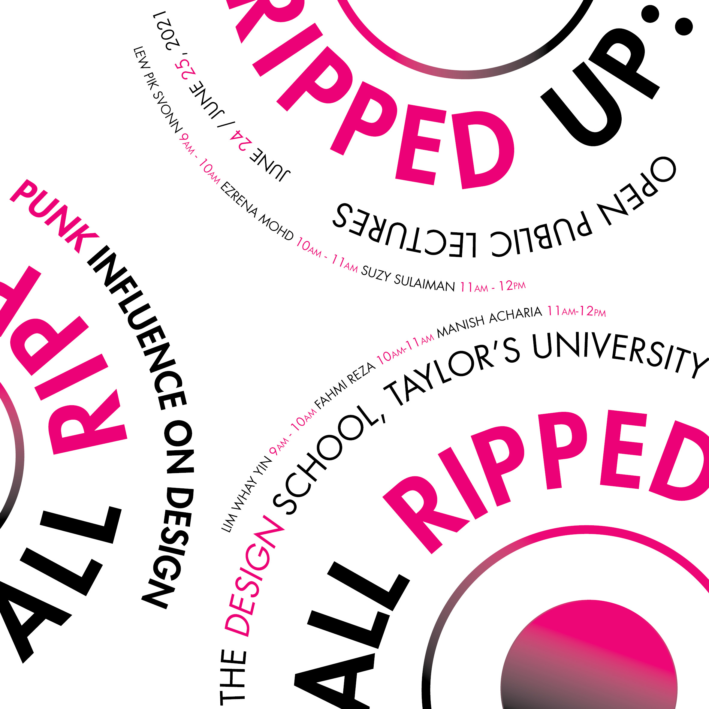
| fig 4.2.2 process montage (26.9.2022) |

|
| fig 4.2.3 Drafts (27.9.2022) |
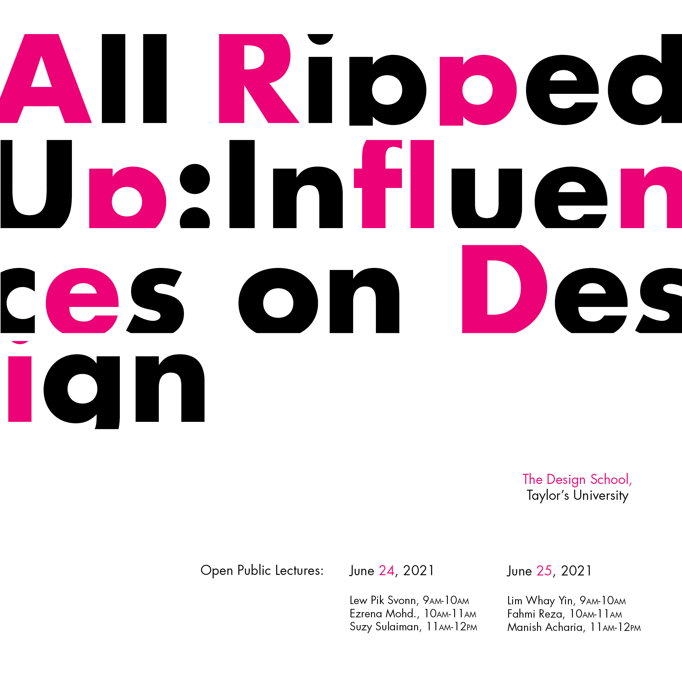
That feeling when your lecturer says the one you took the least time making is the one with the most potential. Played around with the saturations and adjusted the font size.
 |
| fig 4.2.4 wallpaper variations (30.9.2022) |
Final Outcome: Exercise 2 pt 2
 |
| fig 4.3.1 Exercise 2 Part 2 Final Outcome White ver. (30.9.2022) |
 |
| fig 4.3.2 Exercise 2 Part 2 Final Outcome Black ver. (30.9.2022) |
 |
| fig 4.3.3 Exercise 2 Part 2 Final Outcome Colour ver. (30.9.2022) |
Submission for HONORS talents:
 |
| fig 4.3.4 Honors Talents wallpaper submission (6.10.2022) |
 |
| fig 4.3.5 Honors Talents personalized cards submission (6.10.2022) |
FEEDBACK
WEEK 2 (6.9.2022)
General feedback: Make sure layouts are properly centred.
Make sure all information presented is inter-relatable. Downsize numbers
by 0.5pts to make everything look more cohesive and smooth.
Specific feedback:
Overall: Focus on the arrangement, and make sure the body
text remains at 8-12pts. Mind the gap (paragraph spacing), and keep it consistent. Focus on hierarchy (size & hierarchy)
Axial: leading & paragraph spacing is not consistent. To
balance the off-diagonal axis.
Radial: align the info at the dot. Try to anchor to ONE or
TWO points only and make sure the points are clear. Does the date need to
be so weighted when it is already big in size? Try using a more subtle
hierarchy to show contrast. Don't make the viewer have trouble knowing
what to read first. Readability first, design second.
There is also no point in having text skewed.
Dilatational: can go more fancy, clear but not memorable. The
non-objective elements too strong.
Random: the left design is better, but overall designs could
be more chaotic.
Grid: Lacks cohesiveness, don't try to fill in EVERY grid.
Use a less weighted typeface as the counter space looks too heavy and
affects readability.
Modular: No need for italic, focus more on movement. need to
be more cohesive. Rethink the choice of font.
Transitional: Straightforward but not particularly
memorable.
Bilateral: Too complex for expansion. Try starting with a
central line. Current designs look too complex and bilateral elements are
not obvious.
WEEK 3 (14.9.2022)
General feedback: Having consistency in angles is important to
provide a more cohesive look & feel.Tone down on the little elements
coming out from the type. The reference is important to study the
strokes.
Specific feedback: consistency in the gap needs to be
improved. Create an outline, increase the stroke, minus front and create
better consistency (refer to lecture recording). P needs to form a curve.
Introduce a curvature shape into the type while still considering the form
of the rice. When there is a cavity space, it has to be visible even in
small sizes.
WEEK 4 (21.9.2022)
Specific feedback: More improvements can be made to the curvature of
P.
WEEK 5 (28.9.2022)
General Feedback: The wallpaper needs to be smoother and looks more cohesive. Avoid having contrasting elements that are too strong. Consider how the wallpaper may hinder user viewing when apps sit on it. Words should be more prominent as well.
Specific Feedback: The last one has more potential to be wallpaper. 1st 2 are too contrasting. The final "renewal" needs to be more weighted & more prominent. Can select a few leaves to be more saturated than others.
REFLECTION
Through repetition comes variation
Experience
Exercise 1 was surprisingly enjoyable. Yes, I was sort of in crunch mode
because I missed the task announcement, but as I start to get into the mood
of designing the 8 systems, I actually really enjoyed the process.
Exercise 2 pt 1 has been... Interesting. I think I might've chosen a less
interesting motive to work on, or I'm just very burnt out to be able to
create a creative-looking font from something so rigid. Though the process
was pretty fun, I think I could've done better. oh well, you win some you
lose some I guess.
Exercise 2 pt 2 was fun, and having to take our own picture is an added challenge. One I did not enjoy as much 🤡 but overall I'd still rate the experience a nett positive.
Observations
As a designer, we are bound to find loopholes in a rigid framework and work around them. Breaking the rules allow us to create something different, and while not always better, opening up to more possibilities allows us to grow more. That sounded deeper than it was, really, but I had the epiphany, especially when working on exercise 1 lol.
Findings
Through repetition comes variation. Mr Vinod mentioned how heavily
referencing good work can be useful in studying each element in detail and I
really experienced that in exercise 1. Studying my senior's works and trying
to create something similar at the same time not is truly challenging and
truly helped me develop my own style of creating my version of the
systems.
Dying is good as long as you're not dead.
FURTHER READING

|
| fig 5.1 Typographic Design: Form and Communication, 6th Edition |
Rob Carter, Philip B. Meggs, Ben Day, Sandra Maxa, Mark Sanders
ISBN: 978-1-118-71576-5 September 2014 352 Pages
WEEK 1 (31.8.2022)
The Typographic Grid
- a skeletal framework used by designers to organize information within a spatial field.
- provides a strategy for composing text and other visual information in two- and three-dimensional space
- eases communication and enhances aesthetic beauty

|
| fig 5.2.1 Spatial divisions formed from grids |
WEEK 2 (7.9.2022)
Modular Grids
- The goal is to create a distinct hierarchy between units of information by understanding the different levels of information and representing them as contrasting elements.
- Spatial interaction and compositional balance are achieved when modules define void spaces that are integral to the geometry of the page.
- The beauty of the system is that modules can be combined into varied sizes and shapes to serve as zones for content elements.

|
|
fig 5.3.1 Modular grid by Josef Müller-Brockmann |

|
| fig 5.3.2 Modular grid examples |
WEEK 3 (14.9.2022)
Typographic Design Process

|
| fig 5.4.1 The model of the design process |
- Defining: Immersion into the design process begins by defining the problem and its parameters (needs, objectives, solutions, audience, budget, production limitations etc)
- Gathering: This phase provides the essential information needed by the designer regarding all aspects of the problem.
- Ideating: The worst enemy of the design process is thinking inside the proverbial box. The mind should be open to lateral, sideways, and unconventional thinking.
- Synthesizing: Whereas the ideation phase is concerned with expanding possibilities, the synthesis phase concentrates on narrowing options and coming to closure.
- Realizing: Implementation cannot go forward without client approval. Designers and clients communicate on a regular basis throughout the process, which prevents confusion and misunderstanding in the end.
WEEK 4 (21.9.2022)
15 great typography-based objects
Article on Designer daily (https://www.designer-daily.com/15-great-typography-based-objects-1714)

|
| fig 5.5.1 Designer Daily- 15 great typography-based objects |
WEEK 5 (28.9.2022)
17 Tips for Designing with Type on a Photo (https://designmodo.com/design-type-photo/)
An article on designing with type on and around images. An insightful read
on how to have the right photo, a good eye for typography and know what I
want to accomplish to make the most of adding type to an image.

|
|
fig 5.6.1 17 Tips for Designing with Type on a Photo
|
Comments
Post a Comment