
19/10/2022 - 30/11/2022
Leong Jiahui / 0353469
Bachelor of Design (Honours) in Creative Media
GCD 61004 / ADVANCED TYPOGRAPHYTask 3: Type Exploration and Application
Process
WEEK 9 (26/10/2022)
To begin the process, we started out by looking up potential inspirations for the typeface design.
Proposal:
Next, I proceeded with the sketching. I started with my 1st Idea, but ultimately decided it wasn't going anywhere. I felt I didn't have enough time to be able to execute this concept well.
 |
| fig 1.1 failed attempt at Idea 1 (1/11/2022) |
Ditching my first idea, I moved on to the second one. The font I chose from the promotional poster was this one:
 |
| fig 1.2.1 "Girls" font on aespa's promotional poster (1/11/2022) |
I'm gonna call this typeface "Mercury drip" because Mercury was apparently already taken?! We're supposed to make our fonts black and white (duh), but I'm wondering if I could add that silver metallic mercury colour to it after.
Image tracing works wonders, tbh. And I only have a few letters to refine. Hanging onto dear life.
Dare I say I am enjoying the process? This is kinda reminding me of Task 3B in Typography last semester. That's a good thing, by the way. Not sure if I'm just anticipating the sem break, though. Sir mentioned being able to complete a type design sketch in a day. Well, he's not wrong. Everything was done in 6 hours or less since I changed the idea last minute.
Here are the sketches:
 |
| fig 1.2.2 Uppercase sketches attempt 1 (1/11/2022) |

 |
| fig 1.2.4 Typeface "mercury" 1st sketch (1/11/2022) |
Here's a 30s process clip of the sketches:
fig 1.2.5 Sketches process clip (1/11/2022)
WEEK 10 (2/11/2022)
Now moving on to the numbers and punctuations, then onwards to digitalisation!
We need to make half the punctuations from the list below. Kinda intimidated ngl. The ones in red are the ones I'm planning to make. Who knows, maybe I'll wake up one day and decide to do all of them to make my life miserable. You never know.
Punctuations needed:
` ~ ! @ # $ % ^ & * () _ - + = \ | }{ [] : ; “” ’ , >< . ? /
Digitalization
Guess whose apple pencil died when resketching some of the lowercase letters and had it sent for repair and was told that it will be done in 14 working days? (it's me) I want to scream, but that won't do me any good now would it. So here I am, in Illustrator, image tracing my way through the misery.
 |
| fig 1.3.1 Digitalisation (7/11/2022) |
 |
| fig 1.3.2 Digitalization draft 2 (8/11/2022) |
WEEK 11 (9/11/2022)
After the weekly feedback, I went to work again. Things are finally starting to take shape.
 |
| fig 1.3.3 Finalised letters (9/11/2022) |
The Fontlab Experience
Fontlab 8 is trying to murder me for real. I imported my letter "A", and turns out that's the only letter i could import, cause the paste function just decides to suddenly...stop working. Which I ultimately turned towards a bizarre solution...drag and drop. I mean if it works it works I guess. I'm in no position to complain.
 |
| fig 2.1.1 importing letters into FontLab (11/11/2022) |
Kerning
Let the kerning begin. I honestly have no clue where to even start with so many letters, but we'll comb through each and every one of them. Eventually.
 |
| fig 2.2.1 Uppercase kerning process (11/11/2022) |
I have been kerning for the past 2 days, with the texts provided in FontLab as well as random passages and random phrases from the audiobook I was listening to when doing this. Then I found this (very large, I might add) set of basic kerning text online so I've been working with that since. Still got a long way to go, and the FontLab trial I'm using is counting down and I'm anxious.
 |
| fig 2.2.2 kerning process (14/11/2022) |
Damn, this is taking forever. I wouldn't say it was therapeutic, but I sure am using it to escape my other assignments (*cough* interactive design *cough*)
 |
| fig 2.2.3 exported text: Drip (15/11/2022) |
Behold, my first set of letters! I know I said I'm gonna name it mercury, but it's called Drip now. I'm glad font lab didn't give me too many problems this time. Just flashing back to my experience with it during the previous semester makes me sick.
WEEK 12 (16/11/2022)
Applications
Since the typeface was designed based on the Kpop girl group Aespa's promotional poster, I decided to design my applications for a fan-meeting event of the group, from posters, and tickets, to merchandise.
Some application ideas:
- Photocards
- Poster
- Lightstick wristband
- Hoodie
- T-shirt
- Bucket hat
- Ticket
- Sew on badges
- Fake tattoos
- Polaroid border
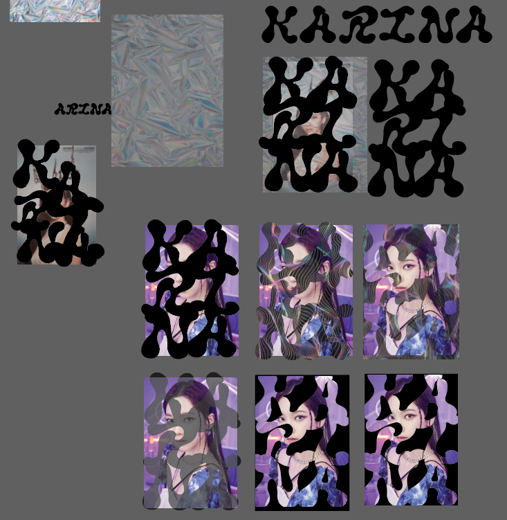 |
| fig 3.1.1 Photocard process (20/11/2022) |
I just wanted you to know, that this is me trying.
One can go through many stages of depression when they're in the last few weeks of the semester, but I didn't expect the country's political instability to be one of them.
 |
| fig 3.1.2 Photocard process (20/11/2022) |
How it's going. The letters on the cards form the names of each member.
 |
| fig 3.1.3 More applications (21/11/2022) |
And the battle continues. I'm really out here designing merch for a group I don't even stan. This is my life now.
WEEK 13 (23/11/2022)
 |
| fig 3.1.4 text (25/11/2022) |
Stuff I'm slapping onto t-shirts. I hope they look decent enough. They're Aespa's song lyrics.
 |
| fig 3.2.1 ticket mock-up process (25/11/2022) |
Making mock-ups will forever be cool to me. Halfway through making mock-ups for the apparel, I figured that the song lyrics placement was a bit dull (see: figure 3.1.4). Hence, I came up with new layouts using their song lyrics (still). The lyrics I selected are from 3 of their title tracks, Next Level, Savage and Girls. They came out looking more like patterns than type, which is what Mr Vinod suggested I do with y irregular-looking font. The colours could use more work, but overall I'm optimistic about how this could potentially turn out. I feel like these designs could fit well on coasters as well.
 |
| fig 3.1.5 song lyric patterns (27/11/2022) |
 |
| fig 3.2.2 t-shirt mockup (28/11/2022) |
Okay, I'm sorry I take it back. They did NOT in fact look good on shirts. Maybe it'll still work for coasters, though! Not all hope is lost. But for apparel, let's just stick with more generic simpler designs. It's overused for a reason: it works.
Overall I think my favourite application made was still the photocards. I'm just realising how immersed I was with creating my collaterals that I did not record all the small details and revisions for each of them, but here's the compilation of my blood sweat and tears:
 |
| fig 3.2.3 my blood sweat and tears (28/11/2022) |
Final Outcome
Font download link: https://drive.google.com/file/d/19QW74K9H0dp3ExeKkml_HA8qPMijibDU/view?usp=share_link
Complete set:
 |
| fig 4.1.1 Drip font (28/11/2022) |
Uppercase, Numbers & Punctuation:
 |
| fig 4.1.2 Uppercase, numbers & punctuation (28/11/2022) |
Lowercase:
 |
| fig 4.1.3 Lowercase (28/11/2022) |
Final outcome PDF:
Applications
 |
| fig 4.2.1 Poster mock-up (28/11/2022) |
 |
| fig 4.2.2 Poster design (28/11/2022) |
 |
| fig 4.2.3 Photocards (28/11/2022) |
 |
| fig 4.2.4 Photocard design (28/11/2022) |
 |
| fig 4.2.5 ticket mock-up (28/11/2022) |
 |
| fig 4.2.6 ticket design (28/11/2022) |
 |
| fig 4.2.7 ticket set mock-up ( 28/11/2022) |
 |
| fig 4.2.8 t-shirt mock-up (28/11/2022) |
 |
| fig 4.2.9 T-shirt design (Next Level ver.) close-up (28/11/2022) |
 |
| fig 4.2.10 Sweatshirt mock-up (28/11/2022) |
 |
| fig 4.2.11 coasters mock-up (28/11/2022) |
Feedback
WEEK 9 (26/10/2022)
Specific feedback: Proceed with the most preferred direction. Can consider creating a new font inspired by the original font instead of completing the typeface. Can consider looking into making a font that speeds up reading.
WEEK 10 (2/11/2022)
General feedback: Analysing existing fonts is essential for punctuation.
Specific feedback:
Uppercase: The uppercase looked fairly consistent. "O" and "Q" cannot be formed just by flipping them. Start working on the numbers as they are capitals too.
Lowercase: The lowercase looked more complex than the Put the lowercase next to the uppercase when designing to create a more consistent type. The slants have to be consistent (b & d, don't just flip). The x can be fattened more.
WEEK 11 (9/11/2022)
General feedback: When involving curves, thick strokes can be thicker so the curving parts will not look too thin.
Specific feedback:
- The X-height is a bit low
- Dollar sign- too thick, center line can try removing
- Remove bumpiness of bracket
- More cavity space for ,
- Z- too thick
- Start thinking about applications
- can either use Font forge or Fontlab in d704
WEEK 12 (16/11/2022)
Specific feedback: The font can be used to create patterns and artwork. Try to see how visibly collectable the typeface can be. The typeface seems to be suitable to format headlines. Research is critical in applications, referring to how others showcase their typeface in various mediums.
Reflection
Experience
Oh my god, what a task. We worked on this for more than a month?! It truly felt like time just flew by working on this task and my experience with it was a positive one (surprisingly). This task has been my go-to assignment when I want to procrastinate on my other assignments (specifically ID and VSP cough) and my irregular-looking font gave me the freedom to freehand my letters before the digitalisation process. I didn't think it was quite possible to construct a full set of letters myself, let alone in 2 weeks. I don't think past me will ever consider doing something like this outside of class but now I might just.
One skill (can you even call it that?) I learned from this task is the magical world of image trace. I owe this entire assignment to it. Also how important it is to have a reference set of letters when constructing your own so the proportions are correct. I don't think I'm still any better at creating collaterals, but I liked how the photocards came out, so we celebrate the small victories today I guess.
All in all, this was one hell of a task, and I had one hell of a time doing it. Dare I say this was the best assignment from Typography and Advanced Typography?
Yes. Yes, it is.
Further Reading
WEEK 11 (9/11/2022)
Ah yes, the classic go-to Instagram post on creating punctuation. Mr Vinod sat us through this guide in the previous semester, but that doesn't mean I remember any of it. So here we are. Again.
Comments
Post a Comment