7/9/2023 - 30/11/2023
Leong Jiahui / 0353469
Bachelor of Design (Honours) in Creative Media
GCD 62404 / ART DIRECTION
Instructions
Project Brief
Art Direction Exercise: Initial Research
WEEK 1 (31/8/2023)
National Day Holiday. We were tasked to play and explore two games that will be the center of the module, "Among Us" and "Goose Goose Duck". We are also exposed to the project briefs to understand the module better.
WEEK 2 (7/9/2023)
This week, we are tasked to play Among Us & Goose Goose Duck, and an additional game is possible. We are split into groups of 4-5 people- our group has 5. This is our to-do list for the week.

We started by testing out the games. We made sure to pay extra attention to the game art & details when playing the game. To make it easier for ourselves, we also looked up game plays on YouTube to study and analyse game details that we may have missed. We then compiled everything in a google doc. We also met up before class to organise our points and prepare our presentation slides.
Observational Studies:
Feedback
The presentation was comprehensive and very well done :D It's great that we were able to incorporate details and learnings from our own specializations and learning into the analysis and findings.
WEEK 3 (14/9/2023)
This week, we mainly worked on the positioning map and further research and exploration of our new art direction. We looked up many games, from serious to cute to realistic to stylized and tried our best to fill up the board. Which, looking at it now, probably wasn't the best idea as more options means more analysis means more work. However, it did provide us with more room to work with.
I am happy that my teammates are all very eager to work on the project and put in their best efforts.
Final Outcome
Group 5 - Visual Analysis by PeiYun
Feedback
Some of the positioning is not accurate yet. Do rearrange them.
WEEK 4 (21/9/2023)
This week, we continued the grind by finally deciding where our new art direction lay. As a group of like-minded individuals, we all in unison, wanted a cutesy, futuristic design with bright vibrant colours. With that in mind, we started sketching out the character design ideas we had in mind. Needless to say, we needed some housekeeping here as the consistency was non-existent.
 |
| fig 4.1.1 character design ideas |
Moving on, we arranged a meeting to finalise our character design. We also delegated tasks to every member to start working on our logo, the attack animations and the emergency meeting animations so we can slowly build up assets and materials for our proposal presentation on week 8.
I was in charge of combining the character design ideas to fit into a final character design, and considering everyone's ideas, this is what I came up with.
 |
| fig 4.2.1 character design sketch |
Project 1: Proposal
WEEK 5 (28/9/2023)
One week in and this is what we're seeing. I think that the cute vibes of the game has been successfully captured in this batch of sketches, and the animation sketches also encompass the cute-silly aspect of our new art direction.
 |
| fig 5.1.1 Character design, logo design, animations sketch |
I continued working on my character design, this time making the lines cleaner and the proportions more consistent. I also started working on some potential pets and props the character could have. It was fun exploring different customizations we could play with.
 |
| fig 5.1.2 character sheet |
 |
| fig 5.1.3 character customization options |
 |
| fig 5.1.4 character customization- props & pets |
Moving on, we also experimented with different colour palettes. We decided to go for a gradient colour scheme, but was still up for exploring more options as our environment design was yet to be finalised. When we tried placing our character on the environments, it turned out that it did not really match.
With this visualisation, we were better equipped with how we could adjust our colour palette to fit with the environment. We decided that the vibrancy of the characters could be toned down, and the environment to take up a cooler calmer tone so the characters could still stand out.
 |
| fig 5.2.1 character colour palette |
 |
| fig 5.2.2 environment design & characters |
I added more variations to the colour as well.
Feedback
 |
| fig 5.2.3 Character colour palette |
- Consider implementing the animal theme into our overall design.
- push the "cute" art style/ direction we are going in
- consider using an isometric view (2.5d) for our environment
WEEK 6 (6/10/2023)
Presentation week got us all at chokehold. We managed to somehow pull the base design for the basic elements and foundation of the game for the presentation. I would say we managed quite a comprehensive proposal deck, and planned out a clear timeline to meet our goals and ensure that the project gets completed in time.
Final Outcome
Group 5 - Project Proposal by PeiYunFeedback
- create more depth for the loading screen
- change the colour of the U
- consider character & environment 3D and UI/UX screens non-3d
Tasks to do moving forward:
-UX ( customization panel, voting & discussion panel)
-finalise environment design
-finalise character design
-outfit (skins)
Project 2: Project Management
WEEK 7 (13/10/2023) & WEEK 8 (19/10/2023)
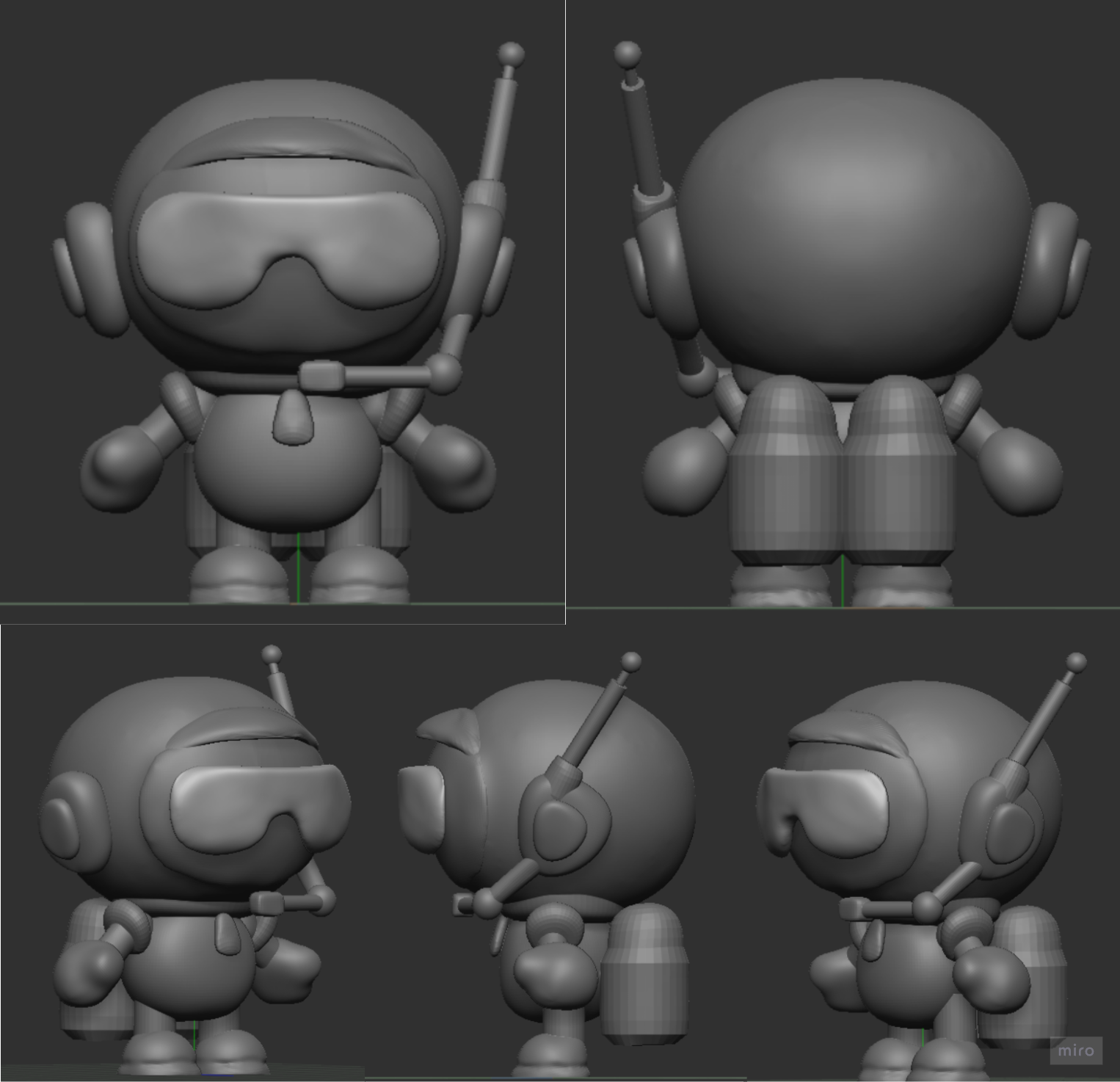
This week, we began polishing up our previous sketches and ideas. As we are hoping to go for a 2D + 3D approach, I started modelling the character on Zbrush. I considered modelling in Blender, but decided against it as I work faster in Zbrush, and we are running out of time. It was a challenge modelling the bent surfaces like the glasses and the upper shield.
 |
| fig 7.1.1 Modelling progress |
This is how the model turned out. I will have to smoothen the glasses more, but having high polycounts is going to be a problem for the rigging. Overall looks quite legit, just need to polish it up more before class next week.
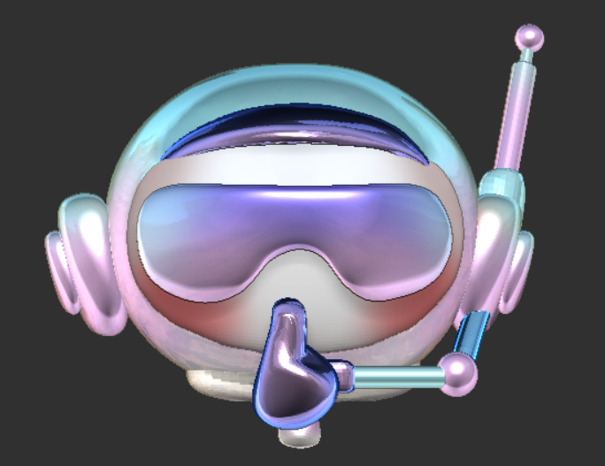
I also tried smacking some materials and textures onto the model, which really gave the model a smoother finishing and helped us envision what the final outcome could potentially be like.
Next step: colouring. Which... I have no idea how to do gradient colouring in Zbrush so we're just gonna start exploring & researching ASAP.
After some messing around, this is what I managed to come up with. I picked the red and the white to try out, and the gradient turned out pretty okay I think.
 |
| fig 7.2.1 character 3d model |
 |
| fig 7.2.2 materials and textures |
After some messing around, this is what I managed to come up with. I picked the red and the white to try out, and the gradient turned out pretty okay I think.
 |
| fig 7.3.1 coloured models |
WEEK 9 (26/10/2023)
This week, I worked on the lighting of the environment. We struggled a lot with the colour palette we wanted to go for, since nothing felt cohesive enough. Our non-solution was to try out the lighting to see how the effect would be before proceeding.
 |
| fig 9.1 Environment design lighting |
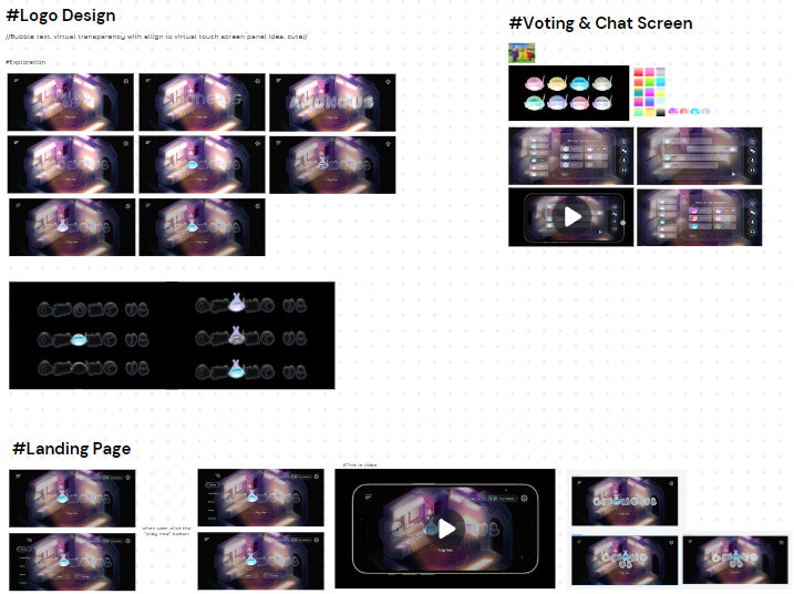
We also made some progress on the task redesigns. We decided to have another zoomed-in background view of the specific tasks to give players a more immersive experience. We also tested out what kind of UI would suit the scene best, since we are taking away the full view of the map in the background by implementing a different background.
 |
| fig 9.2 Task designs by Jia Hsuan & Jenni |
 |
| fig 9.3.1 UI/UX- chatting screen progress |
 |
| fig 9.3.2 UI/UX-character customization screen progress |
Feedback
- play with different coloured lighting
- choose and finalise the wireframe
WEEK 10 (2/11/2023)
This week, I worked on the lighting and ambience of the environment design. The environment design is completed by our team mate Jenni:
 |
| fig 10.1.1 Environment design by Jenni |
 |
| fig 10.1.2 Environment Design lighting & ambience |
fig 10.1.3 lighting and ambience process
I also worked on the 3D props and pets for the customization screen. The colours I chose were to match the white among us character. I think it complemented the character well and matched the cute direction. With these assets completed, our team can now move on to completing the UI/UX designs as well as the animation screen stills.
 |
| fig 10.2 Character props & pets |
There is also great progress on the UI/UX department. It looked minimalistic yet futuristic, which I think looked pretty damn amazing. They even made a mockup on figma, which was very cool. I like how everything seemed to be finally coming together, and am excited to see where we will go from here.
 |
| fig 10.3 UI progress by Jacq & Pei Yun |
Feedback
- Good progression overall
- start working on glueing all the elements together to make it work like a real game
WEEK 11 (9/11/2023)
 |
| fig 11.1 Task design lighting & ambience |
 |
| fig 11.2 role reveal sculpting |
 |
| fig 11.3 UI/UX W11 progress |
Feedback
- Start focusing on combining all elements and take note of how each screen flows to the next
- Take extra note on whether there's good continuity between each screen
WEEK 12 (16/11/2023)
This week, I worked on inserting the characters into the environment (yay!) Before we get to that though, I worked on finally giving the characters more colour instead of abusing the hue & saturation adjustment tool. I painted each one of them individually and it was a somewhat therapeutic experience.
I made 8 colours altogether.
 |
| fig 12.1.1 Colouring process on Zbrush |
 |
| fig 12.1.2 Character colour variation |
To make the posing easier, I inserted each area into Zbrush. I then posed the characters accordingly. I also made a quick animation (that was not quick to make) for the landing page. The animation turned out looking like a party, not gonna lie.
 |
| fig 12.2.1 O2 character pose |
 |
| fig 12.2.2 Electricity simple animation |
 |
| fig 12.2.2 characters posed in electricity, O2 and security |
Moving on, I started working on the animation sequence stills for the role reveal, killings and ejected screens. I got help from my 3D bestie sketchfab simply because we are running out of time for me to be sculpting everything from scratch. Gotta start working smart.
 |
| fig 12.3.1 Posing process |
 |
| fig 12.3.2 Posing compilation |
WEEK 13 (23/11/2023)
| fig 13.1 W13 consultation progress compilation |
Next, I focused on getting the animation sequences ready for the UI/UX team. After the composition was completed, I added the lighting and ambience to each scene. I had to take note of the reflective surface of the characters and how the lighting would look on them. I also worked on making the scenes for the lobby, cafeteria and security footage.
 |
| fig 13.2.1 Lighting and ambience for animation sequences |
 |
| fig 13.2.2 security footage |
 |
| fig 13.3 Characters in lobby & cafeteria |
Moving on, we worked on compiling the slides. Our aim is to get everything done, including a showcase video ready by next week's presentation. We are optimistic about our final outcome and honestly, I thought it turned out pretty solid.
Feedback
yes.
 |
| fig 13.3 feedback |
WEEK 14 (30/11/2023)
Final Outcome
Video showcase:
Gantt Chart
Reflection
This project was truly one to remember, and one I actually enjoyed doing a lot. It gave me a glimpse into how game design as a whole works, with different departments working simultaneously to collectively produce one final outcome. It will forever be a challenge to be a leader and be in charge of keeping the group's progress on track, but organising the tasks onto a Gantt chart helped a lot. I will continue to implement it in my future group work. Having to step up and make decisions during times of uncertainty was also a skill that I am continuing to nurture through projects like these.
This module was very Entertainment Design focused I feel, so me and my ED girlies really got to work on a lot of elements that could benefit our portfolio. The process of creating the character, from the initial sketch ideation to eventually modelling it in 3d was very rewarding. I did not have a positive experience with 3D modelling previously, so stepping up to model the character was a challenge that I'm glad I took up because now I am definitely more fond of 3D modelling. It also made our work significantly easier in terms of angles and perspectives as well as forming the character poses. I hope I had taken the challenge up another level and attempted to rig the model, but that would've made me pass away before I could pass this module, so I decided against it and kept the project for my sem break.
Overall it was very nice working with my Tokyo trio Jacq and Pei Yun again, this project wouldn't have taken shape without their amazing UI/UX skillset and ability to tie up loose ends. It was also my first time getting to know juniors from my specialisation, and Jenni did amazing work with the environment and I'm happy to have her on our team. I probably would've aged 10 years working on the illustrations by myself without her for half the result. Everyone on the team worked hard on this project that we're all proud to call ours. Signing off the first module I officially completed this sem!
Comments
Post a Comment