
29/8/2023 - 5/12/2023
Leong Jiahui / 0353469
Bachelor of Design (Honours) in Creative Media
GCD 61904/ ENVIRONMENT DESIGN
Instructions
Project Brief
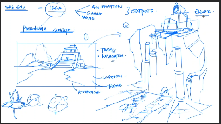
You are tasked with series of multiple exercises as listed below and are required to complete it within 10 weeks of learning and adapting to the fundamentals of Environment Design.
- Perspective drawings
- Composition
- Value painting
- Ambience
- Color management
- Vignette set design
- Photo bashing
Submission:
Complete Exercise Sketchbook. Note that each progression to be drawn on 2000 X 3000 pixels 150 dpi 16:9 ratio landscape for weekly practice.
WEEK 1 (29/8/2023)
To-do:
- Read MIB & Rubrics
- Look for an existing IP to focus on
- Sketch some environment designs with different styles
- Look for exterior and Interior designs
Lecture
Project brief in Mr Kannan style:

Exercise
 |
| Fig 1.1.1 Exercise mood board |
To start off the project, I brainstormed some of my beloved IPs and compiled a mood board consisting of their environment design. Some of the IPs include Gravity Falls, Luigi's Mansion, Hollow Knight, Little Nightmares, Mario Odyssey and Fire Emblem Three Houses. My plan? There was no plan. I was just going to wing it.
Perspective Studies
 |
| Fig 1.2.1 Perspective studies |
To get myself more familiarised with the perspective mumbo jumbo, I snatched images I found while building my moldboard, be it irl sceneries or art from games. I then start breaking down the perspective grids which I hope makes sense.
Environment Sketches
Moving on, I started drafting and playing around with environment sketches. I used this stage from Hollow Knight and expanded from there. The theme I went with was Temple in the Swamp, so I started looking up photos of ancient temples as a reference. A problem with these sketches though, is them being a bit too rough, with no proper line art, making the details look messy and undone. Still, that's the whole point of it being a sketch. I'll try the line sketch method for the next concept.
 |
| Fig 1.2.2 Concept 1: Temple in the Swamp |
 |
| Fig 1.2.3 Concept 1 environment sketches progress |
The next concept I tried was the Desert Dome. Nothing revolutionary, but I played around with greyscale compositions for the second sketch, and focused less on the details, instead focusing on the bigger shapes & silhouettes. I find this shape easier in navigating the big picture. Will continue to try out this method in the coming exercises.
 |
| Fig 1.2.4 Concept 2: Desert Dome |
Feedback
Focus on the main focal building and build the other smaller buildings around it. Games to refer to for the desert dome concept: Uncharted, God of War, Tomb Rider. Mr Kannan really prefers the temple in the swamp. He suggests locking down an idea ASAP to have a better focal point.
WEEK 2 (5/9/2023)
To-do:
- exercise
- Project 1 proposal

Lecture
 |
| Fig 2.1.1 W2 Lecture |
This week, we are exposed to the foundations of environmental design. We learn the thought process behind designing environments and buildings that are functional. Mr Kannan also introduced a line silhouette method to draw the base, which I will try out for the exercises.
 |
| Fig 2.1.2 In-class demo |
In Class Exercise
This is the first time Mr. Kannan asked us to do in-class activities, and it's intimidating and refreshing at the same time. Immediately I got to try the line silhouettes. We were tasked to complete a drawing with the prompts given within 20 minutes. The prompts were medieval houses, mountains, and peaceful.
We were given feedback on our line weight and scratchy lines.  |
| Fig 2.2.1 |
Project 1
Moodboard
I started looking up concepts and as much as I love urban landscapes, I felt like the forest and nature theme is calling out to me, so I went with it. My concept revolves around mystical forests and hidden mysterious buildings.
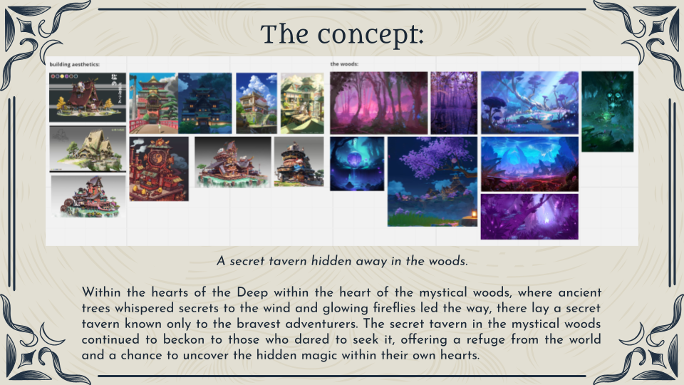 |
| Fig 2.3.1 Project 1 Moodboard |
 |
| Fig 2.3.2 Bathhouse sketches |
| Fig 2.3.3 Fortune telling hut sketches |
Feedback
- can consider combining both ideas, and create scenes where both are separated by different elavations
- Continue building the fortune teller hut
- Choose a specific IP to solidify the direction, suggestions like Avatar & Legend of Korra.
WEEK 3 (12/9/2023)
To-do:
- composition studies
- expand the buildings into sceneries.
- thumbnail sketches with gradient ambience
Lecture
 |
| Fig 3.1.1 Composition Studies demo |
This week, we learned about the composition basics to provide more depth to an environment design. We were taught how to utilize perspectives and create planes to elevate certain buildings to make the environment look more dynamic. A lot of elements like theme and ambience need to be taken into consideration.
 |
| Fig 3.1.2 Rule of thirds and golden spiral |
 |
| Fig 3.1.3 In-class demo |
 |
| Fig 3.1.4 Mr Kannan's work process |
With that in mind, I started building up some silhouette and composition studies. I also worked on values to provide some depth to the pieces. Most pieces I did were vertical, as I felt that it could potentially showcase my building more.
 |
| Fig 3.2.1 Composition studies (thumbnails) |
Here is the process of the thumbnails:
Fig 3.2.2 thumbnail process
Moving on, I made more detailed sketches with value painting. I also added lighting at the end, and tbh it's not looking very flattering at the moment. While I enjoyed the process, I can't help but realise how similar my composition is for everything. 1,2 and 3 are all buildings on top of a plain and elements on the side.
More references need to be studied and experimented with. It is also suggested to play around more with the scale of each composition, as well as to add motifs to make the overall look and feel more interesting.
 |
| Fig 3.2.3 detailed composition study |
Feedback
- value is slightly all over the place, foreground is not dominant enough.
- important to tell a story through the illustration
- start building the world with assets, symbols, logos, motifs.
- experiment with cascading - have an offset with buildings, and shift the weight of the building.
- too cluttered & cramped
- lookup more bathhouse elements
 |
| Fig 3.3.1 Feedback composition example |
WEEK 4 (19/9/2023)
To-do:
- study the environment of how to train your dragon, Arcane, puss in boots, spiderverse
- study the lightscape (highlights)
- further sketch development thumbnails + photo bashing and value painting (coloured)
Lecture
Offset and cascading. Have the buildings be a bit more skewed. Take note of the stability of the building and if it makes sense. Always remember to add the human silhouette for scale reference.
We are also given more examples of offsetting to make the overall painting look more dynamic. It's interesting to see how little details are able to give more life to a building.
 |
| fig 4.1.2 cascading and skewing effect |
 |
| fig 4.1.3 Offsetting and cascading |
 |
| Fig 4.1.4 segmentation |

 |
| Fig 4.1.6 The power of photo bashing + overlay & soft light |
Moving forward, I did more thumbnail sketches. Admittedly, the process was still taxing and snail-paced, but I realise that it has become easier and faster compared to the past weeks. I also tried the photo-bashing technique and was having a blast with it.
However, I still found my composition and perspectives to be lacking. Something is missing, so I decided to work on a few more perspectives.
 |
| fig 4.3.1 thumbnail sketches |
Afterwards, I tried applying colour and lighting with the photo bashing technique and painting over it after. I am honestly shocked by the result. Though it was not polished in any way, it gave me a clearer picture of what I am trying to achieve. I really like the colours.
 |
| fig 4.3.2 coloured values |
Feedback
- add and extend the building more. Add more assets. eg: statues, symbol
- be careful with the flowers. don't let it overpower the main building.
- Give the design more story & narrative
 |
| 4.4.1 week 5 feedback |
WEEK 5 (26/9/2023)
To-do:
- finalise the main piece (hero asset)
- Create the overview that is best suited for the set.
- work on assets of the building
 |
| Fig 5.1 Composition demo |
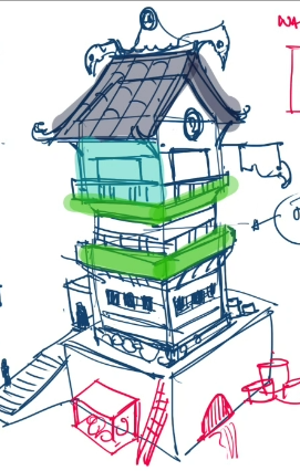
This week, I started working on the details of the main piece (hero asset). Based on my selected IP, I wanted to make the piece dreamy, but filled with traditional Japanese elements. I also started looking into the type of materials I wanted each element to be. After giving it a composition sketch, I broke down the building into two parts to ease my design process. One would be the main gate, while the other is the bathhouse. I took inspiration from the Watatsumi Shrine from Genshin Impact and decided to work from there. The main gate is ironically more detailed than the main building itself because I was more inspired in that direction, but i think more details need to be added onto the main building as it is technically the main piece.
 |
| fig 5.2.1 main building call sheet draft & mood board |
Moving on, I started sketching the little details and assets of the building. I think the design could be improved further by adding in more symbols, however, I do worry about the complexity being a problem when i actually have to work on the artwork. It's therapeutic now to add in details, but i just know it's going to be hell later...
 |
| fig 5.2.2 assets and details |
Feedback
- do not finalise the designs yet, explore ad experiment as you go.
- look for more references. Very detailed ones for every motifs and.
- come up with more expansion & exaggeration.
- look into overlapping & cascading. Thing about exagerrating parts.
- Expand the design based on the function. Showcase everything in a more fun.
- plan the scale of the building, Form follows function. Think about the interior as well as the location/terrain its set in.
- come up with a blueprint/ floor plan/ map
- try not to make the structure completely alien (the 壶 structure)
WEEK 6 (3/10/2023)
To-do:
- expand and exaggerate
- more thumbnail sketches
 |
| fig 6.1.1 workflow |
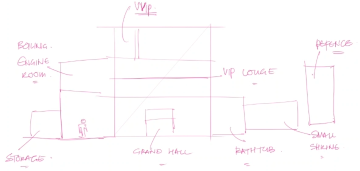 |
| fig 6.1.2 functionality |
 | |
|
We are suddenly going back to the thumbnail grind. After identifying the functions of each part of my building, i worked on more perspectives and composition. I also tried out photo bashing again to give an ambience to the overall look and feel of the piece.
 |
| fig 6.2.1 Week 7 progress |
Feedback
- compile very detailed reference photos of each part
- add more props as details
- look at the values
- experiment & explore with the little functions of each mechanism
- instead of water coming out of windows, can consider pipes
- Perspective 3 looks good to go for. Perhaps can add perspectives 2 and 3 together.
WEEK 7 (10/10/2023)
To-do:
- polish up everything for submission
 |
| fig 7.1.1 project 1 submission expectations |
 |
| fig 7.1.2 value painting example |
I spent the week compiling my exercises and progression for the first submission. I added a colour palette based on my IP, giving the main piece a cooler tone than its original brown. I quite like the splash of colour, actually.
 |
| fig 7.2.1 Colour management |
Final Outcome
Exercises: Technical, Digital Matte Painting Sensibilities
Project 1: Exterior and Landscape Design
WEEK 8 (17/10/2023)
This week, I started polishing up my progress from the past weeks. I started by recompositing my thumbnails with the current-kind of more finalised design. I also shaded them in b&w to give it more value and depth. I tried out different angles and finally settled on the one that I felt could showcase the building and tell a story the best.
 |
| fig 8.1.1 composition value painting |
 |
| fig 8.1.2 coloured version |
 |
| fig 8.2 Ambience lighting |
WEEK 9 (23/10/2023)
After some reflection, I feel that they could use a bit more cascading to look more dynamic.
 |
| fig 9.1 hero assets |
Feedback
 |
| fig 9.3. extension feedback |
- expand certain parts to make it look more polished
- add in unique symbols & identity
- be careful with the usage of purple as it may blend into the night
- choose another colour for the pier
- for rocks & natural elements, good to retain their original natural colour.
- clean up the sketch, extend it a little and ready to submit :D
WEEK 10 (31/10/2023)
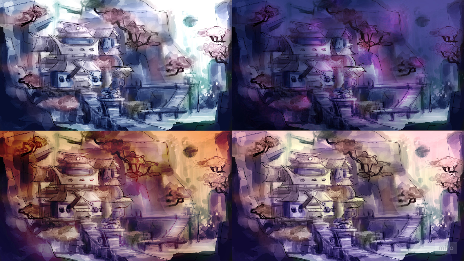
After the feedback, I worked on polishing up the ambience and the overall exterior splashart plan. I changed up some colours according to the feedback. Overall the 2nd attempt at ambience looked softer and more cohesive than the last.
 |
| fig 10.1.1 ambience attempt 2 |
Next, I cleaned up the lines but the more I did it the more I felt like I needed to block out the 3D. I might actually do it, but perhaps for my final. Now, this is how it looks. I also added in some props to give it a more complete look. Though I think I will polish it up further for the final submission.
Final Outcome
Project 1: Exterior and Landscape Design
Project 2: Interior and Set Design
WEEK 10 (31/10/2023)
To-do:
- interior 4 areas
- polish up exterior
This week, I worked on the interior sketches. I broke down my building and chose 4 main sections I could draw. I liked the sushi bar most, but the rest felt more fitting to the main theme of my building, which is a bath house.
 |
| fig 10.1 interior sketches |
Feedback
- Think about duplicate-able elements to be implemented
- 2 & 4 looks good for 3D
- add some colours
- block out
- think about the blueprint/ floorplan
- final needs 1 polished exterior & 1 polished interior
WEEK 11 (7/11/2023)
To-do:
- 3D blockout of interior
- 3D blockout of exterior
- polish up interior
 |
| fig 11.1 Project content and expectations |
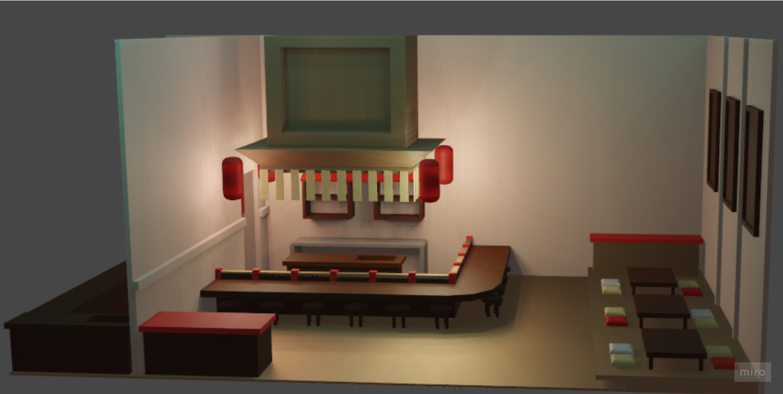
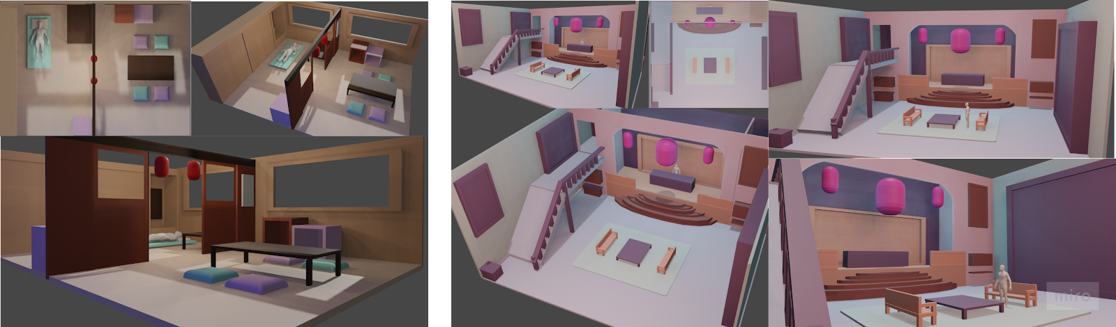
This week, I worked on blocking out the interior in Blender. I am hoping to be able to work on all 4, with my focus on either the main hall or the sushi bar. With these 3D models, I will be able to sketch out the locations and approach the perspectives and lighting better.
 |
| fig 11.2.1 Main Hall sculpt |
 |
| fig 11.2.2 suites sculpt |
 |
| fig 11.2.3 Sushi bar sculpt |
- Think about the scale and functionality of the mechanisms
- Think about painting over the 3D model
- tie everything together with a narrative
- do 3 variations of objects/chairs
WEEK 12 (14/11/2023)
To-do:
- add textures
- add colours
This week, I started working on the 4th and final location sculpting, the sauna. I kept the designs simple to get the overall look and feel of the location. I looked up tutorials on how to sculpt the rocks and later realised that I could've just taken it from Sketchfab. Anyways, I can sculpt rocks now.
 |
| fig 12.1.1 Sauna sculpting progress |
Based on the initial floorplan, the indoor sauna will connect to an outdoor one, so there are door openings and stairs all around for people to exit to the outdoors.
 |
| fig 12.1.2 sauna 3D sculpting |
 |
| fig 12.1.3 Sushi bar extension |
 |
| fig 12.2.1 Base colours progress |
- make the frame thinner
- take note of the thick objects. thick objects indicate big in size
- put a 3d person inside
- sauna colour
- add more character, details and props
- add pillars
Final Outcome
Project 2: Interior and Set Design
Final Project: Complete Environment Design Bible
WEEK 13 (21/11/2023)
This week, I worked on readjusting the scale of every room by inserting a human model into the scene. This helped a lot in determining the thickness of objects for the scale to make sense.
 |
| fig 13.1.1 readjusting scale (suite & main hall) |
 |
| fig 13.1.2 readjusting scale (sauna & suites) |
Once that's settled, I started working on adding more details to the rooms. It was a challenge adding props and objects as I usually prefer rooms that are minimalistic, clean and practical, but in entertainment design, these props will play a big part in telling a story. I looked up assets I could use on Sketchfab. I also added more ceiling details for my main interior location, the sushi bar.
 |
| fig 13.2.1sushi bar extended w details |
I then proceeded to capture the best angle from my 3D model to work on the splash art. I was initially hesitant about how to paint over it as the base colours, shadows and highlights of all objects are in the same layer, but i decided to just wing it and it turned out okay. I added textures, lighting and ambience for a better narrative. I worked on both the sushi bar and the sauna.
 |
| fig 13.3.1 sushi bar and sauna splash art |
Feedback
sushi
- start building the assets
- add more details and textures ( like brick cracks)
- add more depth, give the furniture some extrusions
- can add vents on top! Or an open window
- can add moss/mould on the walls
- colour too warm
sauna
- emphasize the cavities
- add more assets (carpet, patterns, bonsai trees, zen elements)
- water should be more blue
- pipes?
- water splashes, wet areas
- add more story
- add foreground
 |
| fig 13.3 W14 feedback |
WEEK 14 (28/11/2023)
This week, I started refining my splash art from the previous week's feedback. I added in more textures as suggested, and since I really liked the idea of the open window ceiling, I adapted it into my final design as well. I also added more props into the scene to make it more alive and lived in. It was a challenge adding in moss or vegetation details, because once again, realistically speaking I would not want to dine in a place like that, but for entertainment purposes, I put in the moss, I put in the flaking wall cracks and it looked cool.
To-do:
- sculpt exterior
- interior assets
- exterior splash arts
- interior splash art
- art bible
 |
| fig 14.1 Lighting and ambience |
 |
| fig 14.2.1 Sushi bar assets |
Finally moving onto the final stages of this module-refining the exterior. I am absolutely expecting to finish this by the 5th, but I'm writing this on the 7th, so clearly that couldn't be a good sign.
To refine the exterior, I started getting ambitious and ended up changing up the layout slightly. Instead of having my buildings clumped together, I added some corridors to spread out the silhouette. I think it helped build a wider environment instead of just a random building sticking out in the middle of nowhere.
After some consideration, I also changed the colour of the building. The initial baby blue was cute and stayed true to the original Watatsumi Island colour scheme, but it felt too bright and sort of blended into the surroundings, so I changed it up to peachy brown, the shade that matches my interior material. This gave it a more cohesive overall look. I altered many of the shapes to match my interior.
I tried modelling the exterior, but my odd shapes made it a difficult feat that I ended up stopping halfway. Running out of time, I decided to just head straight into sketching and it was the most "trust the process" experience I ever had. I photo-bashed the hell out of everything and honestly am not very satisfied with the final outcome. Given more time, I would refine this by adding more windows and details in the future. I still spent 10 hours on this though, not sure what that says about my skills.
 |
| fig 15.1 Splash art process |
I worked on the assets next. It was mainly the same assets I did earlier in the semester, but now I added colours and textures.
 |
| fig 15.2 Exterior assets process |
Final Outcome
Final Project: Complete Environment Design Bible
Environment Design Final Project_draft.pptx by Jiahui Leong
Exterior Splash art
 |
| fig 15.3.1Exterior Splash Art |
Exterior Assets
 |
| fig 15.3.2 Exterior Assets |
Interior Splash Art
 |
| fig 15.4.1 Suites Splash art |
 |
| fig 15.4.2 Sauna Splash art |
 |
| fig 15.4.3 Sushi bar splash art |
Interior Assets
 |
| fig 15.4.5 Sushi bar assets |
Reflection
This was probably the module where I poured the most heart and effort into. It was nothing short of a torturous experience, but I was enjoying it the entire way like a goddamn masochist. I think many aspects of my design and illustration skills have improved throughout the semester, and even more significantly so compared to the previous semester. It was also through this module that I got to polish up my skills in Blender, and learned an alternative towards illustrating something from the ground up. Photobashing also came in handy in this module, and I surprised myself by applying different aspects and elements I've learned in Entertainment Design to complete this module.
But with all honesty, I'm probably only able to say these positive things about the entire process because I'm officially done with it. Hands down one of the steepest learning curves I've ever had.
Comments
Post a Comment