
1/9/2023 - 8/12/2023
Leong Jiahui / 0353469
Bachelor of Design (Honours) in Creative Media
GCD 62004/ GAME ART
Instructions
Assignment Brief
Exercise - World Creation (Fantasy ) ART DIRECTION Proposal with Sketches and Thumbnails
You are to choose a game in which you intend to alter the art direction/aesthetics. (*note that you are not creating a game design, only art) Based on your choice you are to then create a world with initial concept arts and collections of reference and extract information/components that are shown in your mood board which explains the following:
- Time
- Era
- Ambience and mood
- Back story
- Crisis
- Culture – design component representing their race, worship, colors, materials used, etc
- Ecosystem – who lives there, what do they do, animals, creatures, flora etc
- Geolocation – plain, mountain pass, dungeons, temples ruins, highlands, sea, river, forest etc.
- Architectural design – structure, monuments, relics etc
- Resource – nuclear, oil, crystal etc (can be any motif, candy,food, etc)
- Genre – Horror, Comedy, Drama etc
- Target audience – range max to 8 years
- Theme - (Fantasy – South East Asian) + Sci-fi, Post War, Post Apocalypse, Medieval, etc.
- Classes/hierarchy
- Transport – man-made, animal, hybrids, portals etc.
- You are to include Southeast Asian culture, folklore or any unique component to your design. Your art style could follow any style as long as you alter it to define a unique style with functions and aesthetically pleasing.
Submission:
Slide in .pdf format landscape. 16:9
WEEK 1 (1/9/2023)
To-do:
- Download and try out Brawlstars
- Study Brawlstars (characters, environment, colour scheme, aspect ratio of screen/character, UIUX, colouring style)
- Install Topogun
- Moodboard for Art direction
- Sketch character Ideas
First, we are tasked to play Brawlstars and get to know the content and the mechanics of the game. It's a quick and fun game, but honestly, it's not my cup of tea. It does remind me somewhat of Cooking Battle in terms of aesthetics and map design, a game I was obsessed with back in high school.
 |
| Fig 1.1 Trying out Brawlstars |
 |
| Fig 1.2 Trying out Brawlstars (and winning :D) |
Tasked with creating another world (stage/event + characters) for Brawlstars, I started compiling a mood board. I also did some visual studies on the structure of the game elements to better understand its design and aesthetic choices. If I had to nitpick though, I do feel that the character screens (for winning, eg: Fig 1.2) are a bit dull. I'm not sure if the screen becomes fancier as the level increases, but from online research, it doesn't seem like the case. Putting a pin on that.
 |
| fig 1.3 W1 moodboard |
Moving on, I decided to start small with the character concept sketches first. Chat GPT, my good friend, helped generate detailed descriptions of the character ideas I had. It helped a lot with the visualisation of said ideas, and provided me with a lot of cool names and attack ideas too, which was neat.
I personally enjoyed the chef character most, and found her to have the most potential to continue developing both the character and the world, however, there is already an existing chef character in Brawlstars, so I may reconsider.
Character Concept:
Feedback
- speed drawing
- evaluate the hero type (archetype/class)
- Further develop all characters roughly, then continue to develop
- Tone down the complexity, as it is a mobile game
- study the Brawlstars art style more and adapt it to the current designs
- Reduce flowy & heavy elements that pop out
- best to sketch out characters with 3/4 view
WEEK 2 (8/9/2023)
To-do:
- Experience and interpretation for Brawlstars
- Environment design sketches
- UI/UX study
- More extractions from the game
- Proposal
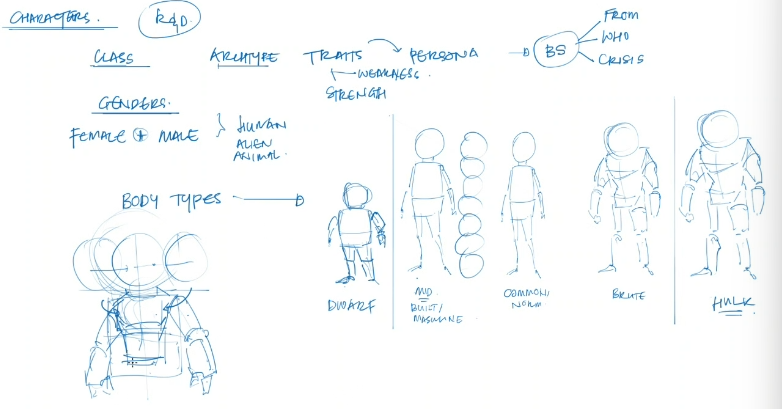
This week, we learned about the ways to extract information from a game design. There are many aspects to determining the character archetype, where all elements like the silhouette need to be taken into consideration. More breakdowns have to be done in all sections - character, environment and UI/UX. We also got a crash course on character design 101, which I'm surprised to say that
 |
| Fig 2.1 How to extract information from designs |
 |
| Fig 2.2 Building a character |
I started to sketch out the further development of my previous sketches. I studied Brawlstar's art style more and sketched this batch in a more similar style. I also took into consideration last week's feedback about frilly and flowy components as it is difficult to incorporate into the game mechanics. With that in mind, I also exaggerated the weapons and included them in the silhouette of the character. I started building up the characters based on their archetypes as well.
Feedback
- conceptually it may be fun, add more abilities and develop further.
- develop more sketches for the same character to express their personality and skills better. Also try out their costume sketches, a full character sheet basically. EXPLORE.
- try out & experiment variety of body types.
- pose better to showcase the skill.
- consider the technicalities (how much space will the character take?)
- take note on the usage of cigarettes & alcohol in game design.
- consider the animations of the character. How can a basic animation showcase what the character is doing? Have a visual representation of how the actions/attacks are done
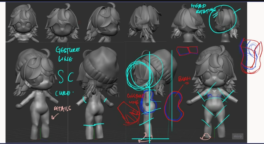
This week, we received a crash course on character design. We studied how characters can be stable, gestures and lines. Outlines are important to provide more detail and clarity to the design.
It's important to explore everything that is related to the design of the character, from the body type to the outfit and props the character carries.
 |
| Fig 3.1 body types |
 |
| Fig 3.2 body proportions |
 |
| fig 4.1.1 Parcel Punch character attack sheet |
 |
| fig 4.1.2 Whiskers character attack sheet |
Feedback
- push the art style further. Brawlstars is only a base.
- sculpt with mannequins or templates as the base. Do not need to work from scratch.
WEEK 5 (29/9/2023)
To-do:
- Sculpting characters (practice blender)
- treasure chest practice (blender)
- detailed battle animation sketches
This week, we explored various 3D software. Mr Kannan broke down the mesh and poly counts, as well as the technical aspects of the different types of software. We were also given a tutorial on Blender.
 |
| fig 5.1.1 3D software 101 |
 |
| fig 5.1.2 Sculpting tutorial on Blender |
 |
| fig 5.2.1 parcel punch character action sheet |
I also tried out some modelling. It's been months since I've touched 3D modelling, and it's like an awkward run-in with an old friend that you used to be close with. I compiled a lot of references on Pinterest. Pretty sure most of them are AI-generated, but the style is cute and I want to go for it. The hair is time consuming to work on, and the sides are a bit tricky but I am doing my best :')
 |
| fig 5.2.2 Parcel punch 3d model progress |
Feedback
- Further push outside of my comfort zone when it comes to character design.
- Try out more body types.
WEEK 6 (6/10/2023)
To-do (due W8)- create a monster (refer to dofus)
- 2 hero, 1 boss / tank,dps,support
- unique props/weapon
- arena
This week, we explored arenas. We are advised to start with grids and blocks to plot out how we want the layout to be. It is important to note that the props and designs should not be too complex. Omit complicated details as the arena will be small and it will not be visible.
With this, I started brainstorming ideas for my arena. I wanted to go with a post office theme to match my character, Parcel Punch. It was a challenge to come up with ideas for props and
 |
| fig 6.1.1 Arena tutorial |
 |
| fig 6.2.1 arena sketches |
Feedback
- place big objects on the side and not in the middle as it may be too distracting
- think about the boost power-up object
- make sure to establish a clear grid space to position obstacles (grey box)
- no need to make the details of the fingers. do 3 piece is enough
- work with textures. can minimise the datils of sculpting
- the torso should be like a bean and now a bean and not a pear
- look at the stability of the character. Give it a head tilt so it is balanced.
- introduce rhythm into the design (3 types of variation) for each - props

zremesh > check polygroup
WEEK 7 (13/10/2023) & WEEK 8 (20/10/2023)
To-do (due W8)
- complete the sculpt & polygroup (to indicate where the UV goes)
- arena grey box
 |
| fig 7.1.1 Arena grey box |
 |
| fig 7.1.2 arena tutorial |
This week, I began working on compiling the necessary submissions for the exercise deadline in Week 8. I revised the arena by adding a grey box concept and plotting out the obstacles. I also continued working on sculpting my character, giving her proper limbs and a skirt.
 |
| fig 7.2.1 sculpting porcess |
Final Outcome
Exercises: World Creation
Project 1: Character Design and World Creation (Concept Art)
WEEK 9 (27/10/2023)
This week, I added and refined certain elements to the arena. I gave it a 3/4 top-down view and blocked out how I wanted the obstacles to be. It was a lot of fun plotting out what kind of obstacle I wanted to put in that fits the theme.
 |
| fig 9.1.1 arena-santa's workshop |
I also continued working on my model, and tried out UV unwraps. However, it has been a struggle to figure out UV unwrap as it has been a while since I did that, and it didn't work as planned. I also re-topo the model into a low poly model before adding colours to it. I also came up with different colour combinations to try out. Overall I felt that the model was still lacking in detail, and the costume was very basic. I will focus on giving her props moving forward.
 |
| fig 9.1.2 Sculpting progress |
Feedback:
- refine edges
- sleeve edges do not stick
- add more wrinkles
- sharpen the shoes
- refine the gloves
 |
| fig 7.3.1 W9 feedback |
Final Outcome
Project 1: Character Design and World Creation (Concept Art)
Project 2: 3D/2D Character & Environment
WEEK 10 (3/11/2023)
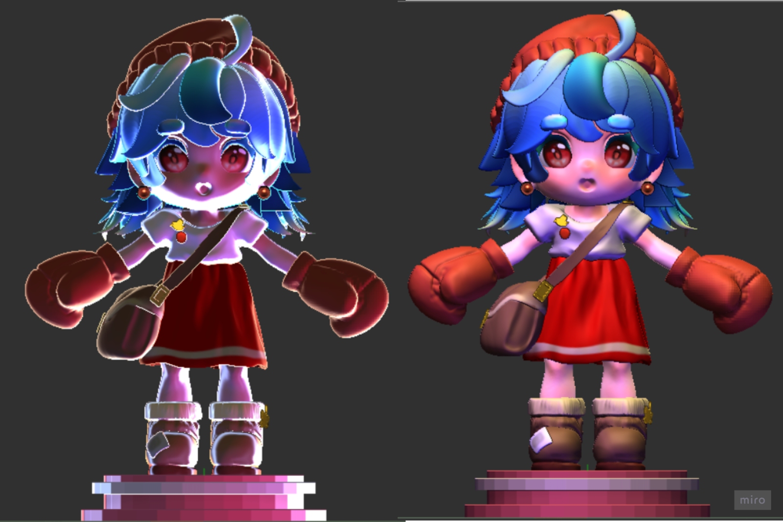
This week, I added details to my character. I gave her boxing gloves to fit her parcel punch identity. I also refined certain details, mainly her clothing folds. Her letter bag was sculpted as well, adding asymmetrical elements into her overall design.
 |
| fig 10.1 W11 sculpting progress |
 |
| fig 10.2.1 colour schemes |
 |
| fig 10.2.2 failed mouth attempt |
Feedback:
- make the skin tone paler
- change her hair colour to dark blue and add some highlights
- give her face more colour details like blush
- play with the lighting
- try out substance painter
WEEK 11 (10/11/2023)
To-do
- Download Substance Painter and try out
- refine character model, add gradients
- sculpt assets based on the environment
- refine arena & polish up assets (3 types for each asset)
- retopo , project & UV before moving to substance
- try out mixamo rigging
- try out Daz 3D
- Marvellous 3d (for garments)
- dragonbones
This week, we had a quick crash course on the basics of Adobe Substance Painter. It looked like a very fun programme to venture into. We were also introduced to many 3d modelling software and tools.
 |
| fig 11.1 Substance Painter tutorial |
 |
| fig 11.2.1 topogun try out |
 |
| fig 11.3.1 Character refinement |
Moving on, I started blocking out my arena. I'm doing the Christmas Santa's workshop instead of my post office since I find the assets to be more fun to make. I looked up tutorials on how to make presents and candy canes, but due to time constraints, I only managed to work on a very rough blockout. The area is still quite deserted.
 |
| fig 11.3.2 Arena block out |
Feedback:
- continue to block out the arena
- work on the props for the character
- paint over effects for the character in the splash art
- give the character a lighter skin tone (as her clothing are already dark warm colours)
WEEK 12 (17/11/2023)
To-do
- look up references when retopo
- retopo model
- UV unwrap in blender
- paint model in substance
- download unity
This week, we were taught the fundamentals of Topogun to work on retopoeing our model. It was emphasized that we must look up references and work from there. The overall process seems like a long therapeutic pain that will kill me slowly from the inside.
 |
| fig 12.1 topogun tutorial |
To start the process, I did final refinements on the model. I enlarged the gloves slightly to give them more emphasis as one of her main attack modes (i decided that approx 0.1minute ago). Also gave her some eye lids. I think she's looking cute.
 |
| fig 12.2.1 sculpting refinement |
 |
| fig 12.2.3 parcel punch turntable |
 |
| fig 12.3.1 Teddy bears from sketchfab |
 |
| fig 12.3.2 arena sculpting |
Final Outcome
Project 2: 3D/2D Character and Environment (Porting and Testing)
Final Project: Art Bible
WEEK 12 (17/11/2023)
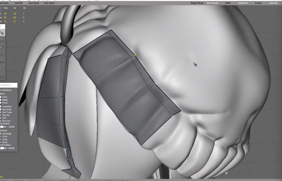
This week, we were taught how to make effective topology, especially in the seams and ligaments for the best rigging outcome. There are many elements to consider when making either quads or tris, so that the topology folds correctly.
 |
| fig 12.1.1 topology 101 |
 |
| fig 12.1.2 topology 102 |
 |
| fig 12.1.3 topology 103 |
Moving back to my own retopo process, I started with the body base. I looked up several references on Pinterest and began my journey in topogun. The software was a bit tricky to manoeuvre in the beginning but I eventually got the hand of the basic controls. Software not having a universal control system is going to be the end of me someday.
 |
| fig 12.2.1 topogun retopo process |
 |
| fig 12.2.2 retopo of all subtools (excld. hair) |
It was a slightly masochistic how therapeutic the process felt, until I reached the hair, and my breaking point altogether. The pleats of the hair were very complicated, and my possibly sub-par sculpting of the hairs inside the scalp made it worse. With a lot of overlapping, the tool kept detecting the wrong pleat of hair, making the mesh a mess, and I had to readjust each point one by one. To make things worse, the points' placements looked different from different angles, making the adjusting process a lot more tiresome and complicated than it should've been.
Feedback:
- go into zbrush and zremesh the hair to the max
- cut of unnecessary parts of the mesh before retopo-ing
- can select vertices and modify>relax to smoothen
- try out the draw (pencil) tool as well
 |
| fig 12.2.3 W13 feedback- retopo |
 |
| fig 12.2.2 W13 feedback - retopo 2 |
WEEK 13 (24/11/2023)
To-do
WEEK 14 (1/12/2023)
Insane week, dare I say. This week, I started working on... Well, a lot of things. To start off, I booted up substance painter and made sure I know how it works before I set it aside for a bit to polish up my previous works (and *cough* other modules) I practiced a bit with the demo model and tried out the fill layer and paint layer. Alos baked my model and learned how to project high poly model to this low poly one.
Switching the scene, I went back to polishing up my character showcase. Honestly, with how my model looked after retopo and the impending doom of substance painter and worse, unreal, I can already foresee the lacklustre outcome in the end. So, I decided to work on the character and arena showcase more, so there's more to show at least. I started off with a quick and simple character poster. I doubled it as the character splash art.
Moving on, I worked on the arena. I looked up more models from sketch fab and filled up the remaining empty spaces in the arena. I went in with the base colours before placing in my character. I then positioned the arena in the angle I wanted to showcase and exported it to be painted over.
While painting over, I added more textures, shadows and highlights to give the arena a more polished look. I think the arena looked a lot better and complete with the textures added.
- look up references when retopo
- complete retopo
- UV unwrap in blender
- start substance painter
NEVER BACK DOWN NEVER WHAT??
I continued the grind to complete the hair and beating myself up for giving her pigatials. Eventually I gave up trying to get all the depth and creases of the hair because it was making my life miserable. I learned that it was possible to increase the hair volume by adjusting it in blender, so I'm going to do just that. The hair ended up looking like a sad sheet of paper at the end, so I'm really counting on Blender to be able to fix this or I'm screwed.
I'm realising that I only have one photo of my hair retopo process. If that's not proof of devastation and a cry for help idk what is.
 |
| fig13.1 hair retopo (in pain) |
Next, moving into Blender we go. The base mesh doesn't look all that bad, if I'm being honest. The silhouette is there, and that's gotta count for something I guess. Shade smooth in Blender made the entire mesh look bloated and disturbing, but my mind had since adjusted to the new look.
 |
| fig 13.2.1 mesh in blender ready for UV unwrapping |
UV unwrap was a whole other ordeal of confusion, but I tried looking up as many references possible to determine the seams and cuts for each subtool. Most of them still looked like a mess, but if it works it works, with this short amount of time, my main goal is just to make sure I understand the workflow and process and create a decent-looking outcome.
 |
| fig 13.3.2 UV unwarp process |
WEEK 14 (1/12/2023)
Insane week, dare I say. This week, I started working on... Well, a lot of things. To start off, I booted up substance painter and made sure I know how it works before I set it aside for a bit to polish up my previous works (and *cough* other modules) I practiced a bit with the demo model and tried out the fill layer and paint layer. Alos baked my model and learned how to project high poly model to this low poly one.
 |
| fig 14.1 Substance painter trail |
I wanted to give the poster a very stylized look, with a neon-retro vibe.
fig 14.2.1 Parcel Punch poster illustration process
 |
| fig 14.2.2 Parcel punch character poster |
I worked on the ambient lighting next. This reminded me a lot of last semester's anatomy class where we had to showcase our model, but I think there was a good overall improvement in comparison. I made one with extreme dramatic lighting and another with reddish lighting. I made playing cards with them for fun, and proceeded to work on a showcase poster.
 |
| fig 14.2.3 Ambient lighting |
 |
| fig 14.2.4 playing cards |
 |
| fig 14.3.1 arena showcase in blender |
While painting over, I added more textures, shadows and highlights to give the arena a more polished look. I think the arena looked a lot better and complete with the textures added.
 |
| fig 14.3.2 Arena- Santa's workshop final outcome |
To be honest, this arena was built based on a skin idea i had for ParcelPunch. If she was in her Christmas santa claus skin, this would make a lot more sense, but unfortunately I did not have enough time to develop that skin. Hopefully, I will be able to polish it up and complete it during sem break. Completing the task in hand is still the priority, and designing skins is not one of them.
Moving onto the not-so-final stretch, I worked on the assets for both character and arena. While the character assets are all hand-drawn, the arena assets are all modelled. There are 2 models included that were plucked from sketchfab, and are credited accordingly.
In the end it looked like this:
As much as she looks like my sleep paralysis demon, she is also enough. So here's the log of an attempt made. I've also realized halfway that the brows were not there for some reason. I didn't retopo the brows just for them to not show up but... I'll refine it at a later date. Now let's try to throw this girlie into unreal engine and we can wrap this up.
This is, in fact, not abstract art. I have no idea why it looks like this, and honestly, I'm too tired to care.
 |
| fig 14.4.1 character assets |
 |
| fig 14.4.2 arena assets |
WEEK 15 (8/12/2023)
Substance painter not responding every stroke I make it not the ideal way of working, which also explains why this took 3 hours to complete, and I wanted to die. It did crash my entire PC and gave me a heart attack, but after the restart it ran a bit smoother, so I managed to push through and complete the painting. With everything lagging and threatening self-destruction at any moment, I kept it simple and did not try to be adventurous or ambitious with any of the painting in substance.
I also attempted baking the high-poly to my low-poly mesh, it worked, but not a lot. It could be mainly due to my high-poly model not having enough, highly distinguishable detail for it to be obvious. But hey, at least I tried and know how it works now. This is a common theme with my assignments. Just a compilation of "It's not perfect, but at least I tried".
 |
| fig 15.1.1 baking in substance painter |
 |
| fig 15.1.2 substance painter process |
In the end it looked like this:
 |
| fig 15.2 painting in substance painter |
This is, in fact, not abstract art. I have no idea why it looks like this, and honestly, I'm too tired to care.
 |
| fig 15.2.1 Unreal engine is killing me |
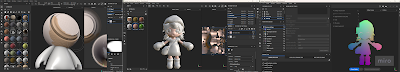
She's HUGE, This is exciting. It actually worked, I'm so touched. It looked UHM questionable, like why is her shirt orange, but it worked, and that's all that matters.
 |
| fig 15.2.2 ParcelPunch in Unreal engine |
 |
| fig 15.2.3 ParcelPunch in Unreal engine in colour! |
Final Outcome
Final Project: Art Bible
Game Art Final Project by Jiahui Leong
Art Bible
Reflection
This module turned out to be a very different experience than I had anticipated. I expected a lot of drawing and concept art-related work, but I came out of it with knowledge of 3 new software. It was honestly very overwhelming, and I feel like the module could've been structured better to reduce this. The influx of new skills we are expected to pick up in the final 3 weeks took a big toll on everyone, especially when the end of the semester is the busiest time.
This was a very heavy and difficult module, and I am glad I managed to push through it. I managed to further sharpen my skills in Zbrush, and understand better the basic workflow of creating a game from sculpting to UVs to painting to Unreal. My submission honestly felt like a compilation of trials and mostly errors, but it was a good attempt and I've managed to learn from the mistakes made. I definitely will polish everything up when I can, but for the sake of the submission, I did my best with the time I had and had to wrap it up here.
Signing off from Game Art 🙏
Comments
Post a Comment