 Week 3 - Week 6
7/5/2024 - 28/5/2023
Leong Jiahui / 0353469
Bachelor of Design (Honours) in Creative Media
GCD62104 / DESIGN EXPLORATION
Instructions
Task 2 : Ideate a Solution for the Problem Statement
WEEK 3
Moving on, we started working on ideation for our project. We decided on a list of features that we may want to implement for the app. We compiled a mood board on the UI/UX (app & website), the branding, mascot as well as the marketing plan. We considered factors mentioned previously by our clients, and their preferred art direction for their app.
 |
| fig 3.1 moodboard |
After much discussion and voting, we narrowed down our preferences. We all agreed that:
Mascot
Twin mascot was the way to go. It was an interesting concept that can capture both the characteristics of the contractor and the homeowner, our 2 target audiences.
Logo
Abstract and simple shapes are more memorable and identifiable. The play of negative space as well as the clever play of shapes to form letters is an interesting direction to explore.
Application/microsite
A clean and minimalistic look is the main goal. It should be consistent on both sides and should be the main focus of the entire project. The rest of the elements should be made to suit the app.
Colour scheme
Derived from the client's initial preference, we found more complimenting colors to match and provide more contrast. We hope to achieve something that is vibrant and distinguishable.
Social media
We are looking at some simple and clean but trendy design layouts that align with our application outlook.
Pitching Video
Simple but impactful is what we are going for. We take Apple's video the main reference.
 |
| fig 3.2 Final art direction moodboard |
WEEK 4
This week, I worked on some mascot ideation sketches. Going off from our moodboard, I tested out the twin concept on various body types, from frogs to humans to a more cartoony retro style. It wasn't very innovative, but I also started exploring on what kind of tools and props best represent the homeowner and contractor. The contractor was visibly more identifiable with the hat and uniform, the challenge lies more in the homeowner side. The only prop that I felt was clearest was a key.
 |
| fig 4.1 mascot skecthes |
After discussion with the group, we decided to go for Jun Zhe's idea, as it better represents the brand and its identity. With the Monitor head representing the "cube" in QuantoCube, we proceeded to brainstorm on how that could be portrayed by the homeowner. While we wanted the mascots to have a twin concept, we still wished for some variation in terms of the silhouette. With that, I suggested a TV as the head for the homeowner. The antenna brings slight variation to the silhouette, and it fits the theme of a "homeowner" as well. I also played around with other home elements that could potentially be used as a motif, like the power plug.
 |
| fig 4.2 homeowner brainstorm sketches |
Meanwhile, the rest of the team started working on the logo designs, UIUX workflow and social media plan. We all came together to vote for our favourite designs and gave each other feedback and suggestions on what can be implemented or improved.
 |
| fig 4.3 initial logo sketches |
 |
| fig 4.4 social media plan Besides that, we also had a meeting with the client to align our ideas and get to understand more of their views and expectations for each aspect of the project. We also got to clarify our doubts about certain aspects of the project, and gotten feedback from their end. Here is the meeting minutes that I have compiled for reference: |
fig 4.5 meeting minutes with client
Feedback
- Mascots can take on different styles (2D and 3D)
- Consider trying out a simpler abstract design
WEEK 5
This week, we focused more on fine-tuning and refining our ideations. I helped to compile a mood board of the icon styles that we can use for our application. I focused more on 3D designs, as the group has previously mentioned about the interest in exploring that. However, we decided to revisit this at a later date, as the application wireframe needs to be solid before implementing the icons. |
| fig 5.1 icons moodboard |
 |
| fig 5.2 logo progression |
The social media posting and pitching video storyboard was also drafted, we all pitched in and gave our suggestions and feedback on them.
 |
| fig 5.3 social media plan and pitching video storyboard |
In the meantime, we also started working on the presentation slides and project document for next week's presentation and submission. I helped with the writing that needed to be done for the project document. I also helped gather a list of potential merchandise to be launched for the contractors working with QuantoCube, as per requested by the client. I focused more on practicality, compiling mainly apparels and tools that the contractors can use during their work. After getting a greenlight from the rest of the team, I proceeded to make the mock-ups with our QuantoCube logo on them.
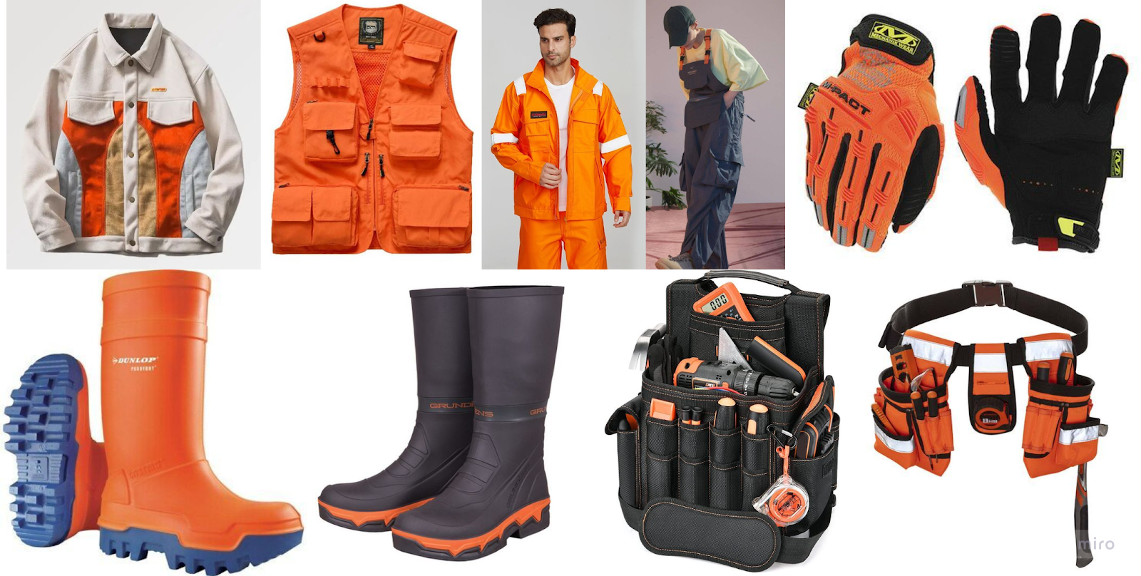 |
| fig 5.4 contractor merchandise moodboard |
Feedback
next week:
- wrap up task 2
- prepare slides & task 2 presentation next week
- begin ideation for prototyping
feedback:
logo:
- prefers idea a (geometric shape) and d (adjust the strokes)
- b not a great idea atp
- fgh looks like graduation hat.
- put in the wordmark
mascot:
- shouldn’t be too different so they can stay as a “twin”
- colour palette works very well with the mascot
- key is too detailed, might easily get lost. Make it bigger and more significant
- continue to develop the colours
Social media:
- check w the client on their preferences w templates
- colour palette and typeface is good
- consider how the information can be presented to the client
Icons:
- translucent is not that practical. Must have 2 sets
- simple & curved (rounded corners)
- avoid perspective
- align with mascot & overall art direction
- note that this is only a small part of the app. Consider the significance of them and the amount of time we want to spend on it
Application:
- consider how this information should be presented to the client
WEEK 6
It's presentation week! We presented our ideas and got feedback from ms Lilian. We also took notes during the presentations of other groups, hoping to learn from their ideas and rationales in order to improve our execution. I think all groups came up with very organized and innovative solutions to the problem, it was interesting to see what everyone came up with.
Feedback
Presentation feedback
- Slides pacing are well considered
- App should come first as it is the most important outcome
- User flow is very conceptualised and extensive, love the community page addition
- Graphic elements are not strong, develop from the brand identity
- Pitching video idea was very brief
- Merchandise is a good outcome, but need to consider client can present it
- Overall togetherness is still unsure until prototyping stage
- focus should be on the app design
Application
- contractor dashboard can be more complex
- remember to credit ikea for all the elements used. Alternatively, look for stock images and royalty free elements ( sec.hu )
- skin by next week
- Think about how the app design can be aligned w the rest of the elements. The cohesiveness of all ideas into one
- unsure of how the mascot can be applied into the app, socmed and overall look
Social media
- graphic elements need to be made from whole distinguishable components, do not break them
- graphic elements need to be aligned with the rest of the elements
Reminder
- slides & peer evaluation due 12pm
- Blog (design journal) needs to be done by next week
Task 2 Final Outcome
Canva board:
MBTIC3 by PeiYun Presentation Slides:
CDP @ MBTIC3 : Task 02 Presentation by Jacqueline YungProject Document:
Reflection
Experience:
Throughout task 2, we focused on ideating for the QuantoCube project. We developed a list of app features and created a comprehensive mood board covering UI/UX, branding, mascot, and marketing plans. I worked on initial mascot sketches, experimenting with various styles and props. After group discussions, we chose Jun Zhe's monitor head concept for the contractor mascot and decided on a TV head for the homeowner to maintain a twin concept with some variation.
The team also worked on logo designs, UI/UX workflows, and a social media plan, collaboratively reviewing and refining our ideas. We met with the client to align our concepts with their expectations and clarify any doubts. Additionally, I created a mood board for icon styles, focusing on 3D designs, and worked on the project document and contractor merchandise mock-ups.
During presentation week, we received feedback from Ms. Lilian and learned from other groups' presentations, which showcased diverse and innovative solutions.
Observation:
Effective teamwork and collaborative creativity were crucial this week. Our group's seamless functioning, open communication, and mutual respect enabled rapid progress. Of course, there were disagreements due to different preferences, but we were able to work pass it through constructive criticism. Client meetings provided essential insights, highlighting the importance of aligning our ideas with their expectations. Observing other groups' presentations offered valuable perspectives on different approaches to the same challenge.
Finding:
Effective teamwork and clear communication were key to the smooth progression of this task, enabling cohesive collaboration amongst the team. The client consultation ensured our project aligned with their expectations, while continuous feedback from Ms Lilian and refinement balanced creativity with feasibility. Observing other groups' presentations provided valuable perspectives and inspired new ideas. Prioritizing foundational aspects first allowed us to adapt effectively and focus on critical elements at each stage. These insights will guide our ongoing development for the prototype phase in Task 3.
Comments
Post a Comment