
4/6/2024 - 25/6/2023
Leong Jiahui / 0353469
Bachelor of Design (Honours) in Creative Media
GCD62104 / DESIGN EXPLORATION
Instructions
Task 3 : PRODUCE RAPID PROTOTYPES, TEST AND ITERATIVE DESIGNS
WEEK 6
After much discussion with the team, I took on the Pitching Video from Viola to lessen her workload. Continuing from Viola's initial summarized pitch video points, I redid the storyboard according to the art direction of the application. I decided to keep the designs minimal and clean, and stuck with simple but impactful animations as we have a deadline to meet, and I am not the most proficient with After Effects.
I took into consideration of implementing the mascot into the video to tie together the look and feel of the overall art direction. I also implemented parts of the logo wherever applicable. Initially using all 5 of our main color palettes seemed a bit too overwhelming and unnecessary for viewers, hence after feedback, I stuck with only 3 colours - orange, navy and white, with certain exceptions of light blue where appropriate for extra emphasis.
It was my first time making a full storyboard, making it a great learning experience for me to experiment and consider factors that goes into a well structured video that is not only engaging, but conveys information well to the audience.
 |
| fig 6.1 pitch video storyboard |
WEEK 7
Next, I started animating the first section of the pitch video to give the team, our lecturer, and the clients an overall vibe of how the video would be. It was quite a challenge to find and select the music that best fits the vision, as different music can drastically change how the video is presented. To be safe, I made 2 versions, one to an upbeat music and another to a calmer music.
The calm version gives off a more professional corporate vibe, while the upbeat version comes off stronger and captures the audience's attention better.
fig 7.1.1 pitch video section 1-calm version
fig 7.1.2 pitch video section 1- upbeat version
Ultimately, the client was a bigger fan of the upbeat version, so I went ahead to continue working on that. However, as the video requires assets from both the UIUX and mascot team, it was put on hold until those assets are ready.
In the meantime, I started working on the sticker pack. From the mascot designs, I made a sticker pack for the in-app chatting function. Taking references from Shopee, I made a set of 8, consisting of stickers that both the contractor and homeowner can use. I kept in mind of the functionality of the stickers, and how to convey the mascots in various expressions and poses in a different style while keeping it recognisable.
 |
| fig 7.2 sticker pack illustrations |
Feedback
-app should be done by W9
Mascot
-body form does not bring across the initial characteristic, playfulness & relatability
-Perspective may present the character better
-Needs a bit more emphasis on the main characteristics
-don’t dwell too much on the 2D concept. focus more on 3D
Pitch video
- not necessary to use all the colour palette for the logo ( blue was a bit off)
- background colour change can also indicate movement
Socials
-good improvement from the previous week. The overall look is solid.
-Explore more possibilities when mascot is finalised
Logo animation
-2nd animation is more conceptualised
Micro site
-can get inspirations from the look and feel of the social media posts
-consider introducing colour blocks into different sections
App
- work with the light mode ( to show versatility of the app)
- App does not display the personality that the socials have
- Consider how to present this information to the client
WEEK 8
Moving on, while still waiting for the assets for the pitch video, I started working on the icons. Initially discussed to be 3D, we figured that a 2.5d may look better in the app and make it easier and faster to produce, as we have a lot of icons to get to. Working on this myself, I started looking for assets that we can potentially use to modify and implement into our app. I used Illustrator to make the icons, and with the UI provided from the UIUX team, tested their visibility on different backgrounds. It was quite challenging to keep things consistent here, and there was a lot of back and forth between the aesthetics of it and whether it looks cohesive on the app.
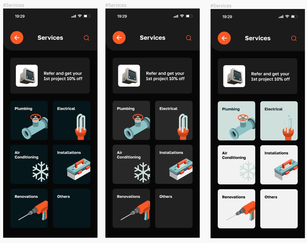 |
| fig 8.1.1 icon UI testing |
 |
| fig 8.1.2 icons illustrating |
However, after much trial and error, we decided that the best way to approach this is to use stock images instead. It was the best way to keep everything consistent and professional looking without having the pain of designing everything one by one. Since our button size is huge, the complexity of real life images was not an issue. It was a shame that all the hard work that went into designing the logos went to waste, but it's all part of the design process, and choosing what's best for the outcome is our priority.
Due to circumstances from our mascot team, I also had to pick up on preparing the mascot assets for the app, social media and pitch video. As we are running out of time, I opted for 2D instead of the 3D. Fortunately, we did not have to use these in the end as our mascot team managed to return and delivered last minute. Many things went down the drain this week, but we're still staying strong.
 |
| fig 8.2 backup 2D mascot assets |
As the presentation date draws closer, I decided to just proceed with the animation as we are running out of time. I animated everything I could and substituted the assets with placeholders just so I can determine the timing as accurately as possible. The animation process got easier the longer I did it.
fig 8.2.1 full pitch video draft
Finally, with the mascot assets and app assets ready, I slotted them in, made some final adjustments and exported the final video.
fig 8.2.2 final pitch video
I proceeded to work on our presentation slides in preparation for the proposal presentation with clients in the coming week.
WEEK 9
Feedback
-cohesive app
-Mascot is cute & should be utilised more
-Geofencing is a great feature
-Give mascot more pose
-Quantomall is a long run feature that can be considered in the future
-Concern about the portfolio feature (how to screen the quality of photos they upload)
Task 3 Final Outcome
Canva board:
Presentation slides:
Microsite prototype:
App prototype:
Reflection
Experience:
There were numerous internal conflicts between members for this task and the tension was high due to the large amount of outcome expected in a short timeframe. Perhaps also due to the fact that it was ILW, some members were busy and wasn't able to contribute as much into the project as others. This task certainly was a less pleasant experience as I have to take care of other member's work on top of my own and it was stressful playing the "will they won't they show up and do their work?" game up until the day before the final presentation.
While I understand that these are unavoidable circumstances when working with other people, I hope communication between members can be strengthened.
Creatively, this task allowed me to try out various things that are borderline in my comfort zone but also not really. I get to experiment with different illustration styles and work on animating a motion graphic, something I have never really done before outside of that one module I took over a year ago.
Observation:
Effective teamwork was truly the foundation of a smooth group project. The team proved that by crumbling said foundation this week. The initial plan to create 3D icons shifted to a 2.5D approach, reflecting a conflict between the ideal aesthetic and practical constraints of time and resources. Different opinions and miscommunications also proved to be a hurdle. Endurance and persistence to overcome such difficulty is most important when working in a group, although sometimes leading to wasted effort, contributed to a more streamlined and realistic approach to meeting project goals under time constraints.
Finding:
The experience truly underscored the importance of flexibility and adaptability in the design process. Despite the effort invested in icon designs, using stock images proved to be a more efficient solution, ensuring consistency and quality. Additionally, unforeseen circumstances with the mascot team caused a sudden change to my workflow, suddenly having to prepare 2D assets, although the original 3D designs were ultimately used.
Comments
Post a Comment