
27/6/2024 - 25/7/2023
Leong Jiahui / 0353469
Bachelor of Design (Honours) in Creative Media
GCD62104 / DESIGN EXPLORATION
Instructions
Task 3: Design Document
- Task 3 - Design Document (Project Proposal)
- Section 1: Research Data
- Section 2: User Journey Map
- Section 3: Proposed Idea for the Solutions
Finally kickstarting the app design part of the project, we made a quick summary of the key findings from our survey and task 1 and analysis from task 2. We tried to relate key findings to the features we are implementing in the app, how each feature solve the persona's problems and addresses the unique selling point. We also began the process of establishing our brand name and identity.
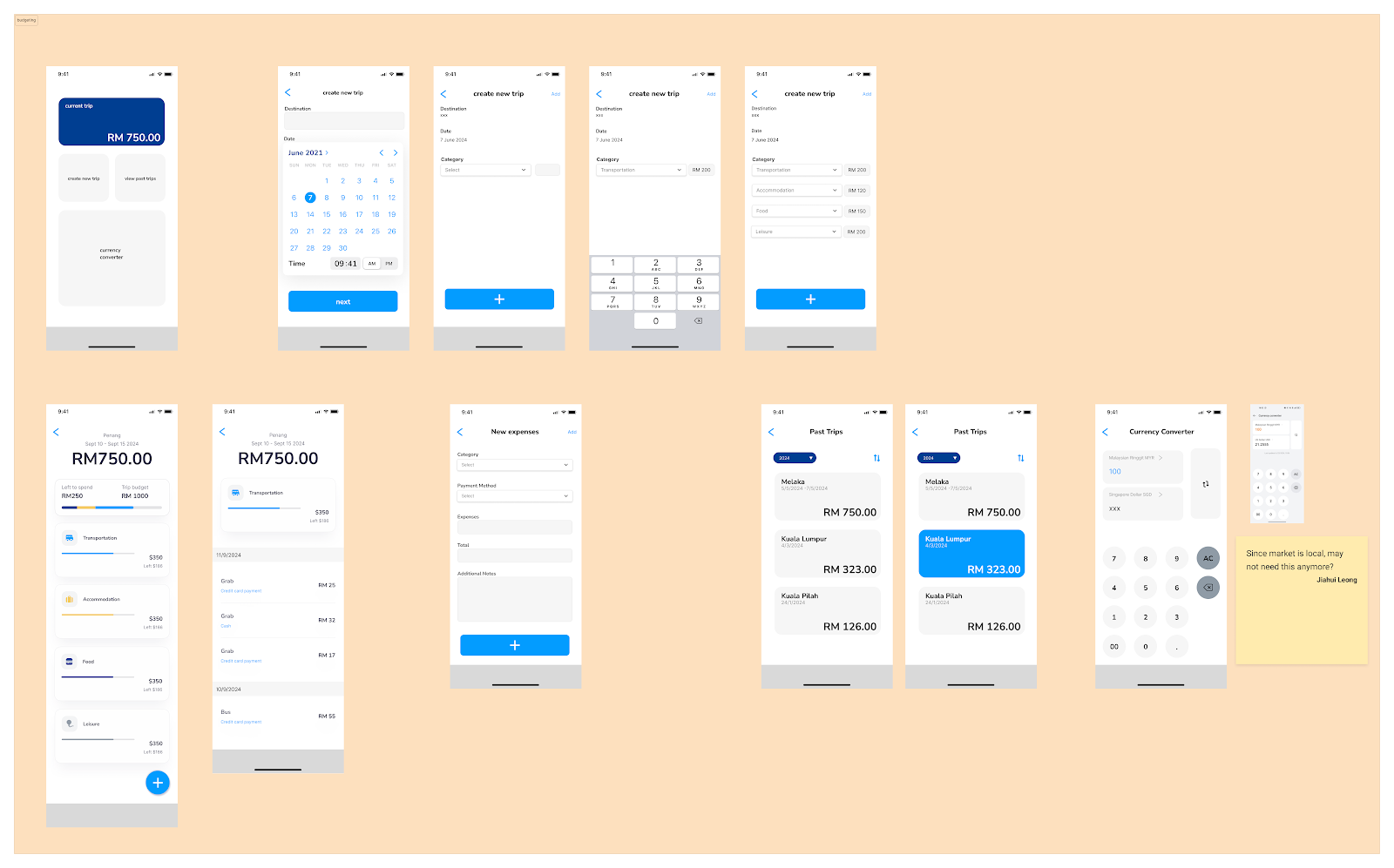
Since our app focuses on solo travelers, we decided to name our app "Travello" (Travel + solo). When deciding on our app color scheme, we went for blue, as blue is often associated with reliable and dependability, which is something we prioritize for our app. Now, it is time to build our prototype. We started out by building a mid fidelity prototype. As per delegated previously, I worked on the budgeting page and navigating page.
We had a quick tutorial on Figma in class, which taught us the fundamentals on how to maneuver the platform, but most of the prototype building was learned from online resources like YouTube and assisted by the Figma community assets and templates.
 |
| fig 1.1 mid-fidelity prototype |
 |
| fig 1.2.1 budget page (mid-fidelity) |
 |
| fig 1.2.2 navigation mid-fidelity |
While building the pages, I found many aspects of UIUX design to be challenging. From making the layout look appealing and easy to understand, to making each page functional and looking consistent was the biggest challenge. Of course, there was added difficulty of not having the Figma knowledge to make certain ideas happen, such as the scrollable carousels that took us way too long to figure out, and had to reach out for help from our peers.
Of course, we also took a lot of references when making our page. Our main reference was the Klook app, but we also took a lot of references from Grab, Google Maps, xiaohongshu, Pinterest and more. I specifically used a lot of google map reference for my navigation page, and some calculator reference for my currency converter page.
I also realised how difficult it was to create low or mid-fidelity wireframes because i couldn't picture it without making it clear. As I add more elements to make it clearer, it no longer looked like a mid-fidelity prototype anymore. Not sure if it was a skill issue on my part, but I did what worked best for me and the efficiency of the entire project.
Task 3 - Design Document (Project Proposal)
UX Design Task 3 by Jiahui LeongTask 4 - Final Project (Prototype)
- Usability Testing Analysis (pdf) - Data analysis & link to survey
- Link to Figma Prototype iPhoen 13mini (In the first page of the pdf)
- Link to Figma Editor (In the first page of the pdf)
After the 2 weeks of struggling to make our mid-fidelity prototype, we are now moving into preparing the prototype for finalisation and completion. After consultation, we were advised to establish a set of assets to ensure consistency throughout the pages. This is the assets we compiled and standardized:
 |
| fig 2.1 assets |
We continued refining our prototype, making adjustments based on user feedback to better align with our project objectives. By filtering the feedback, we ensured that the changes we made were directly related to the key findings from our survey. These findings highlighted that solo travelers are most concerned with safety, seek personalized experiences, and require offline access to information. Our updated prototype now reflects these priorities, integrating features that address safety concerns, offer tailored itineraries, and provide reliable offline resources, while ensuring that community insights are accurate and useful.
The next step is to carry out a Usability test to refine our app, focusing on improving layout, navigation, and overall user experience. I crafted relevant questions to ensure we collected useful and actionable feedback, then created a Google Form. I also screenshotted and organised our current prototype into graphics for the form to help the respondents understand and answer better. The form was organized into sections to cover different aspects of the app, making it easier to analyze responses. Each team member sent the form to 1-2 people, allowing us to gather feedback quickly and make informed improvements based on the input we received. It was an extremely challenching task extremely limited time available and little guidance. Did i say extremely? We referred to the past examples and hoped for the best.
Usability Testing Questions
Usability Testing Google form:
Next, we analyzed the feedback gathered from the usability tests and compiled them as comments directly on the Figma prototype. This approach allowed us to easily reference specific issues and suggestions, streamlining the process of making necessary edits and improvements. By annotating the prototype, we ensured that all feedback was clearly linked to the relevant parts of the design, facilitating efficient updates and refinements.
Usability Testing Analysis:
We then compiled the feedback and analysis into a comprehensive report, which included a discussion of limitations and a summary of findings. The report outlined the key insights from the usability tests, highlighting areas where the app’s layout and navigation could be improved. It also addressed the limitations we encountered, such as the constrained timeline, which impacted the depth of testing and the breadth of feedback we could collect. Despite these challenges, the summary of findings provided a clear overview of the user experience issues identified and the actionable recommendations for refining the app. This report served as a valuable resource for guiding further development and ensuring that the final product meets user needs effectively.
Usability Testing Report
We made the final touches and refinements to the app prototype, ensuring that all elements were polished and functional. This included verifying that all linkings within the prototype worked correctly and seamlessly guided users through the app’s features. By checking the connections and interactions, we ensured a smooth and intuitive user experience, making the prototype ready for the final presentation (finally :D !!)
We also decided to record a video demo walkthrough of our app to give the project a polished, complete feel. To achieve this in 2 days, I wrote the script for the video, Hoi Yee provided the narration, and Jamie handled the editing. Riko on the other hand worked hard on getting our final app showcase slides together. Teamwork at its finest. This final touch helped us present the app effectively and showcased our hard work in a cohesive and engaging format. I felt like we could do anything at this point, rushing these outcomes non stop like its nothing, all within less than a week's time. We should run for presidency next.
Video Demo script
Travello Final Outcome
Travello Final Prototype
Travello Figma Board
Travello Video Demo
Travello Task 4 Slides
Reflection
Reflecting on the journey of developing our app prototype, it felt like the longest yet kinda empty 14 weeks of my life. A few key learnings really stood out, particularly regarding the challenges we faced and the lessons we learned during the prototyping phase.
Starting with little prior knowledge or skill in UX design, we faced a steep learning curve. The process of brainstorming and defining our app’s focus was daunting, especially with limited guidance. Despite these initial hurdles, our teamwork and resilience were crucial. We leaned on each other’s strengths, with each member contributing to the research, design, and refinement phases. We weren't shy or hesitant when giving each other feedback too, and the transparency helped the efficiency in our workflow.
Time constraints added another layer of difficulty. We had to juggle multiple tasks, from gathering feedback to implementing changes, all within a tight schedule. A lot can and should be improved in the structure of this module, starting with better scheduling and timings for each task. Having only 4 weeks to build a full prototype while doing a usability test is unheard off, and really limiting as we could've done a lot better had the module structure been more organised. This pressure tested our ability to prioritize and make efficient decisions. Nevertheless, we managed to produce a refined prototype by staying focused and adaptive.
Ultimately, these experiences underscored the importance of adaptability, teamwork, and persistence. We learned how to navigate challenges with limited experience and time, transforming these obstacles into opportunities for growth and innovation. The final prototype and the video demo we created are testaments to our collective effort and resilience throughout this process. With that I'm signing off my UX module for the sem, thank you bye!
Comments
Post a Comment